
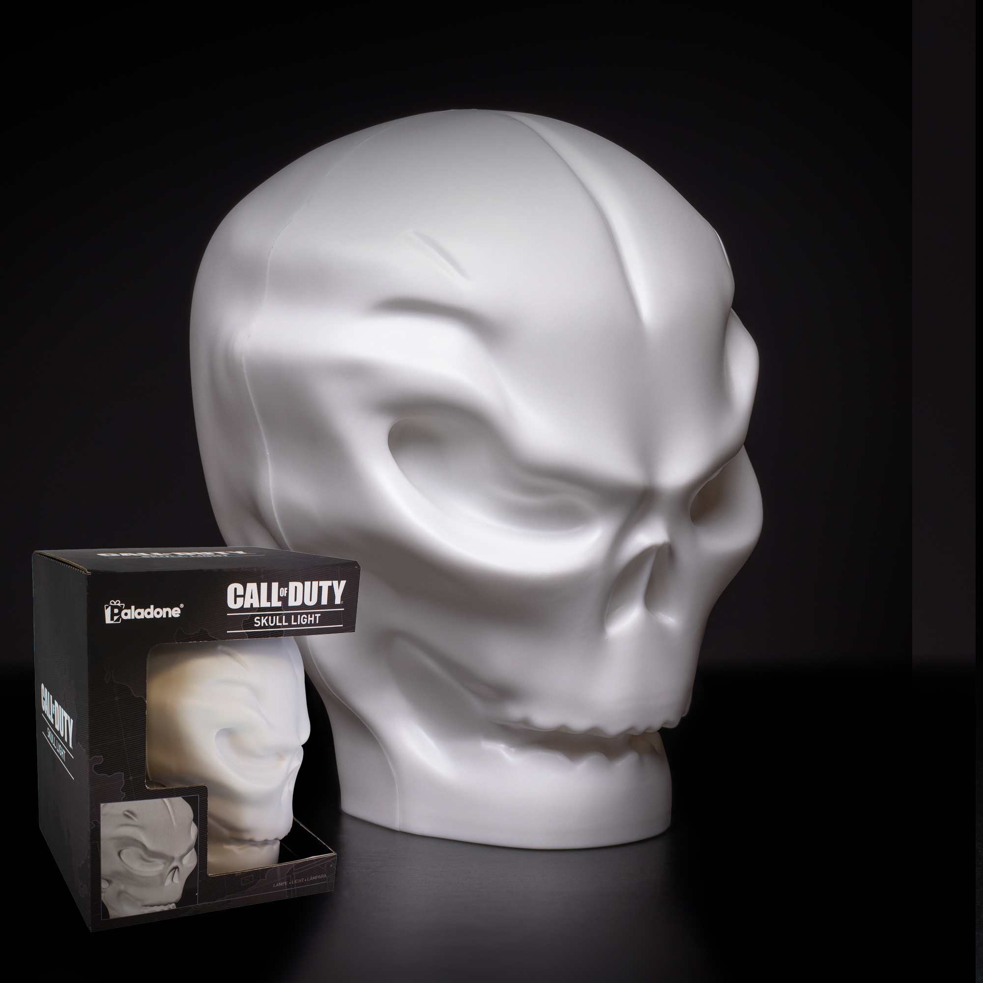
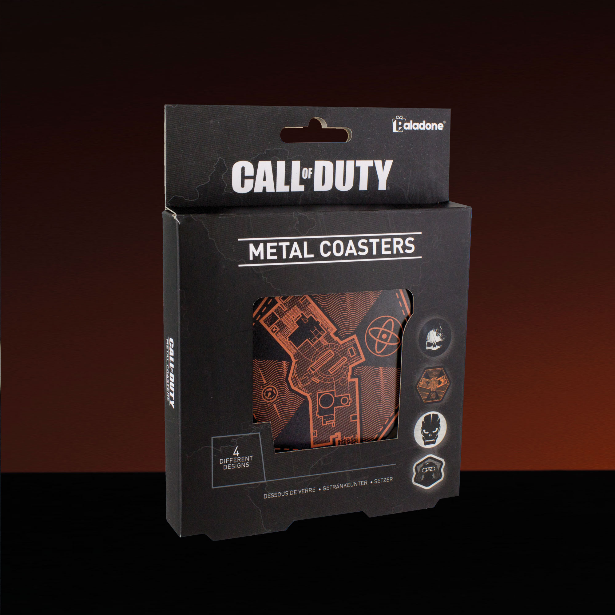
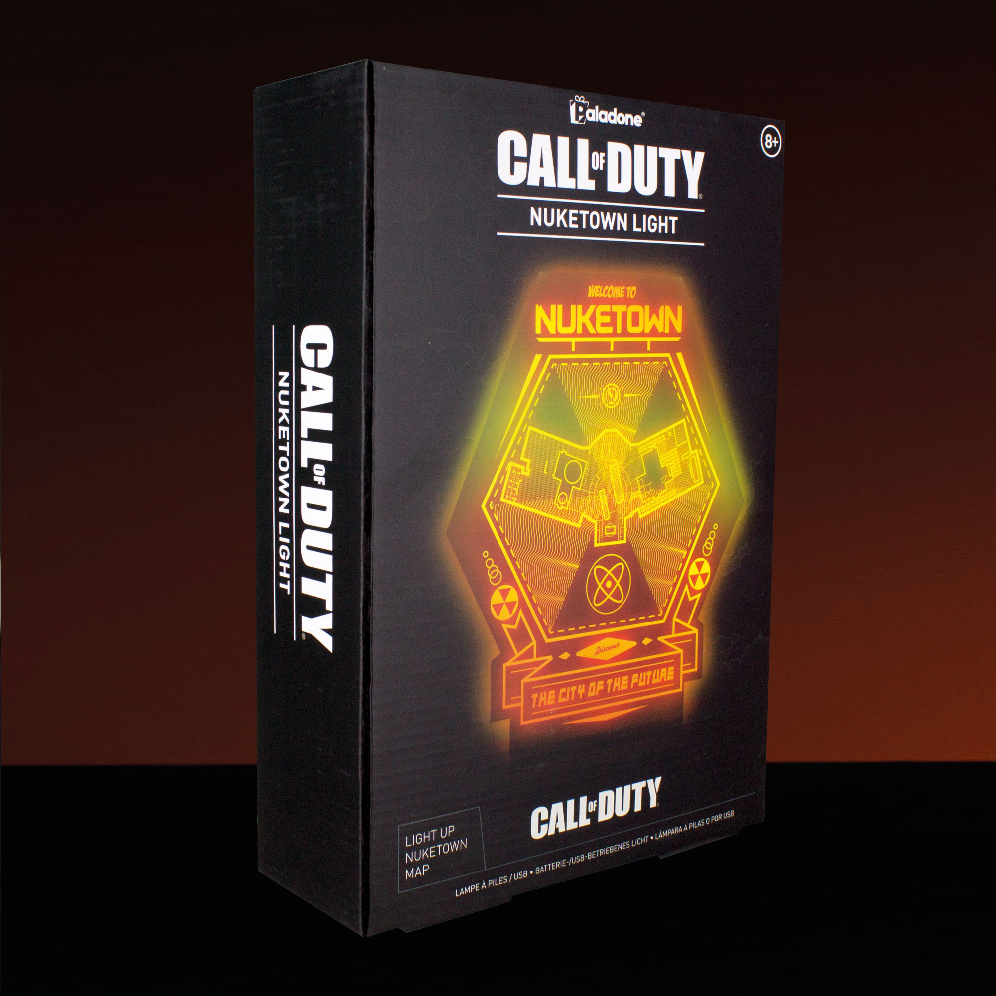
CALL OF DUTY
Style guide / Concept / Product /
Packaging / Digital assets
Style guide / Concept / Product /
Packaging / Digital assets
CALL OF DUTY
Style guide adaptation / Concept / Product / Packaging / Digital assets
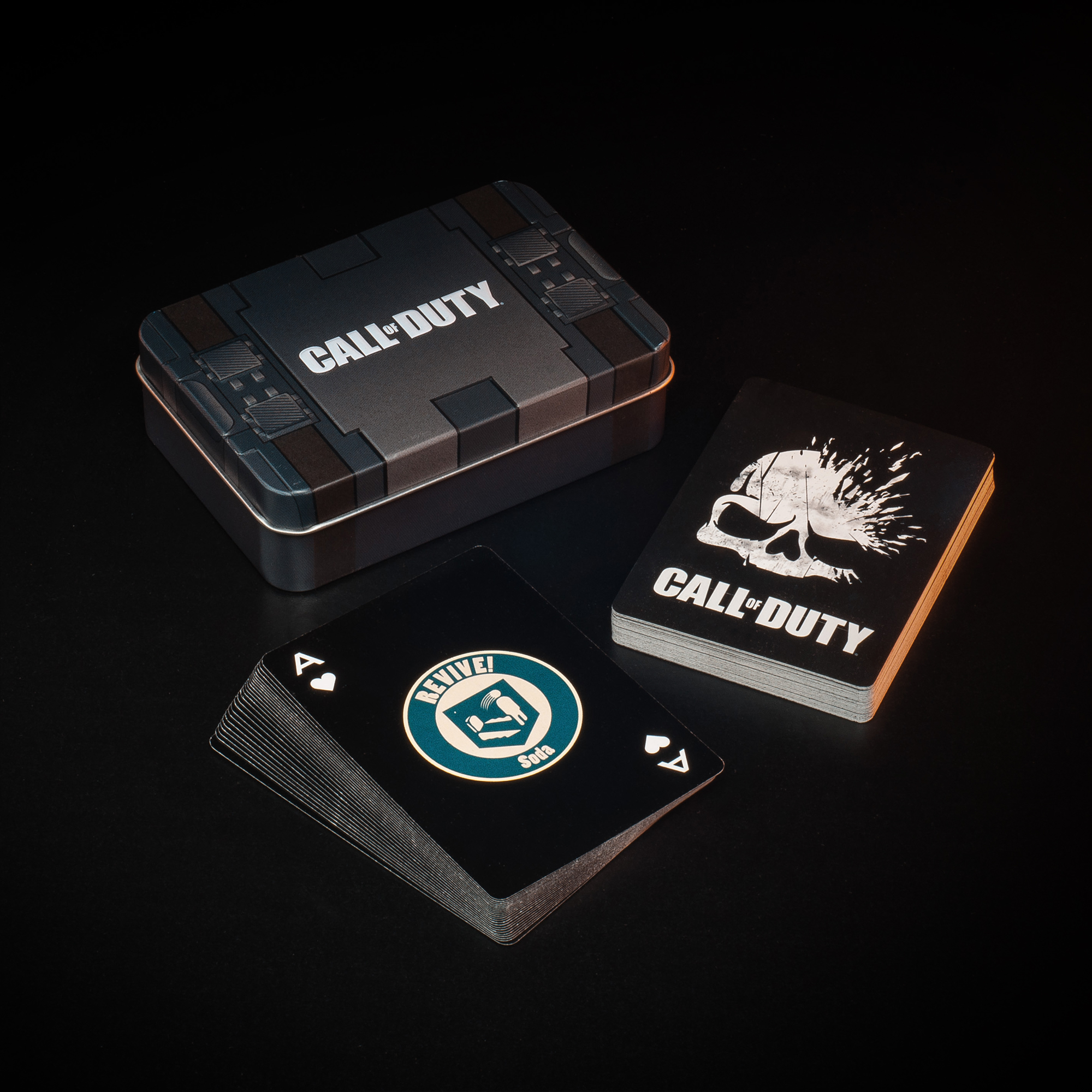
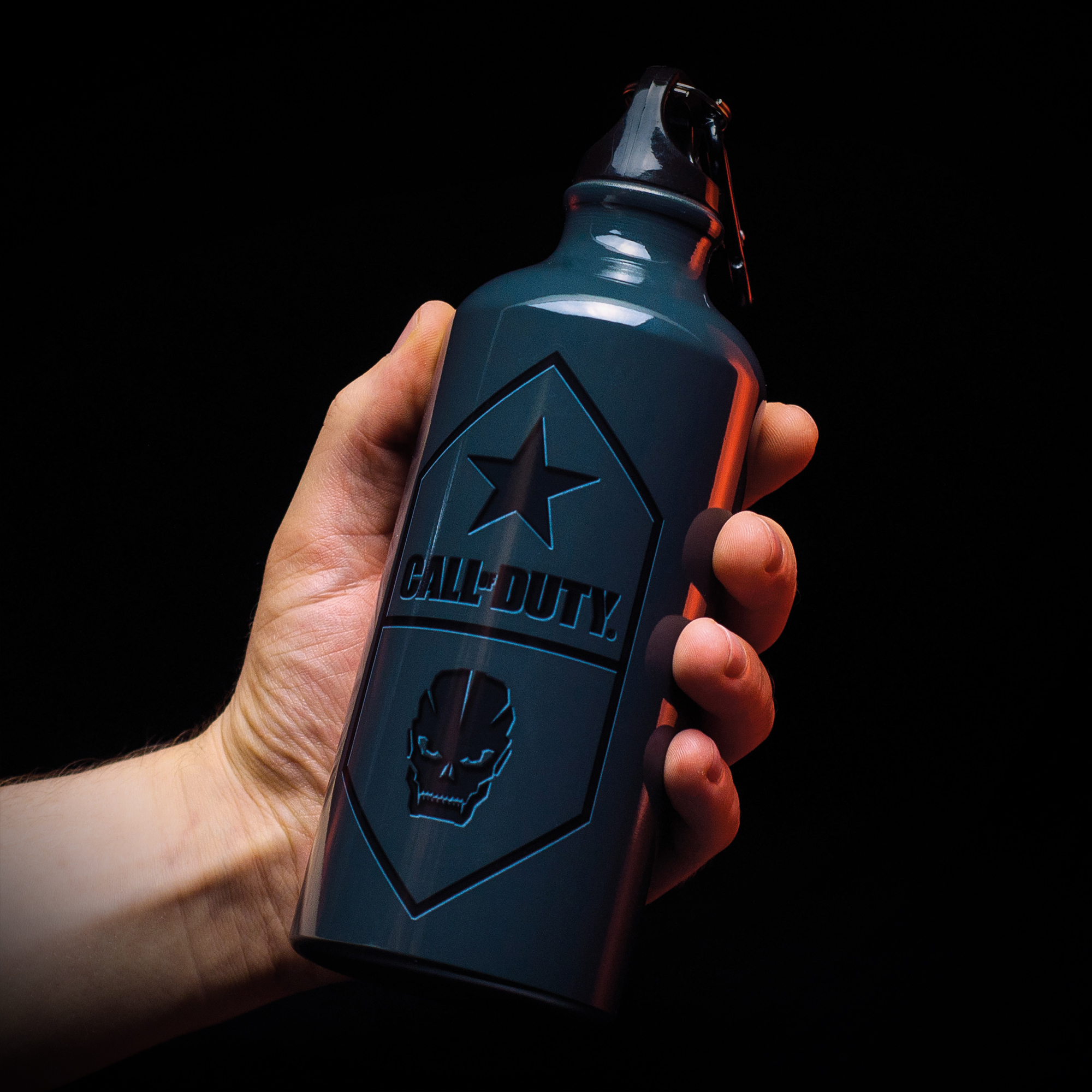
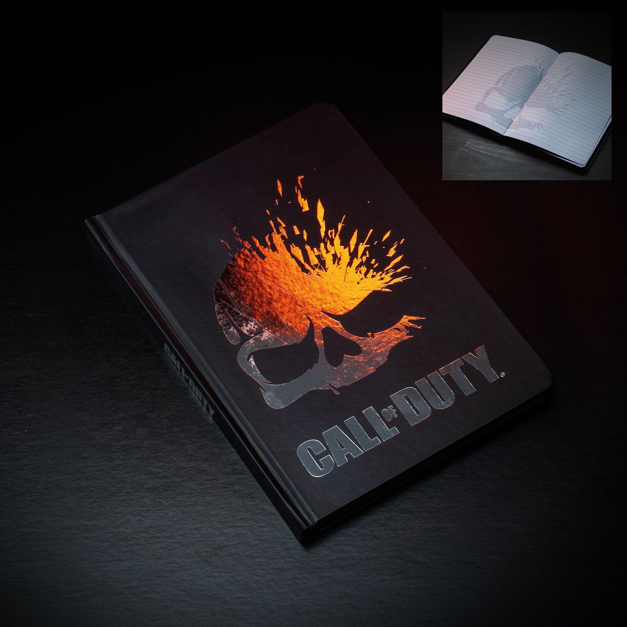
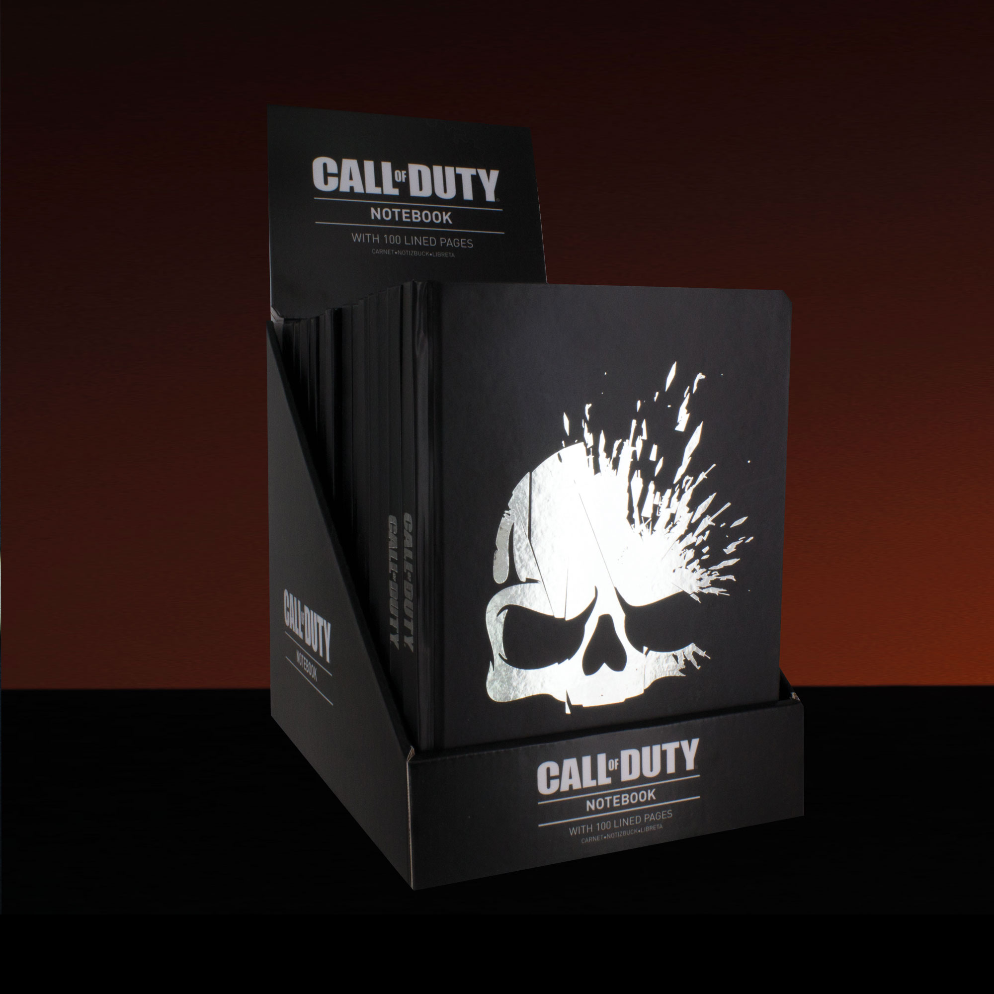
Call of Duty has held its own since 2003 as one of the world’s most popular video game franchises. As a fan of the game it’s been an incredible experience to be involved with the development of their merchandise range for several years – designing a particularly dark look and feel for the style-guide and packaging and applying the style-guide to a variety of products, digital assets and more.


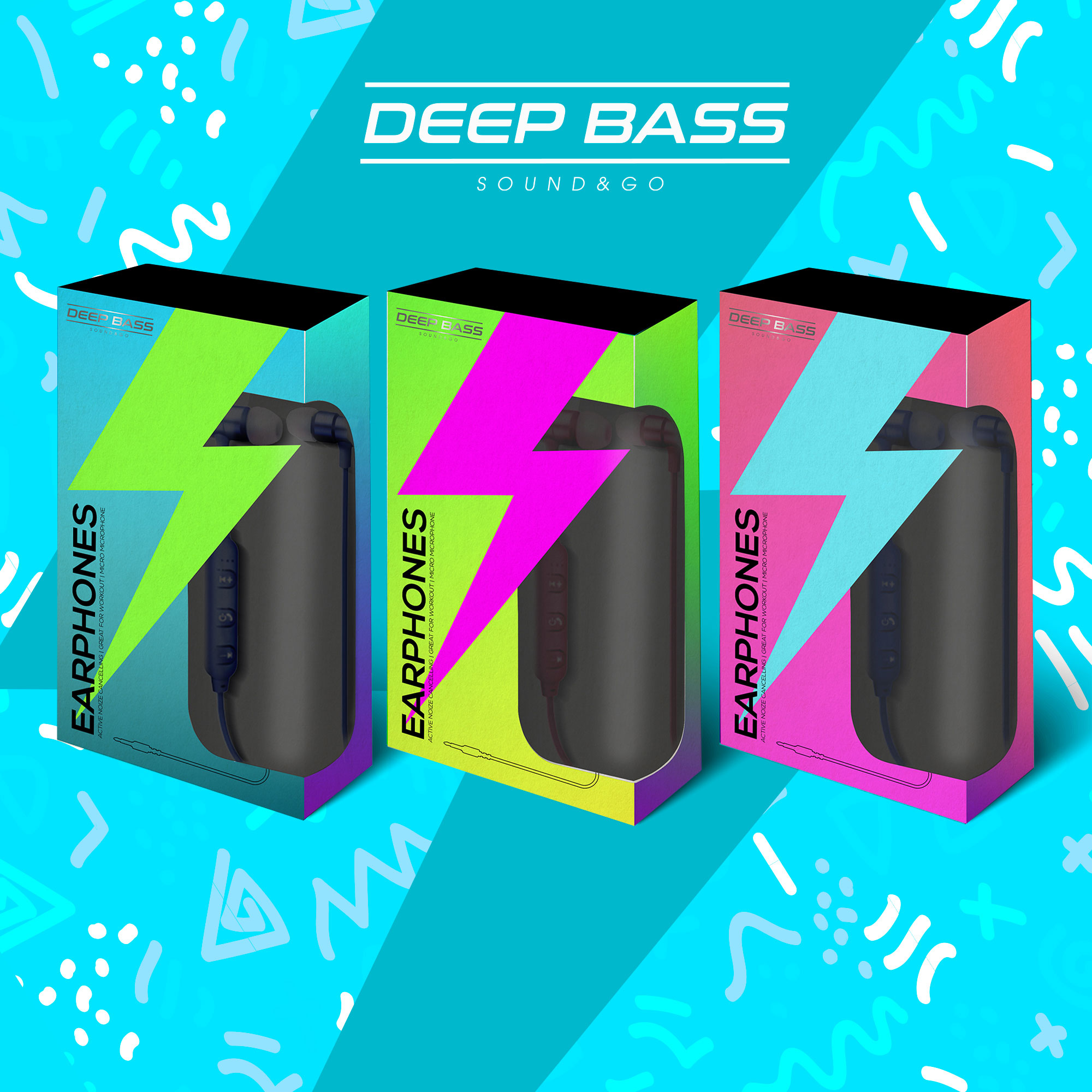

DEEP BASS
Style guide / Packaging / Identity
Style guide / Packaging / Identity
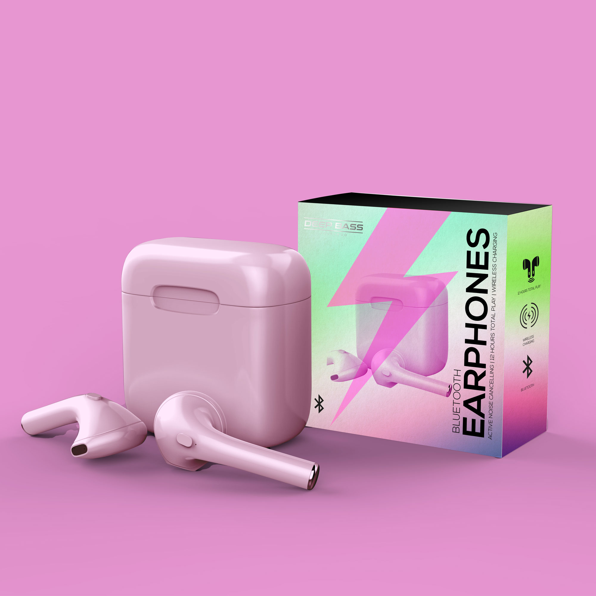
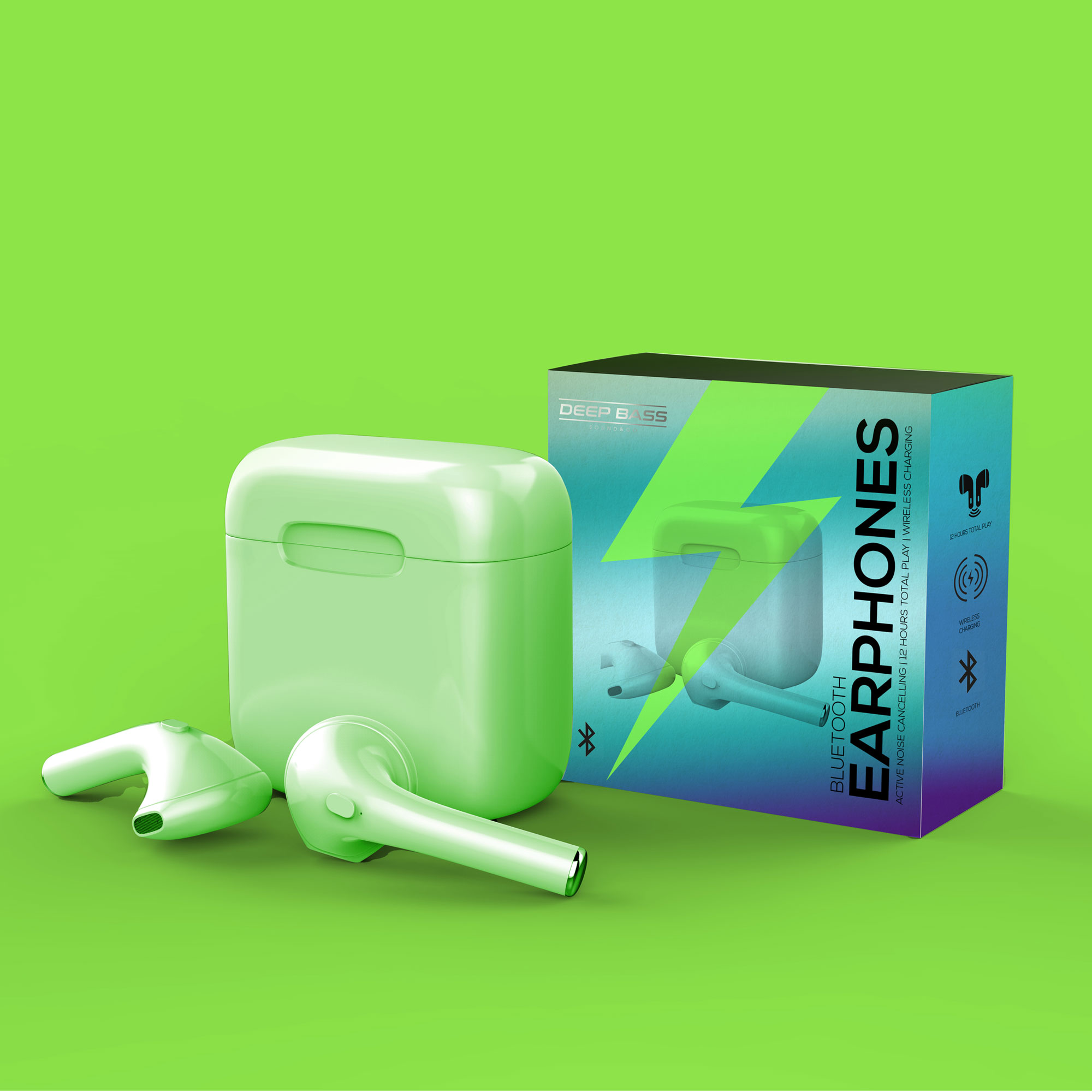
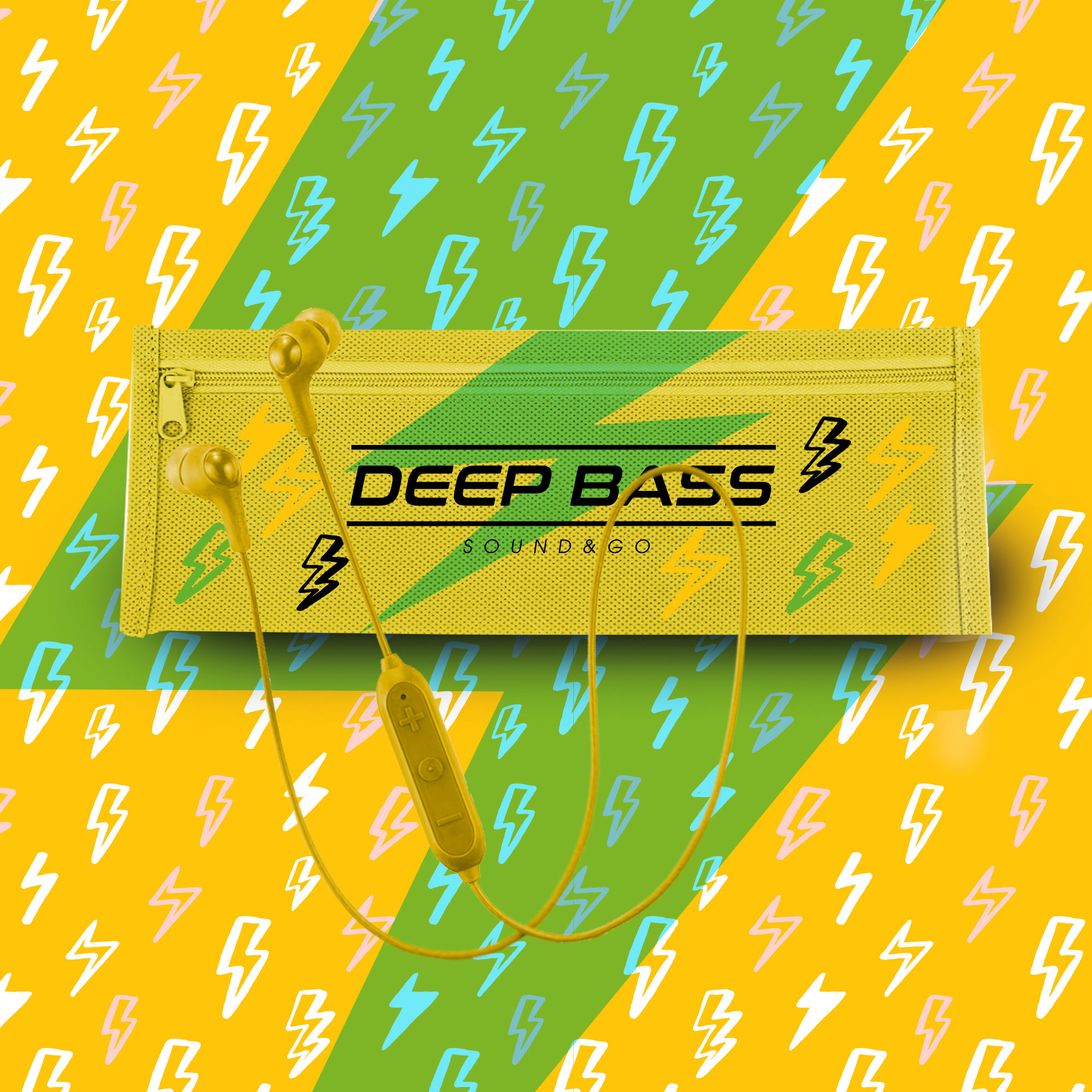
DEEP BASS – SOUND & GO
Concept / Style guide / Packaging / Identity
London retail company engaged me to work on a new
Deep Bass identity for their headphones brand. Inspired by David Bowie’s iconic ‘Aladdin Sane’ look I brought colour and energy to the style-guide and packaging using intense colour and the famous lightning bolt.
![]()
ORGANIC WAYS
Identity / Concept / Style guide /
Packaging / Fabric design
Identity / Concept / Style guide /
Packaging / Fabric design
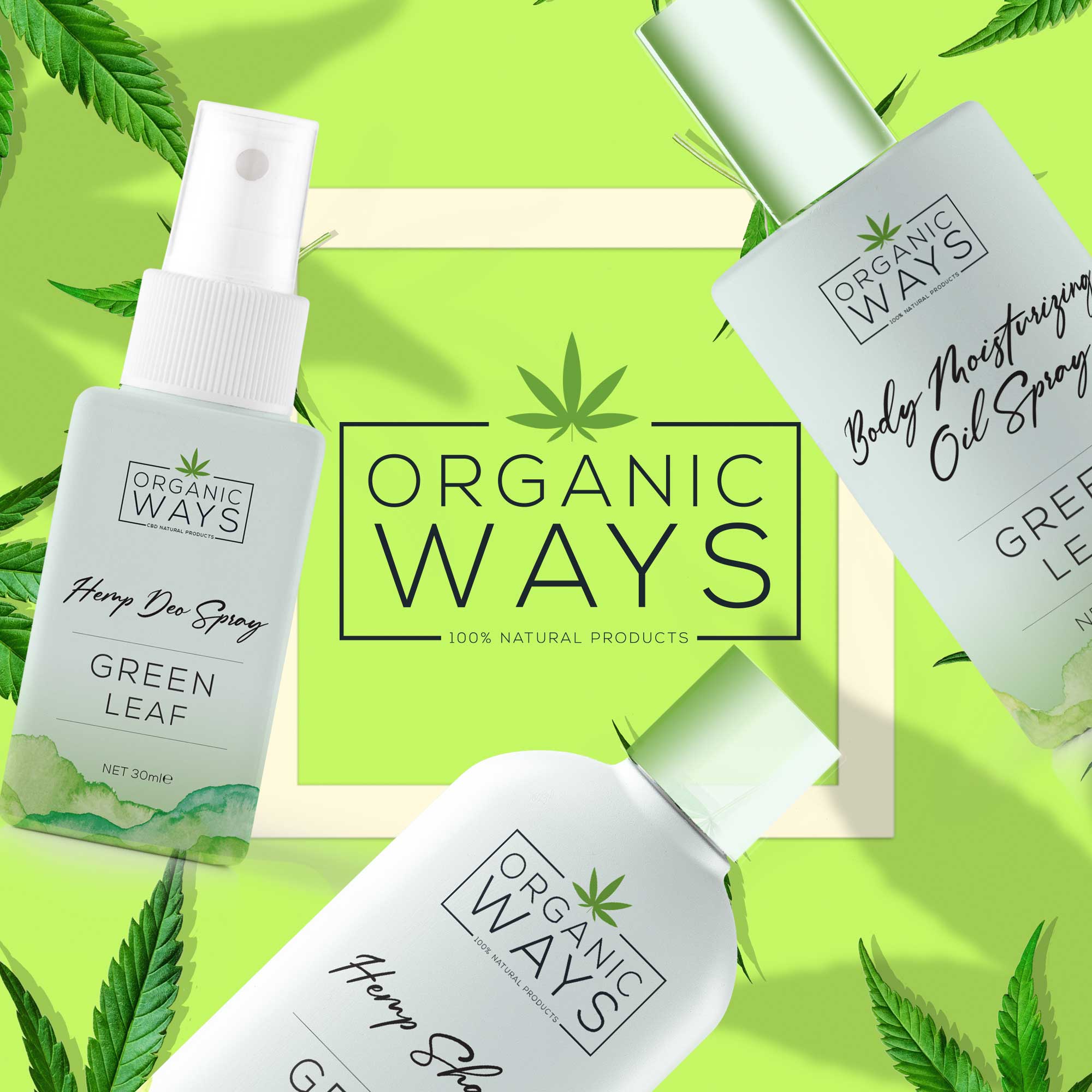
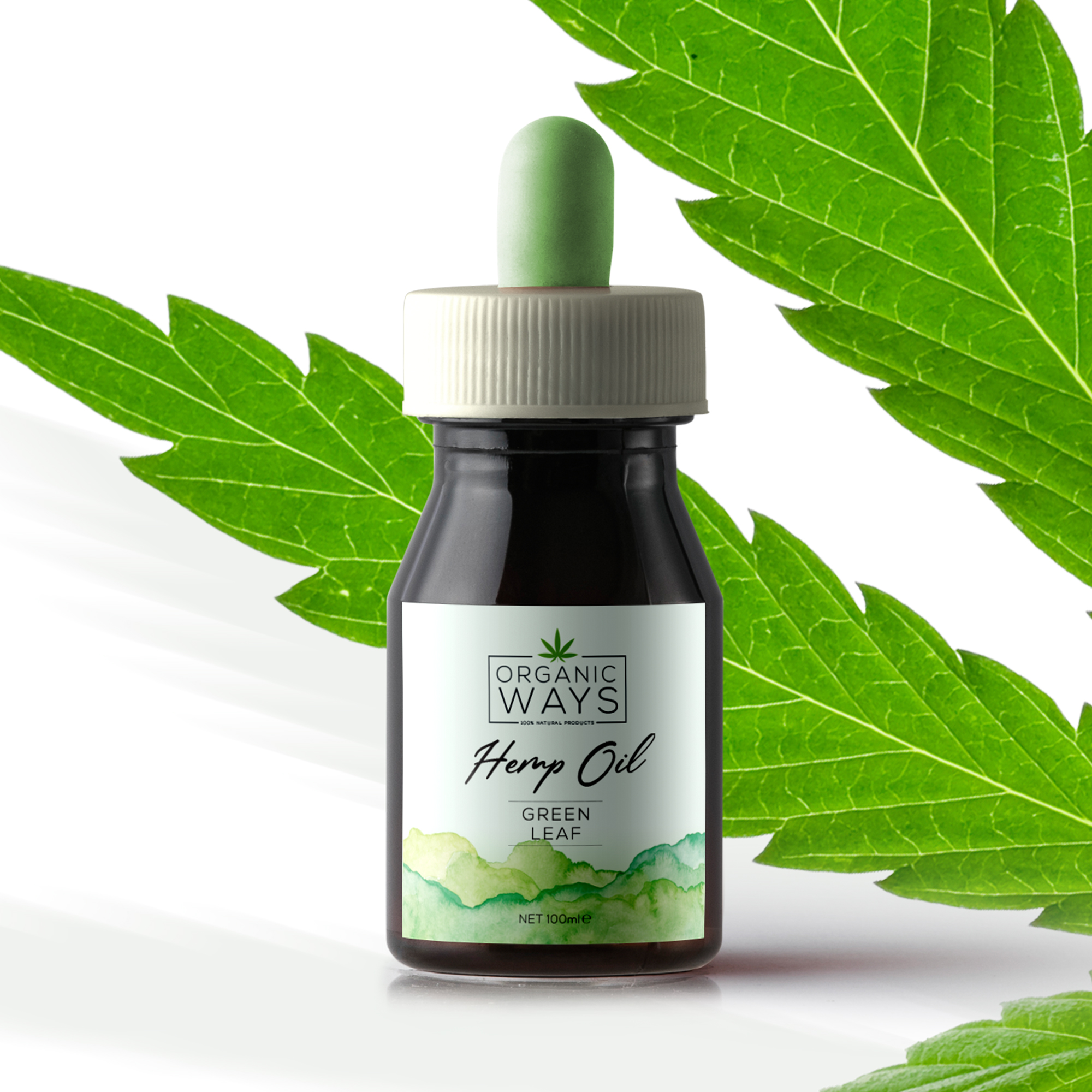
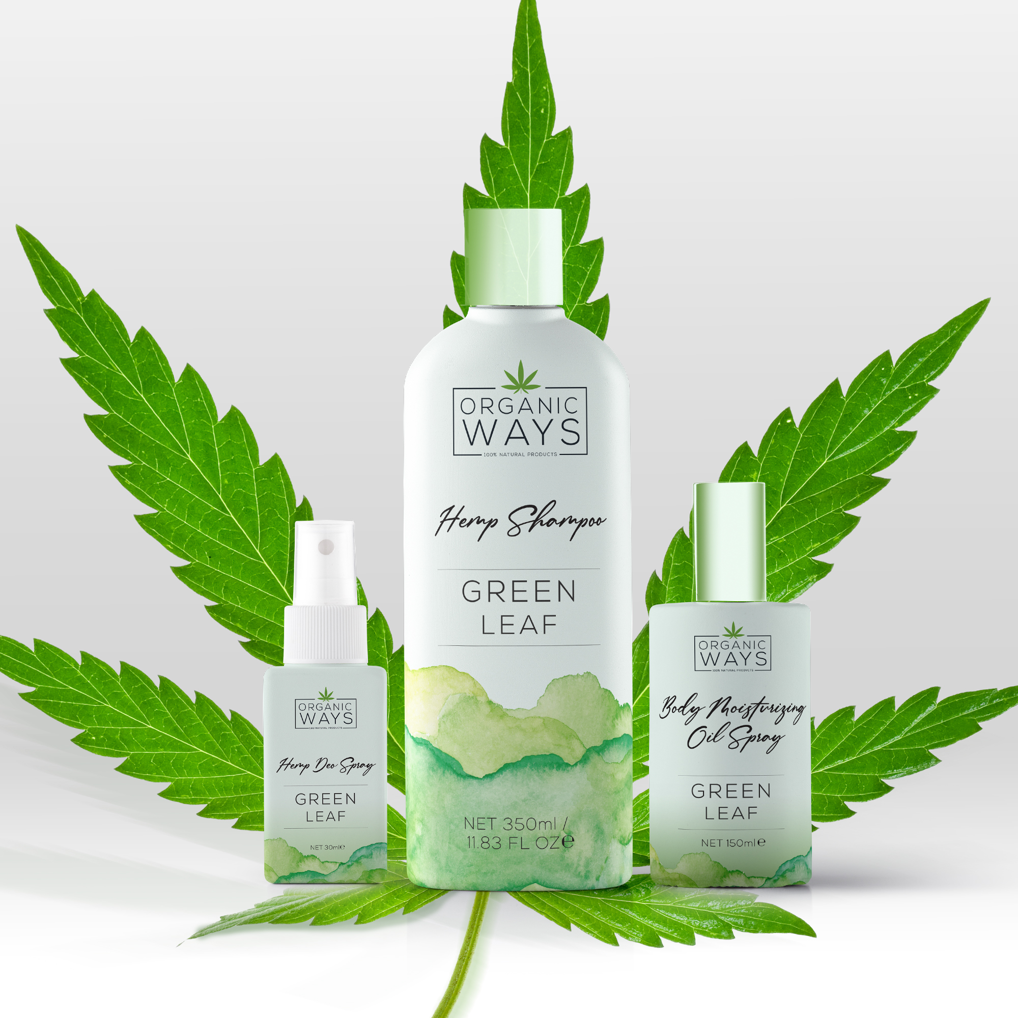
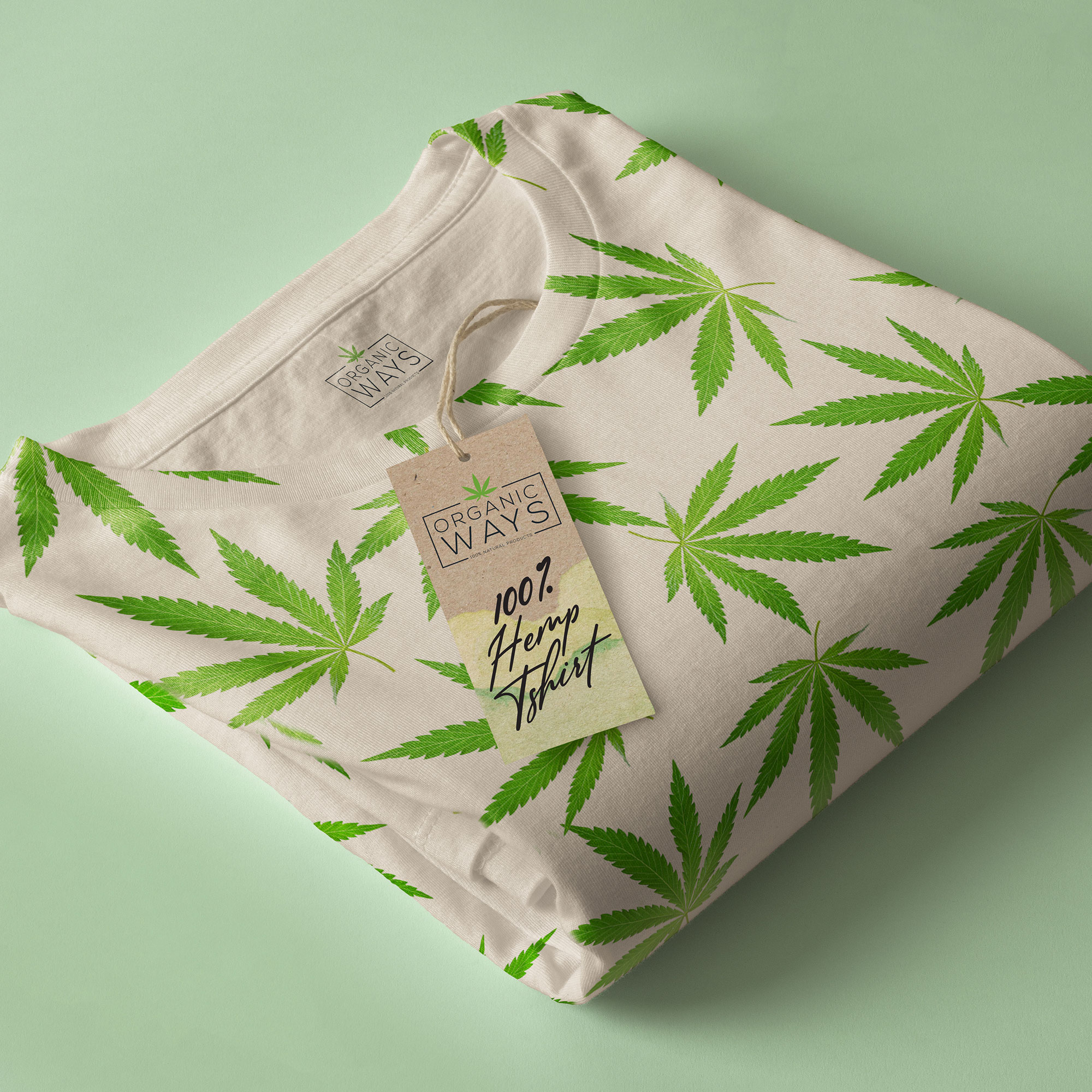
ORGANIC WAYS
Identity / Concept / Style guide / Packaging / Fabric design
European beauty and cosmetics company, Organic Ways, produce organic products using hemp and CBD. I supported them from the product brainstorm through to concept and final look, creating the product identity with a style-guide that included a variety of illustrations, packaging, and fabric design.

BBC Illustration / Poster
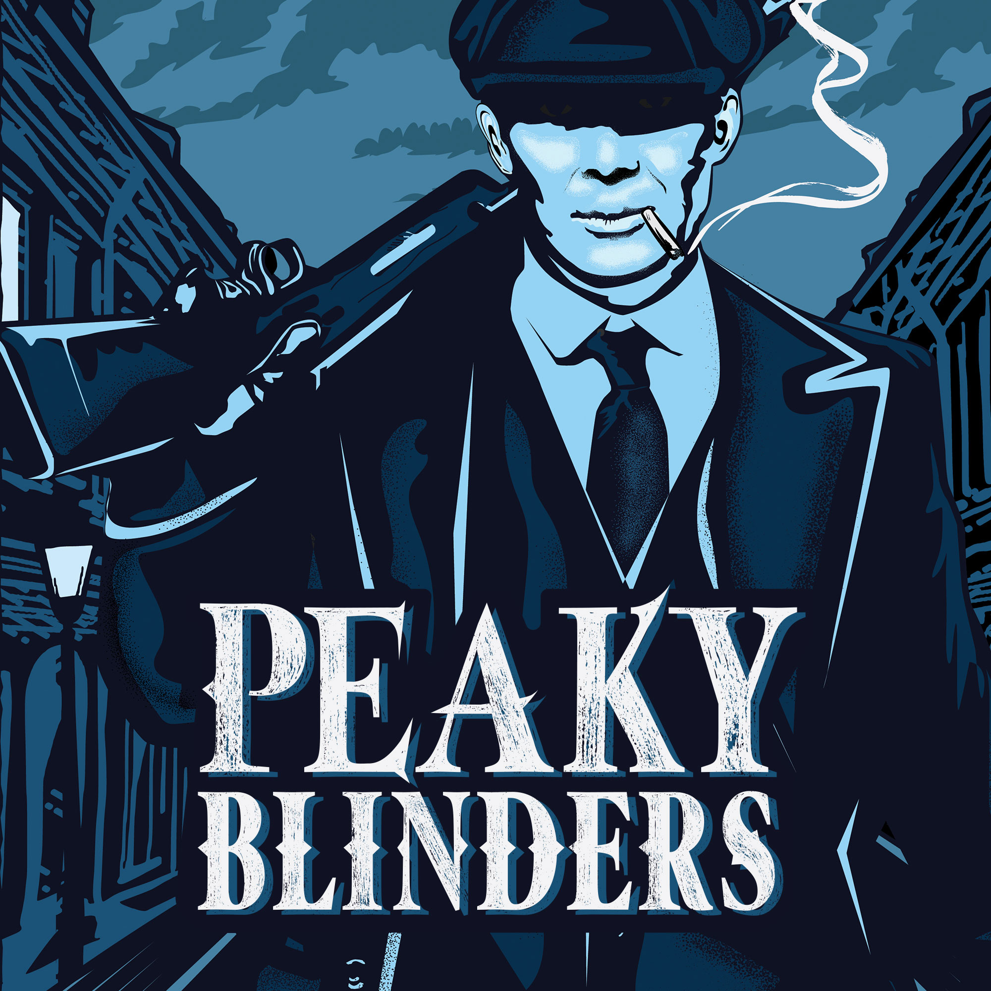
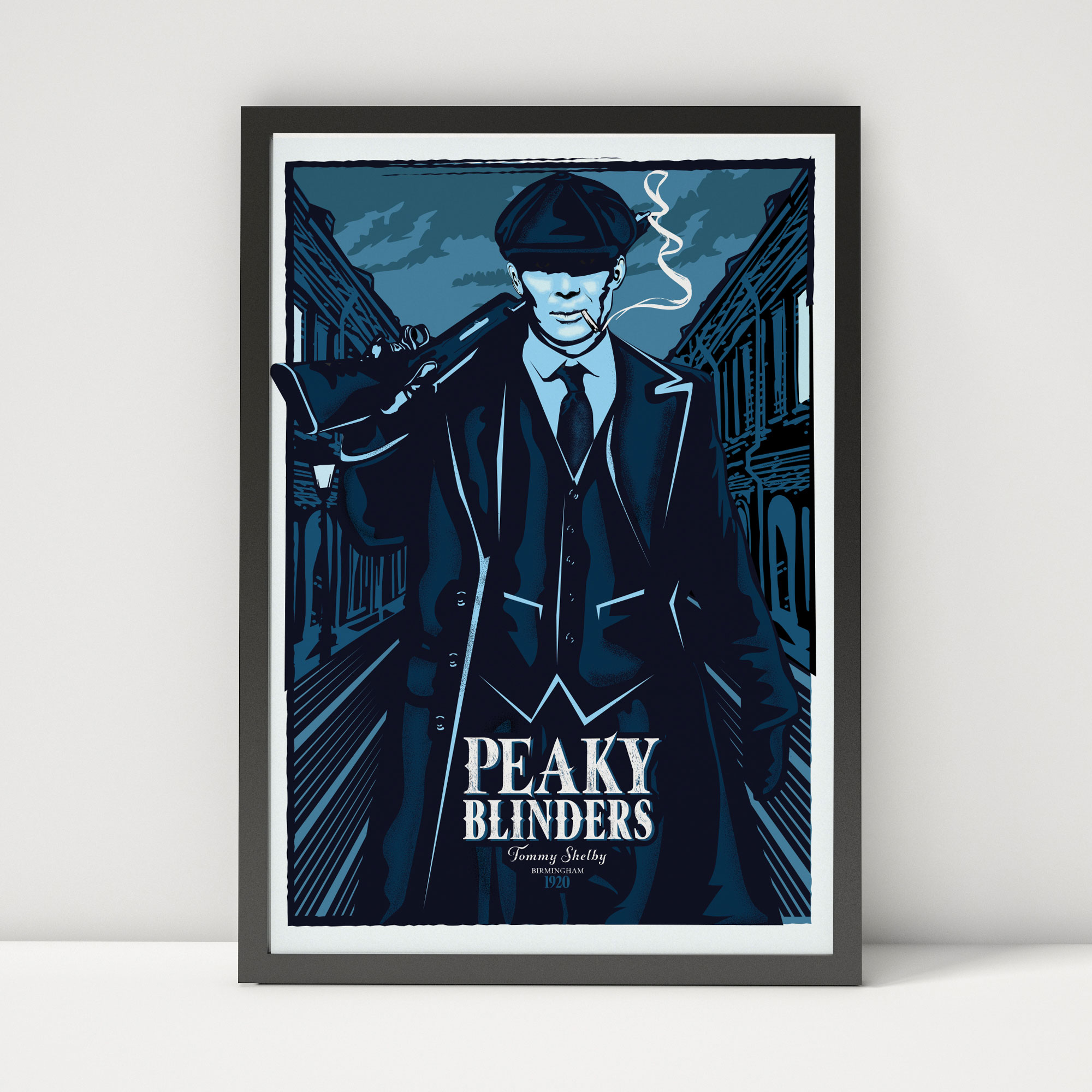
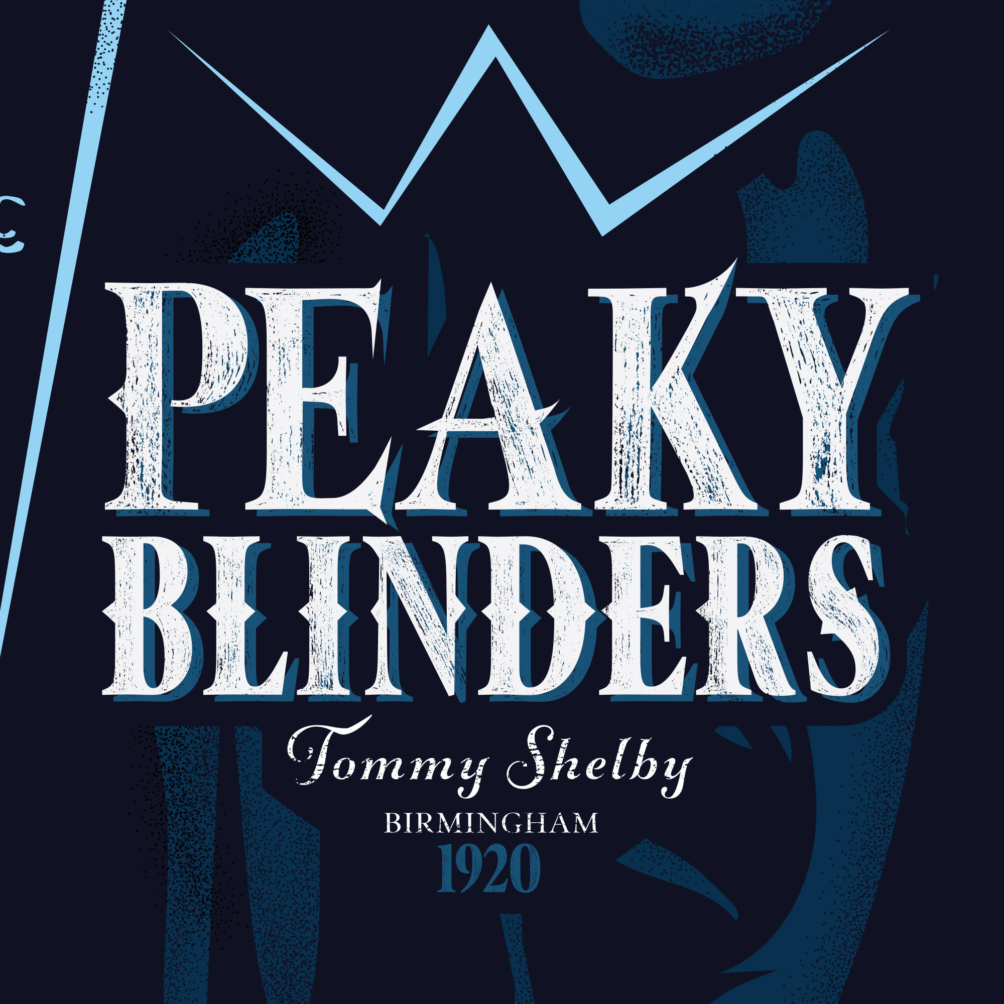
BBC PEAKY BLINDERS
Illustration / Poster
Now presented in the BBC Peaky Blinders digital gallery, I created this poster to enter a contest celebrating season 5 of the popular BBC drama, Peaky Blinders. As a lover of the show I wanted to bring out the power and fearlessness of Tommy Shelby and used black and blue tones to tell more than a visual story. The black hints towards both his early days growing up in Birmingham during the industrial revolution, and his dark time spent underground in the tunnels during the war

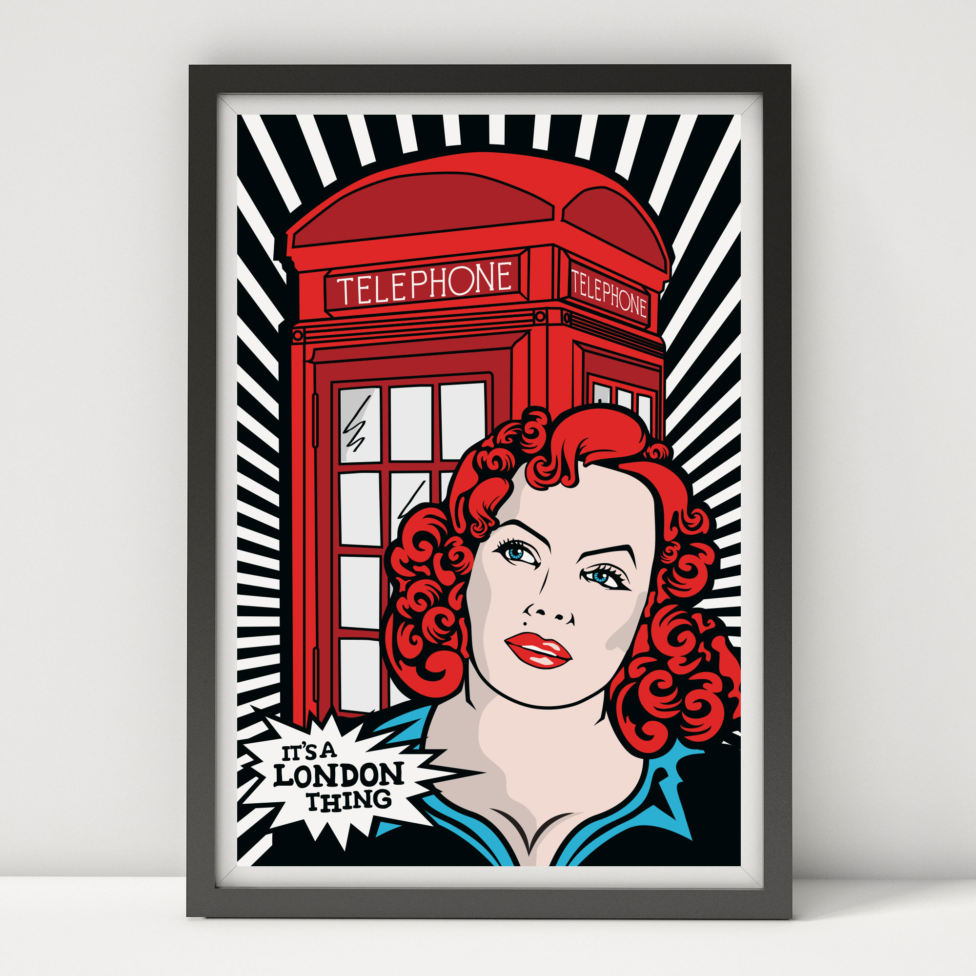
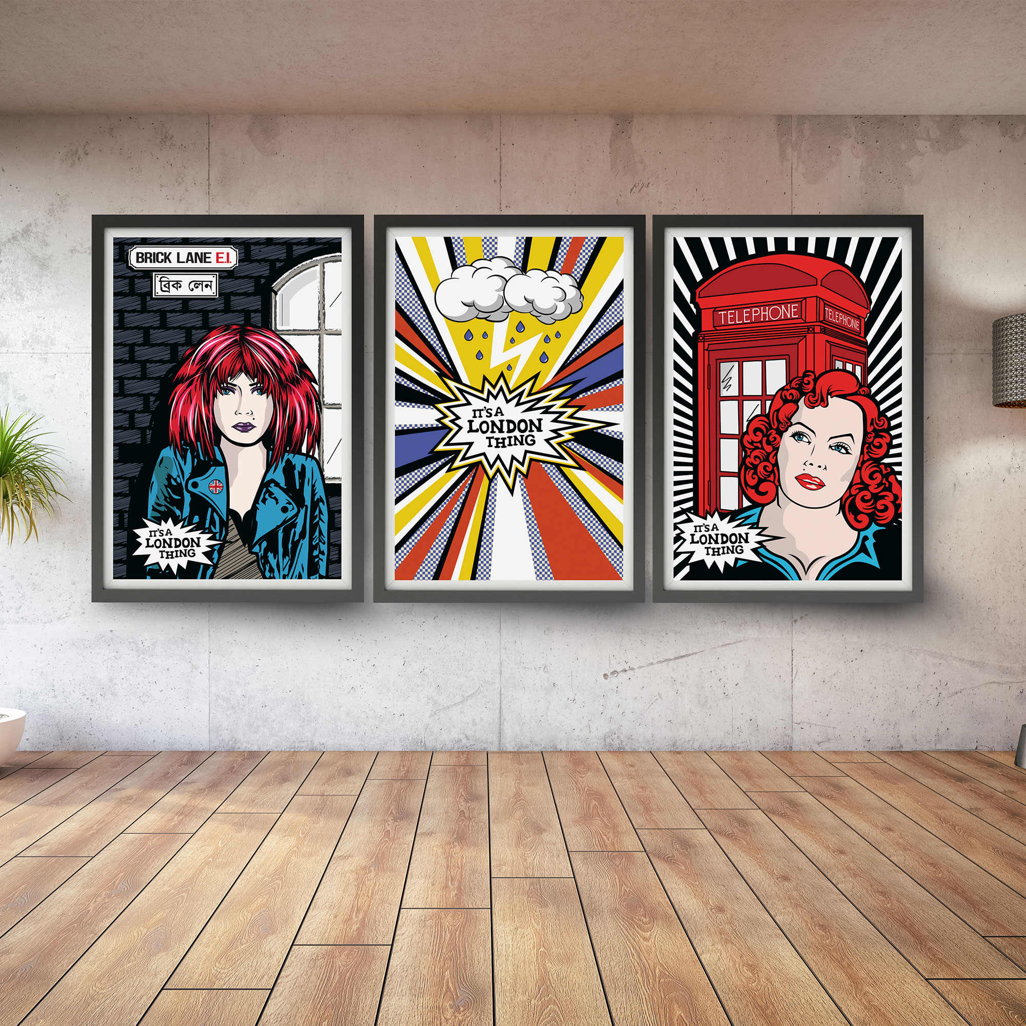
IT’S A LONDON THING
Illustrations
Illustrations
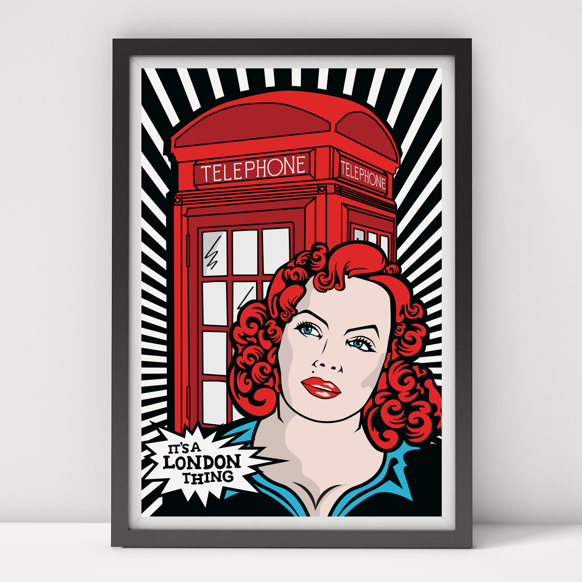
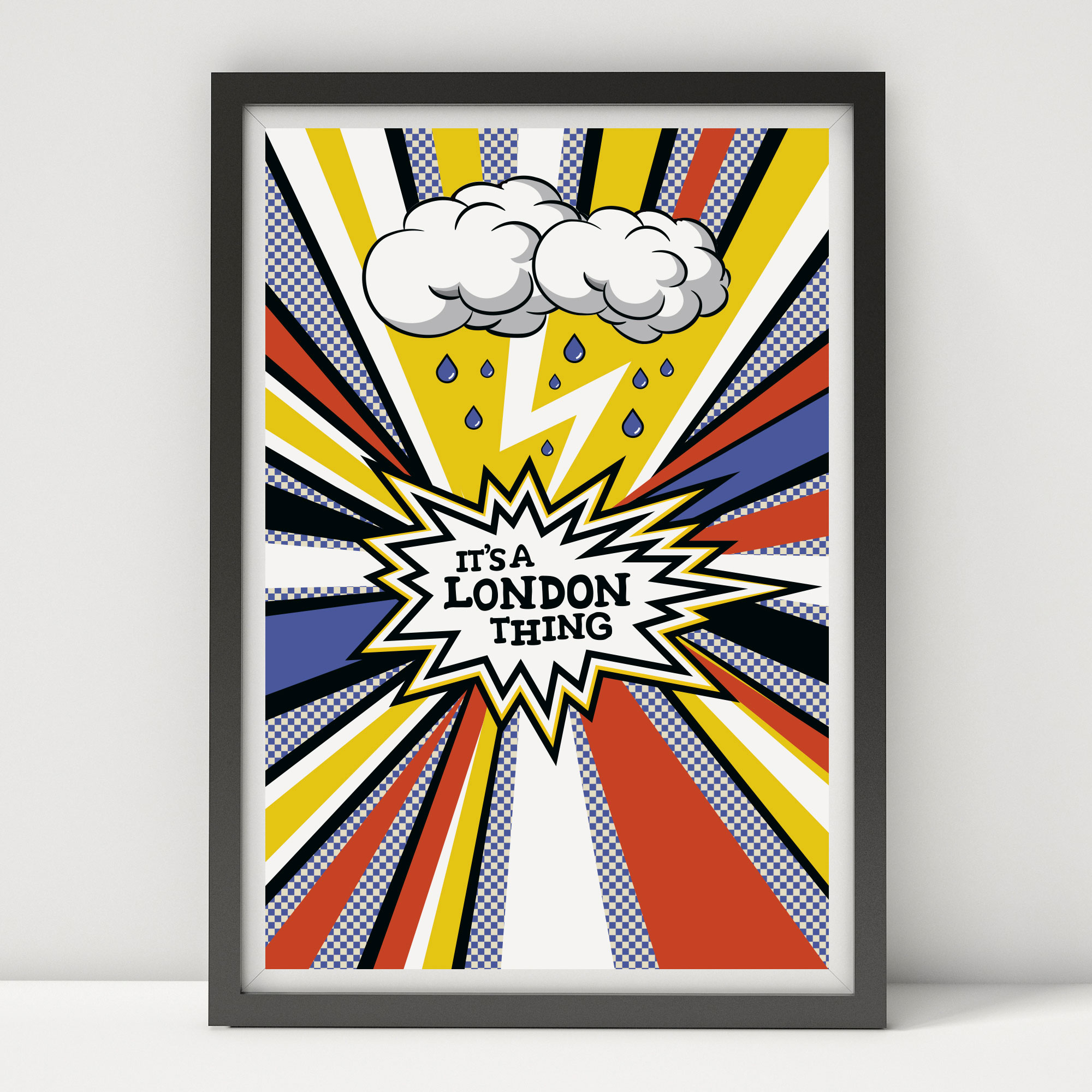
IT’S A LONDON THING
Illustrations
This a 3-piece illustration in the style of a comic strip. I created these using a retro-London style-guide and brought iconic elements into the series such as rain, Brick Lane, and the famous telephone box. Both colourful and moody, I found inspiration in this pop-art style and the varied colour palette.

I LOVE SHOREHAM
Illustrations / Product design
Illustrations / Product design
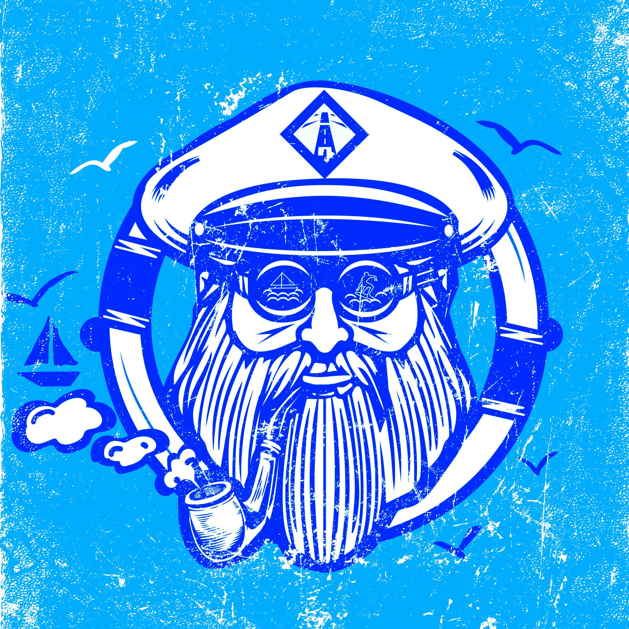
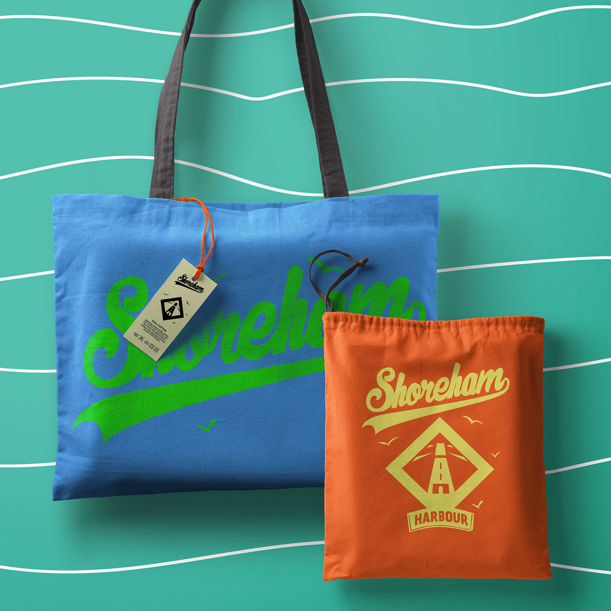
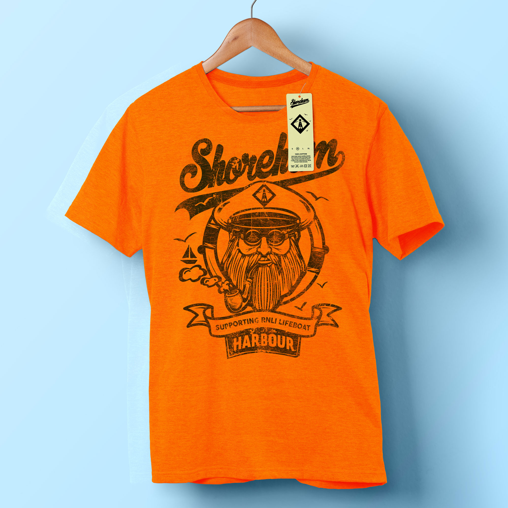
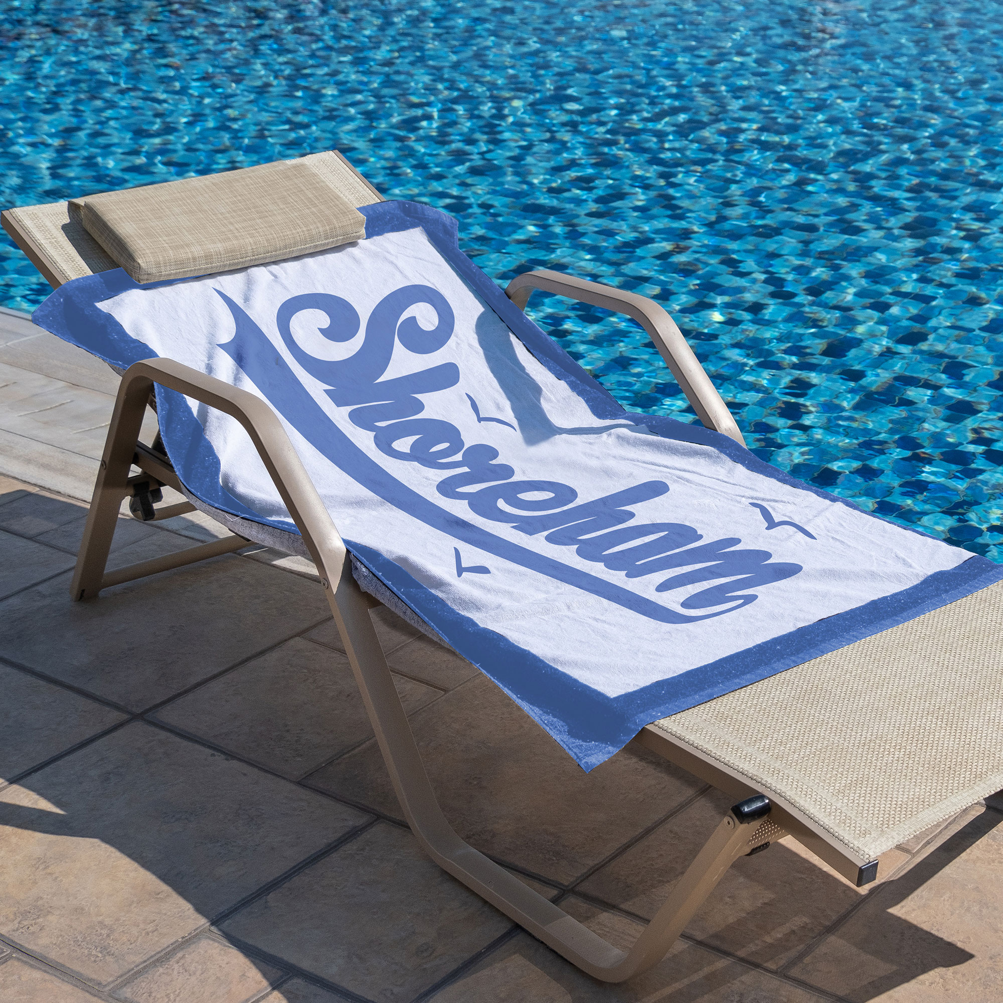
I LOVE SHOREHAM
Illustrations / Product
This fund-raising product was developed to support the local community and Harbour Lifeboat Station in Shoreham-by-Sea. I both live and work in Shoreham and am often inspired by its beauty and peacefulness. The harbour is an integral part of the community, so I created these prints and products to lend support.

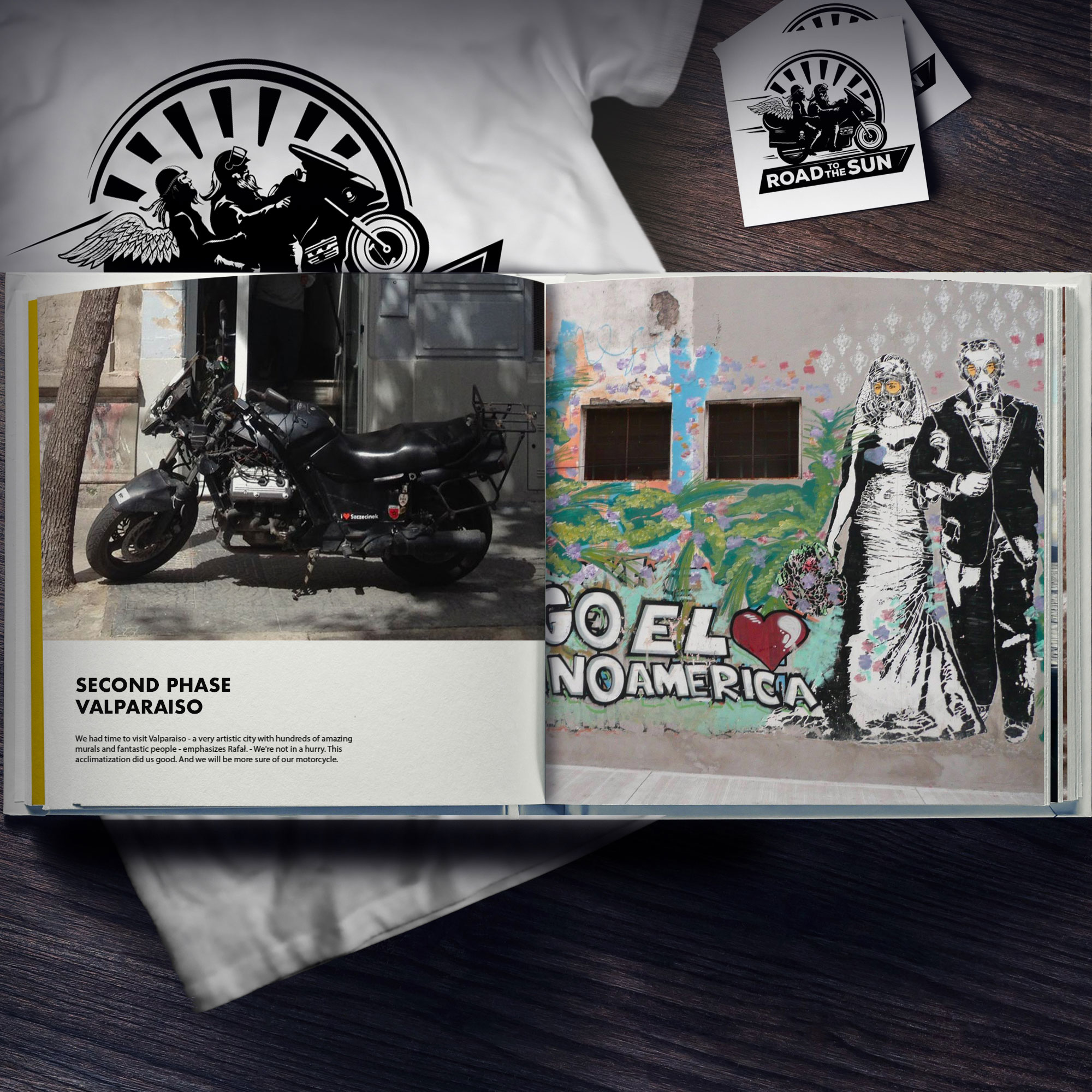
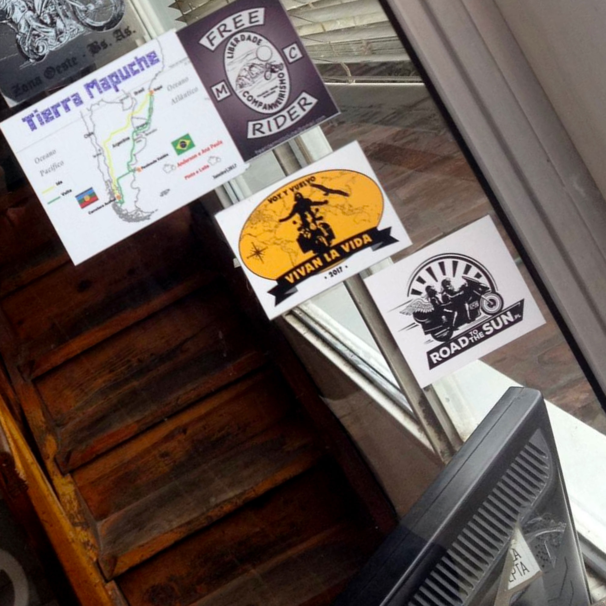
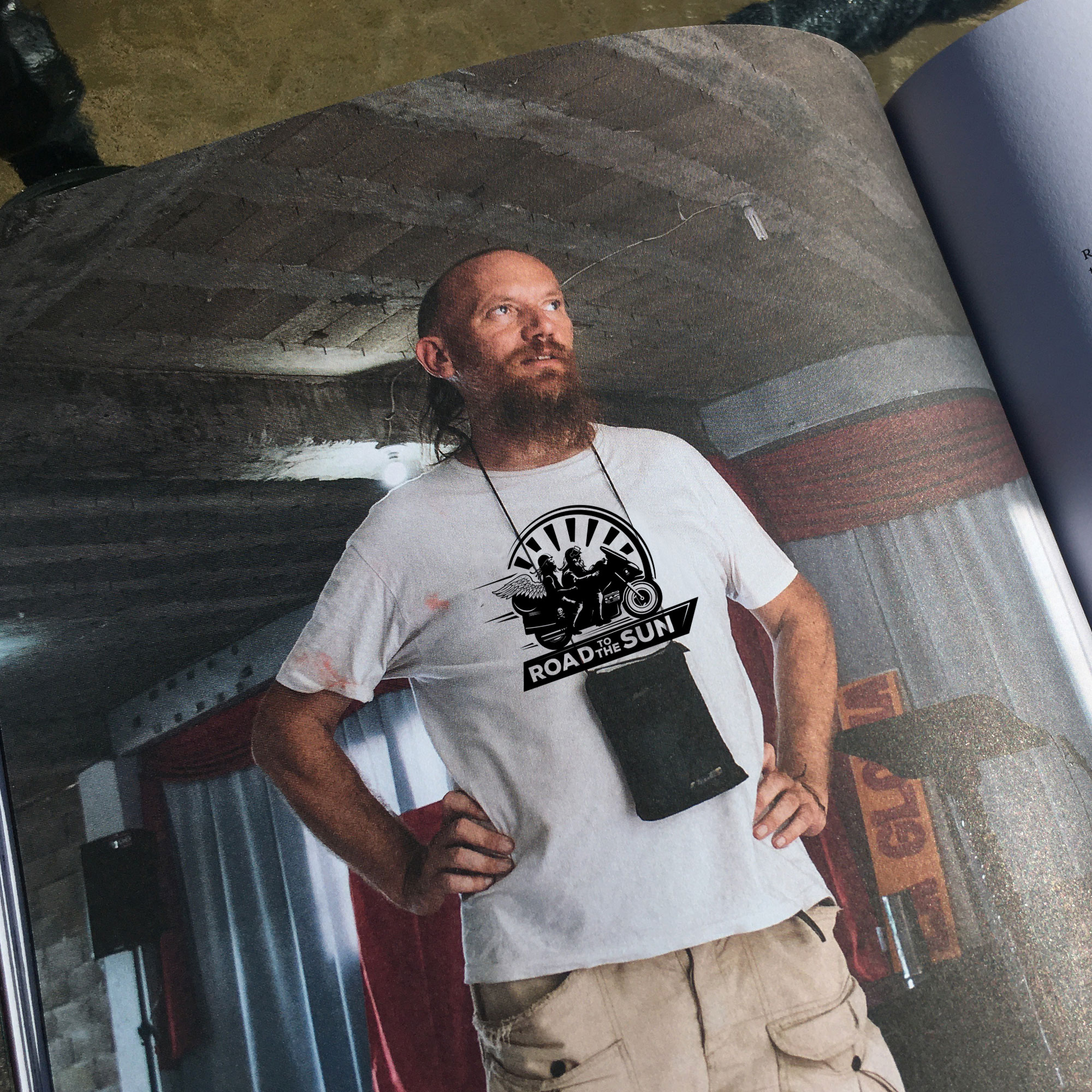
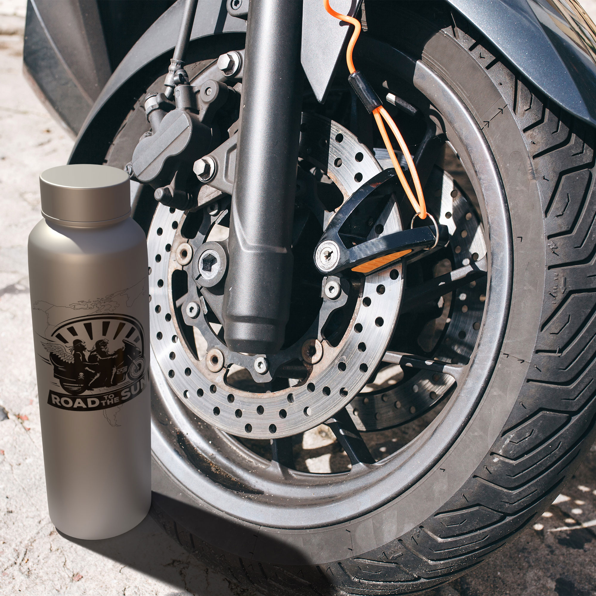
ROAD TO THE SUN MISSION
Identity / Photo Story Album / T – shirt
Identity / Photo Story Album / T – shirt
ROAD TO THE SUN MISSION
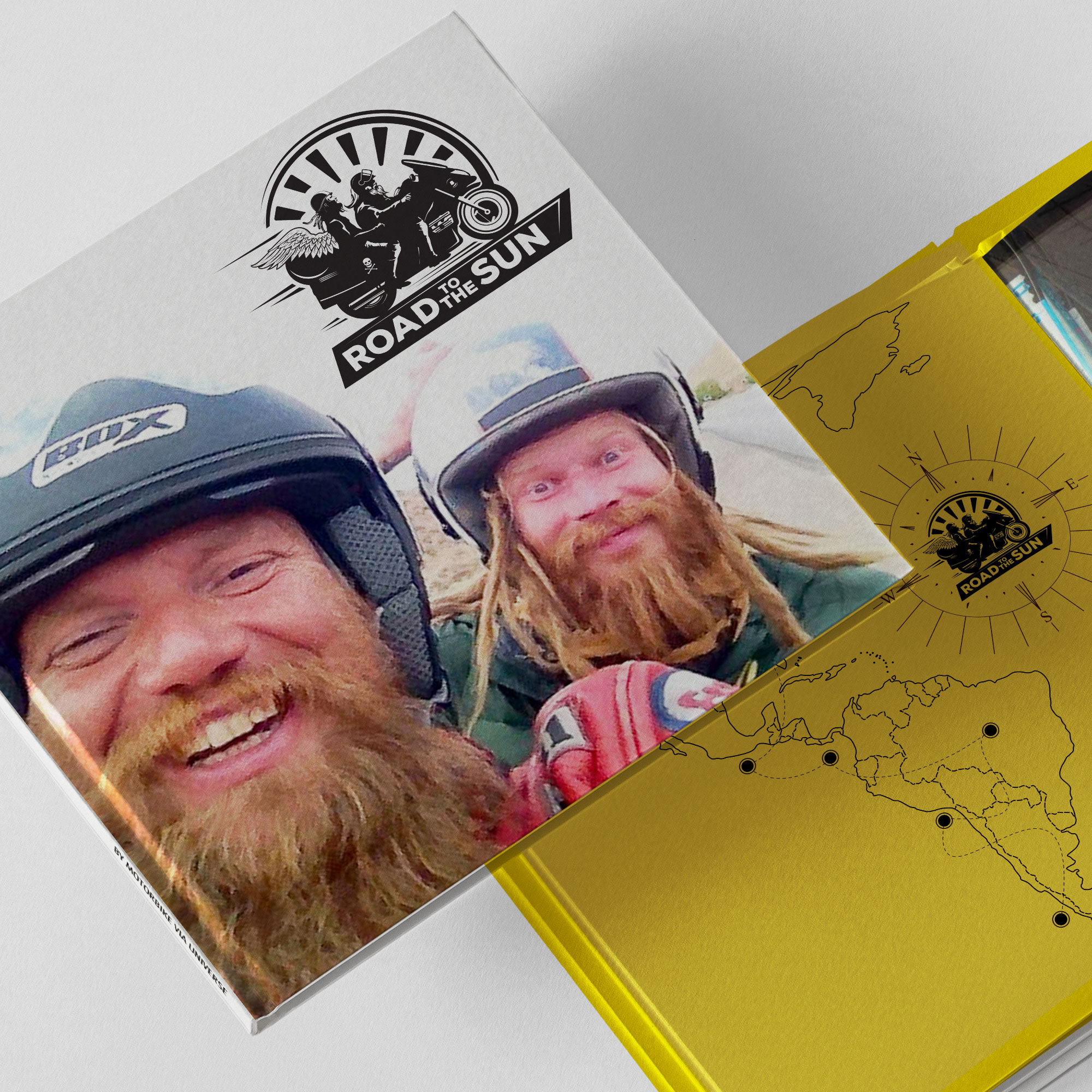
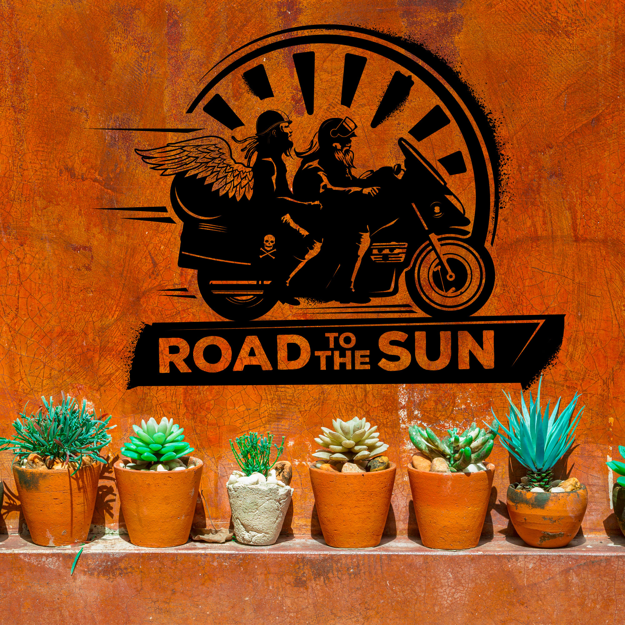
Identity / Photo Story Album / T – shirt + sticker design
Another fund-raising project, I was tasked with creating the collateral to support a charity bike ride across South America. The collateral would help raise funds alongside the sponsorship. I created a variety of merchandise including t-shirts, stickers, and a road journal album. The goal of the challenge was to prove that anything is possible even with little or no money in your pocket. Be more self-confident, be motivated, and see what you can achieve.


WARNER BERGER
Identity / T- shirt / Web /
Illustration/ Stationery
Identity / T- shirt / Web /
Illustration/ Stationery
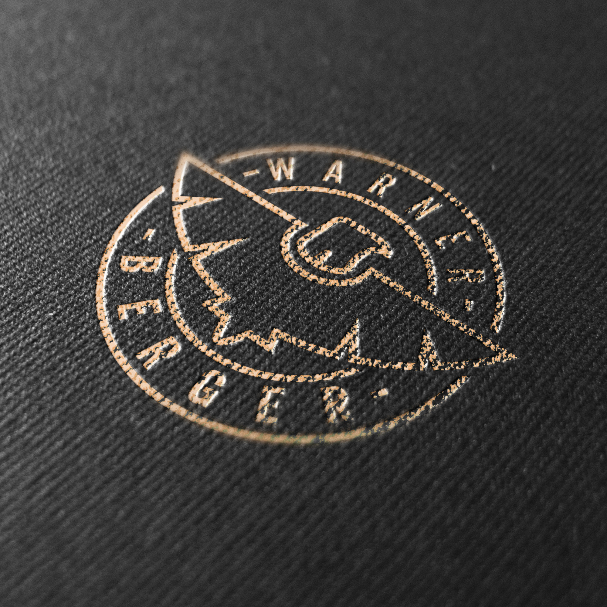
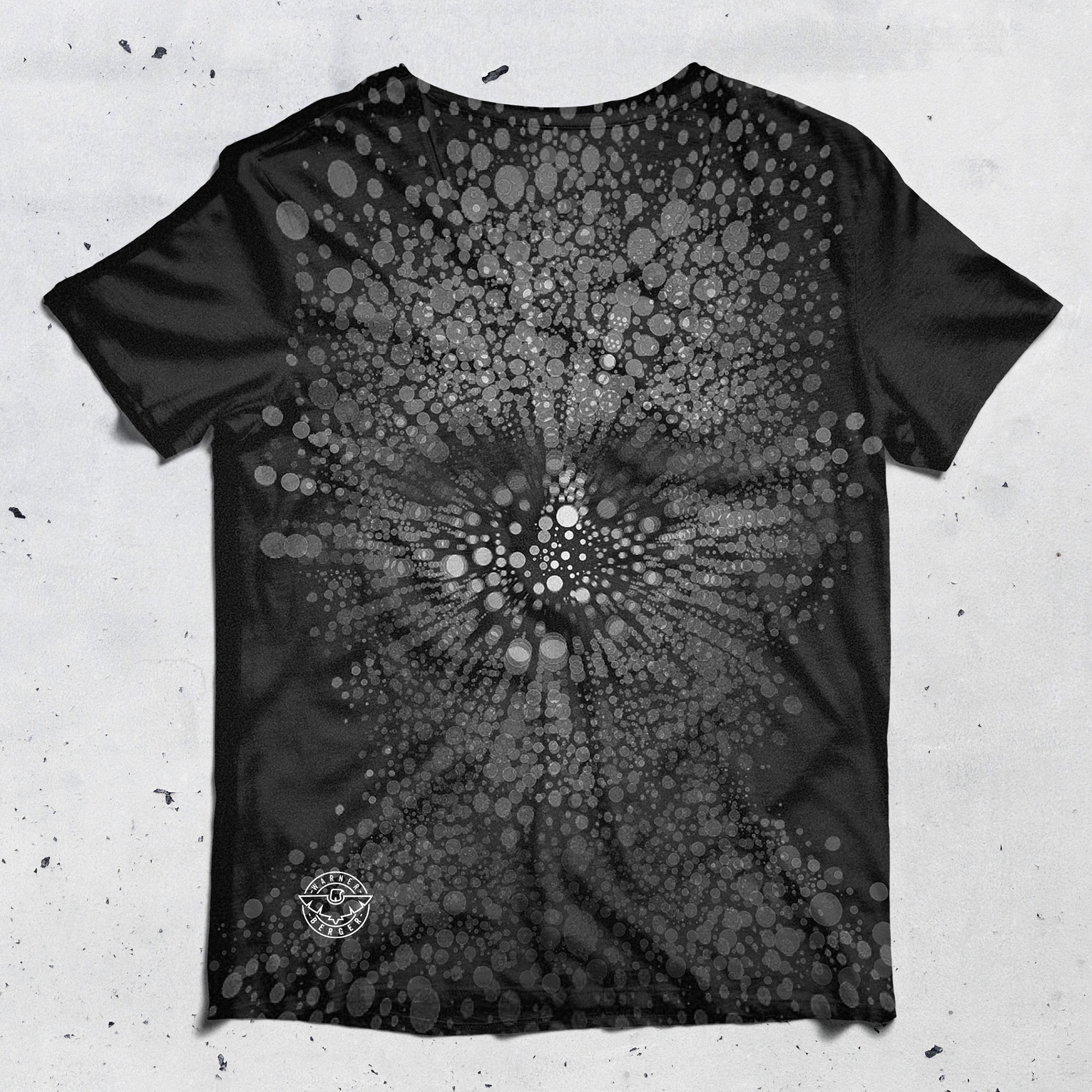
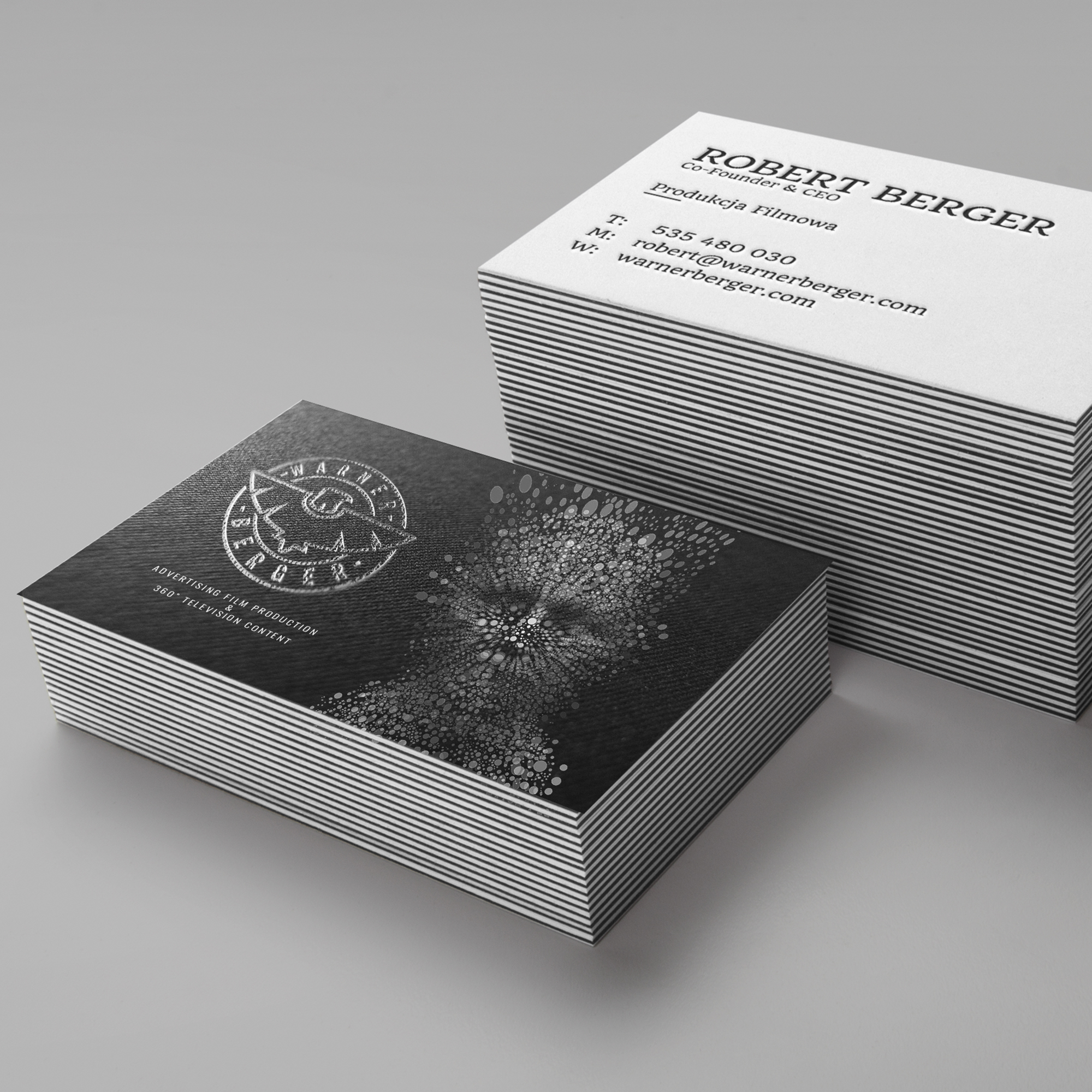
WARNER BERGER MEDIA COMPANY
Identity / T- shirt / Web / Stationery
Warner Berger are an independent media business producing 360’ content for TV, Film and internet all around the world. I was engaged to rebrand the business, delivering a new logo and identity statement, illustration, imagery layout, and design the look and feel of the website.
warnerberger.com
warnerberger.com


BANNED SAUCE
Identity / album art design /
T- shirts/ Stickers / Web + Social media
Identity / album art design /
T- shirts/ Stickers / Web + Social media
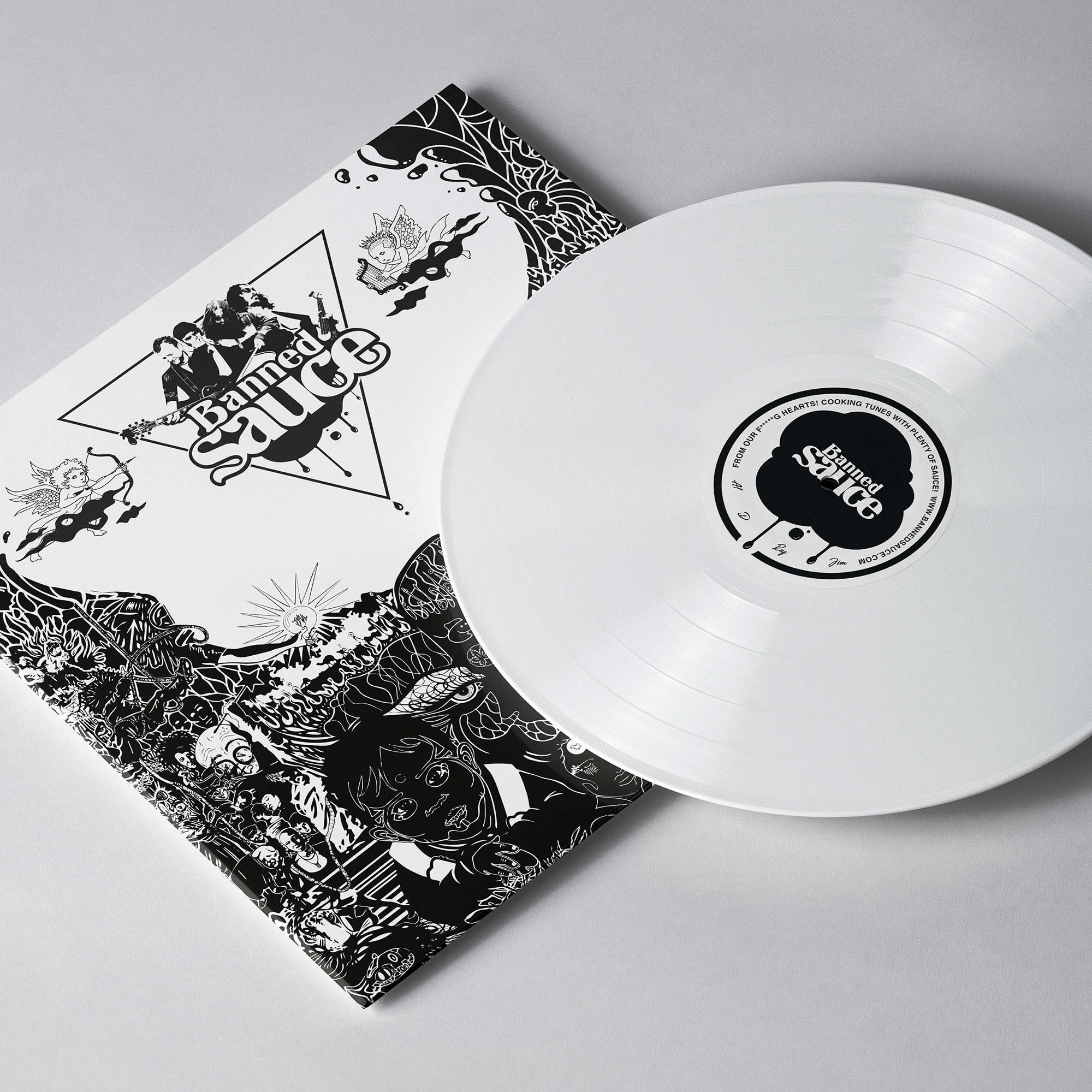
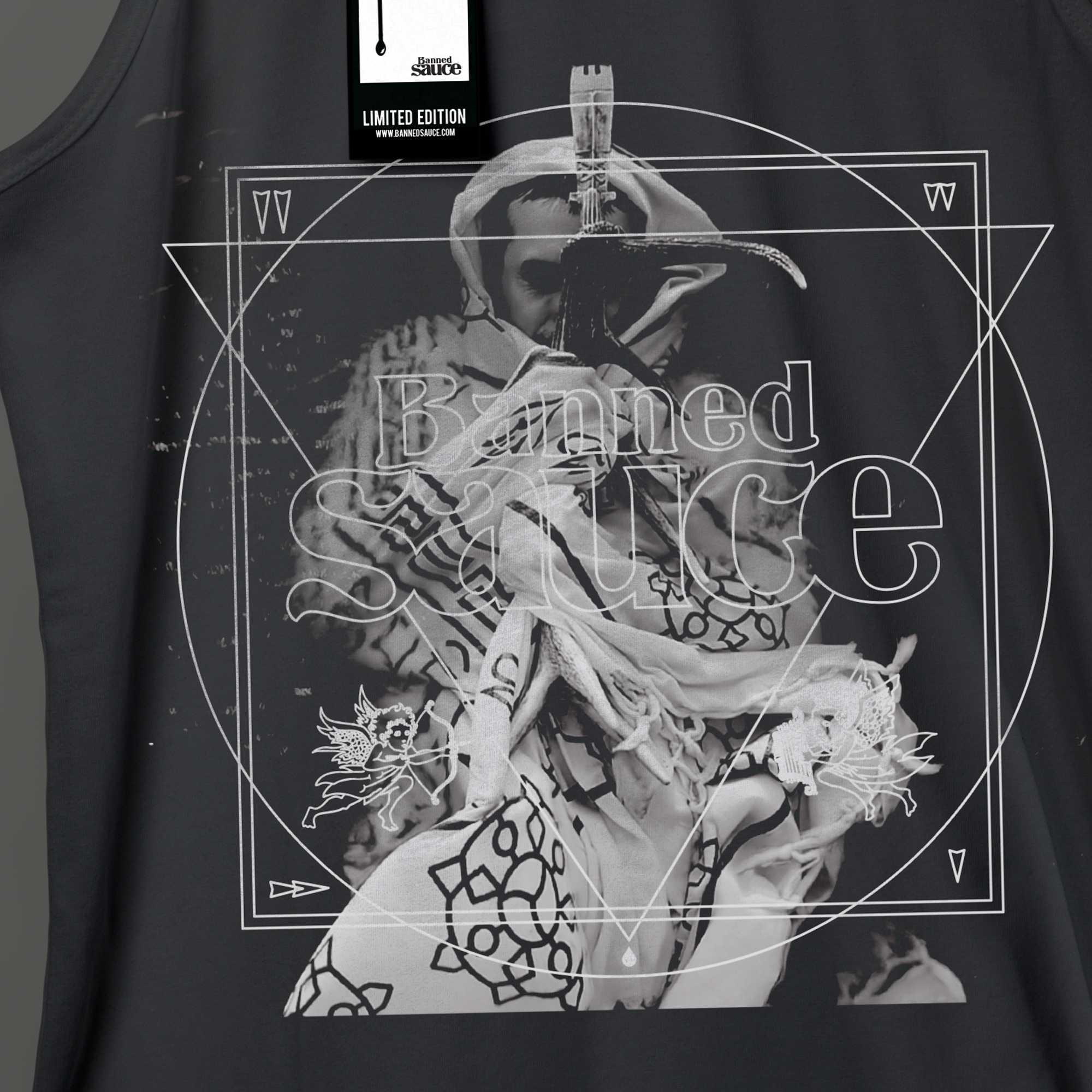
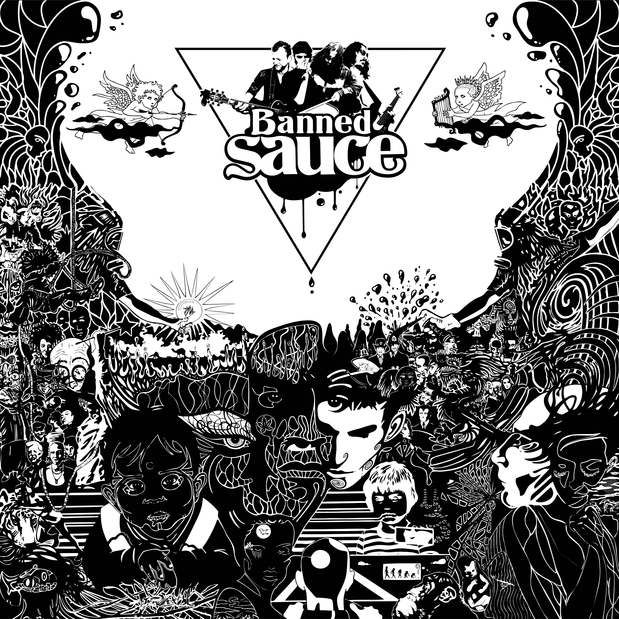
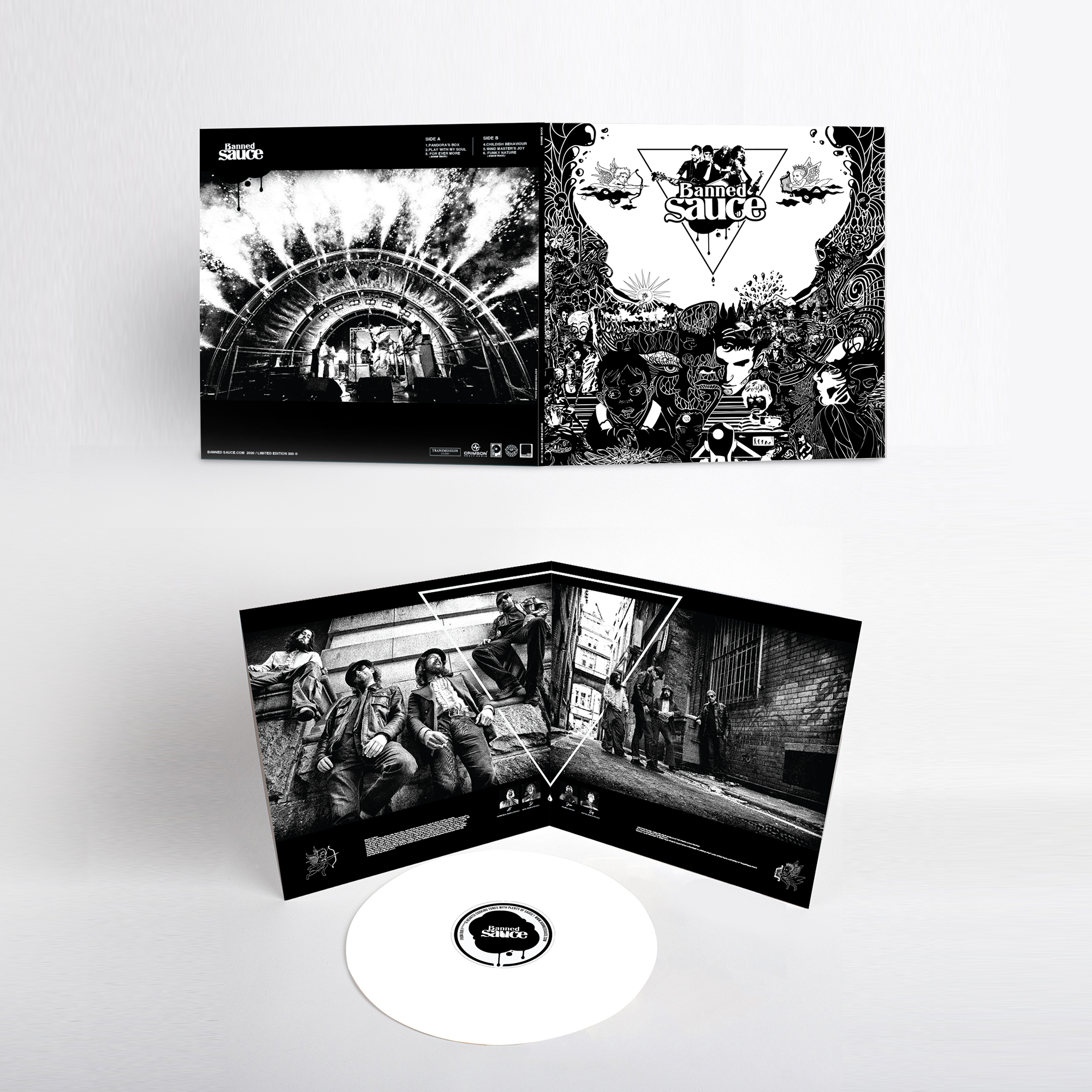
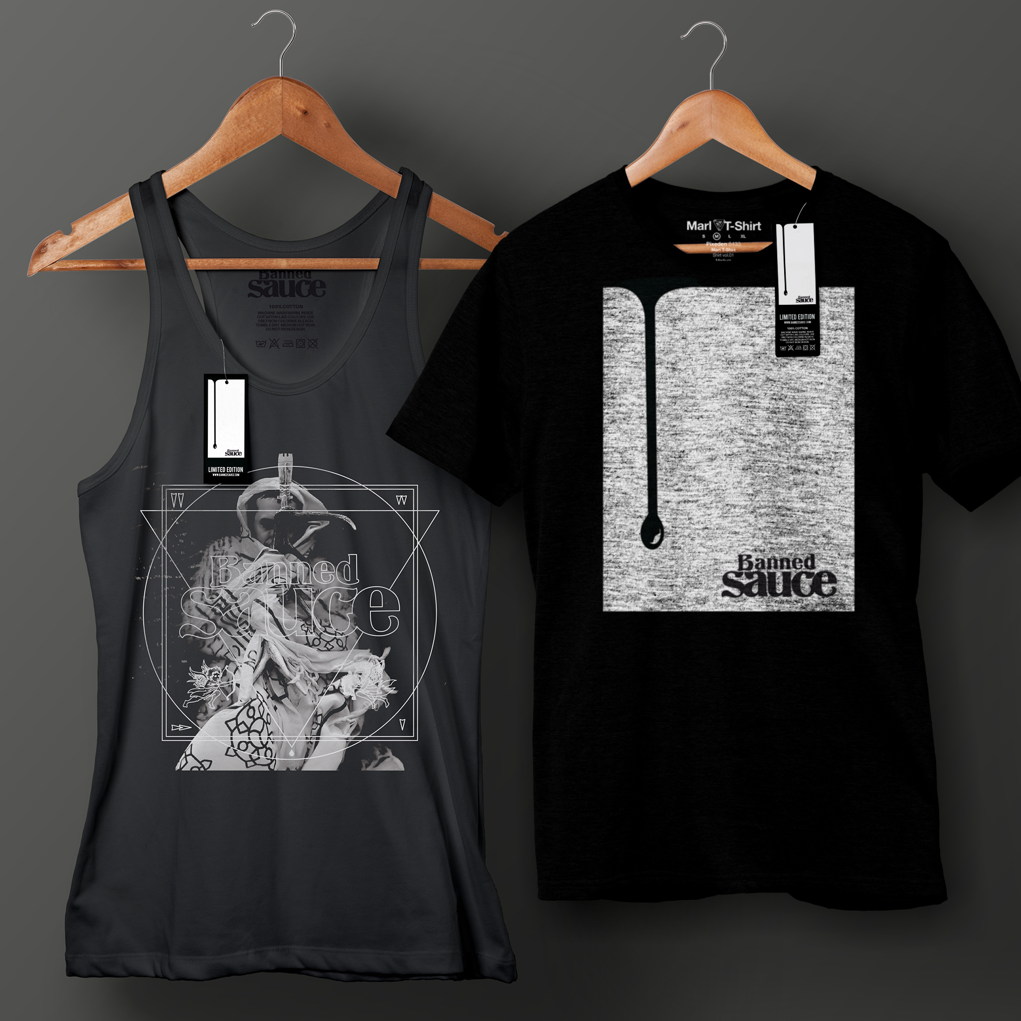
BANNED SAUCE BLUES ROCK,FUNK & SOUL BAND
Identity / album art design / T- shirts/ Stickers / Web + Social media
As a lead-guitarist of Banned Sauce it also falls to me to lead the branding for the group. It feels powerful when music meets design so to be a creative force behind both is a great experience. Throughout the lifespan of the band I have created a variety of branding, album designs, illustrations and website projects bannedsauce.com
DC COMICS
Styleguide / Concept / Product / Packaging
Styleguide / Concept / Product / Packaging
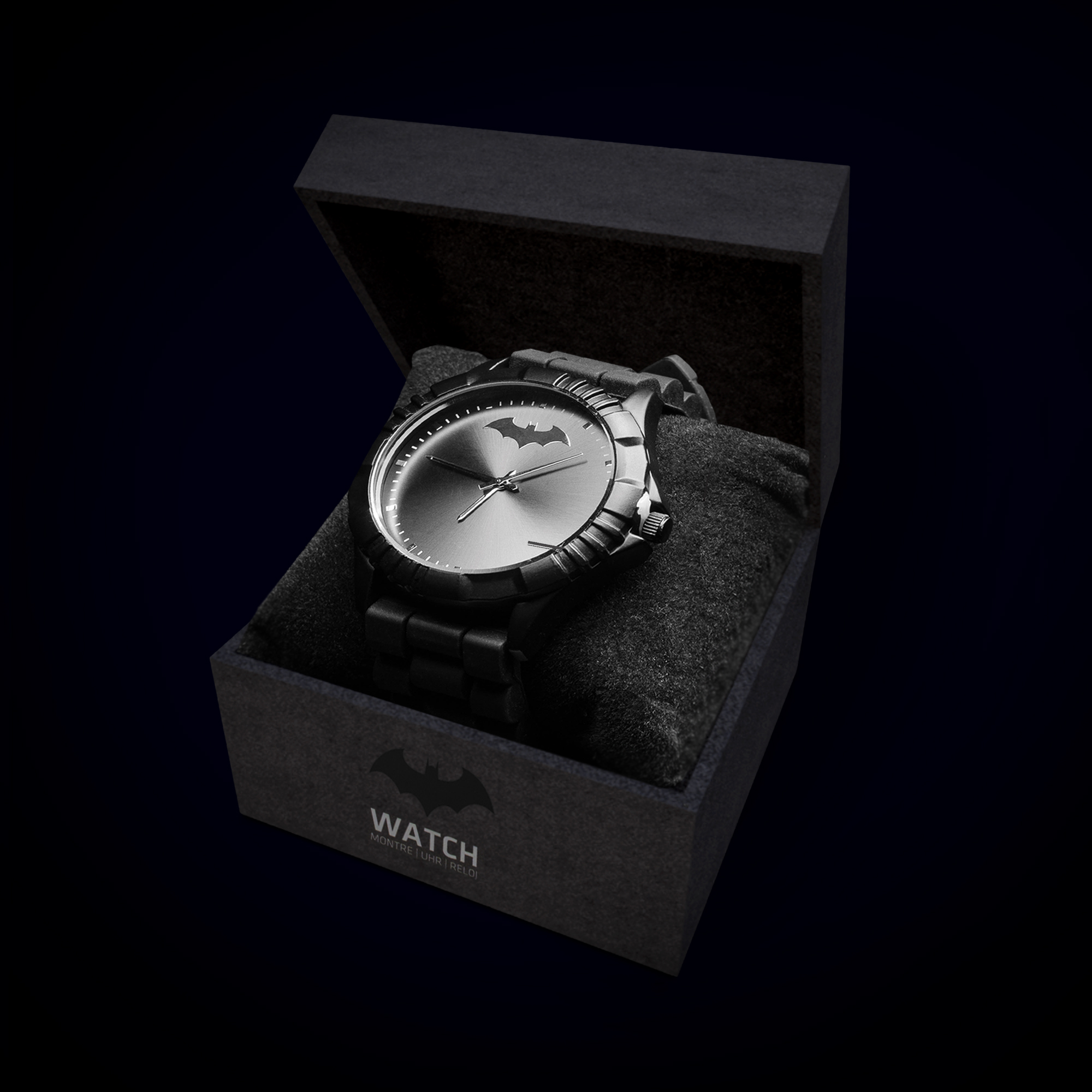
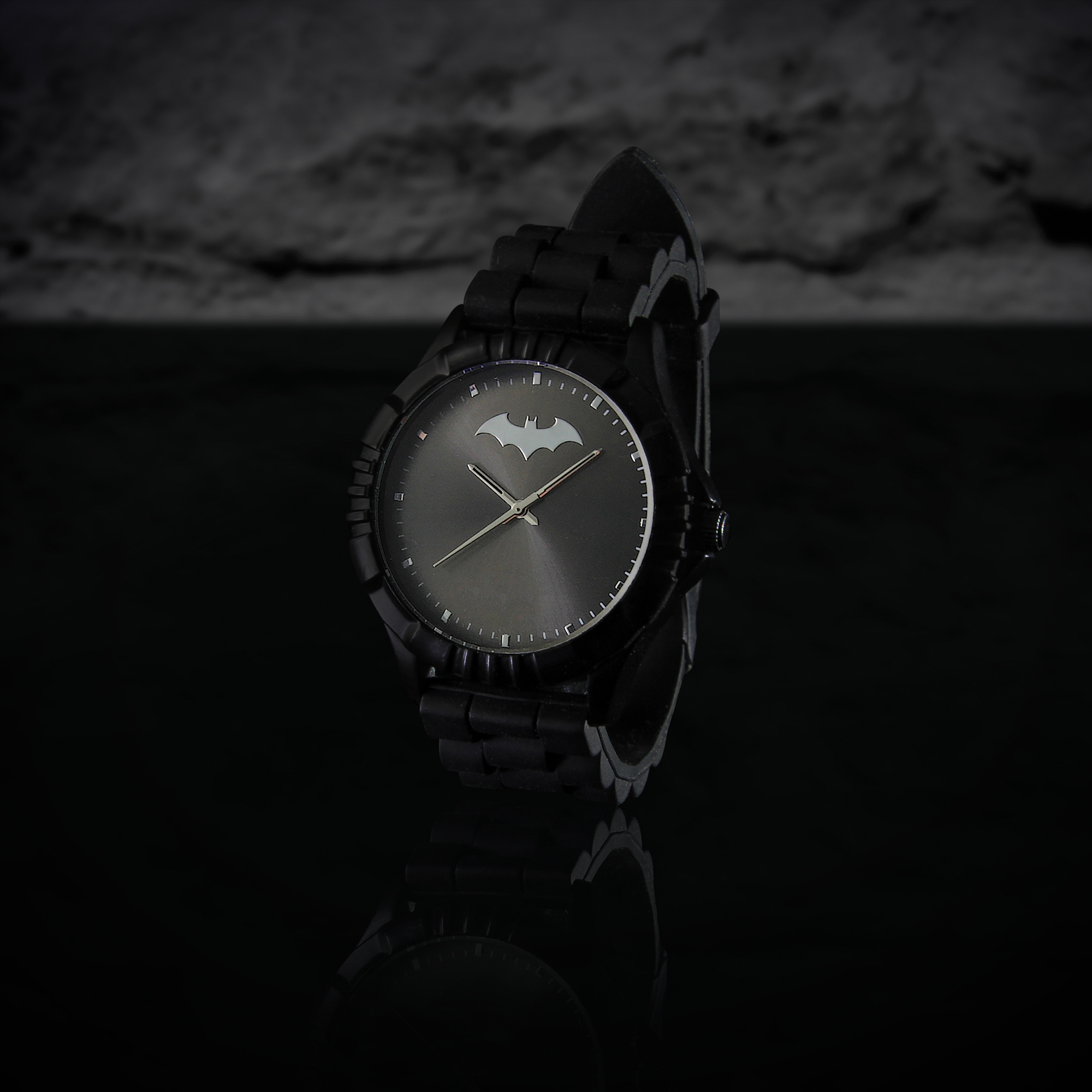
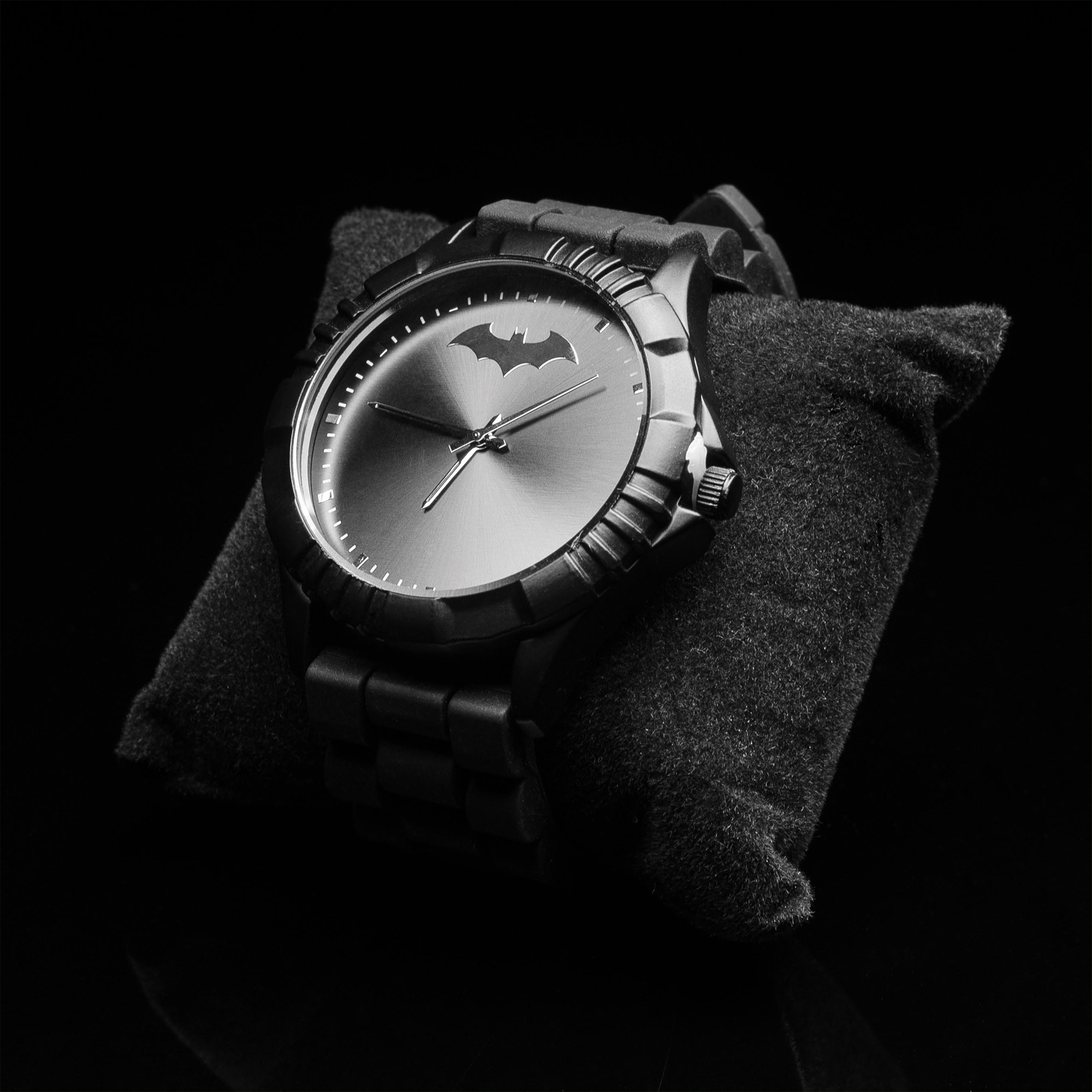
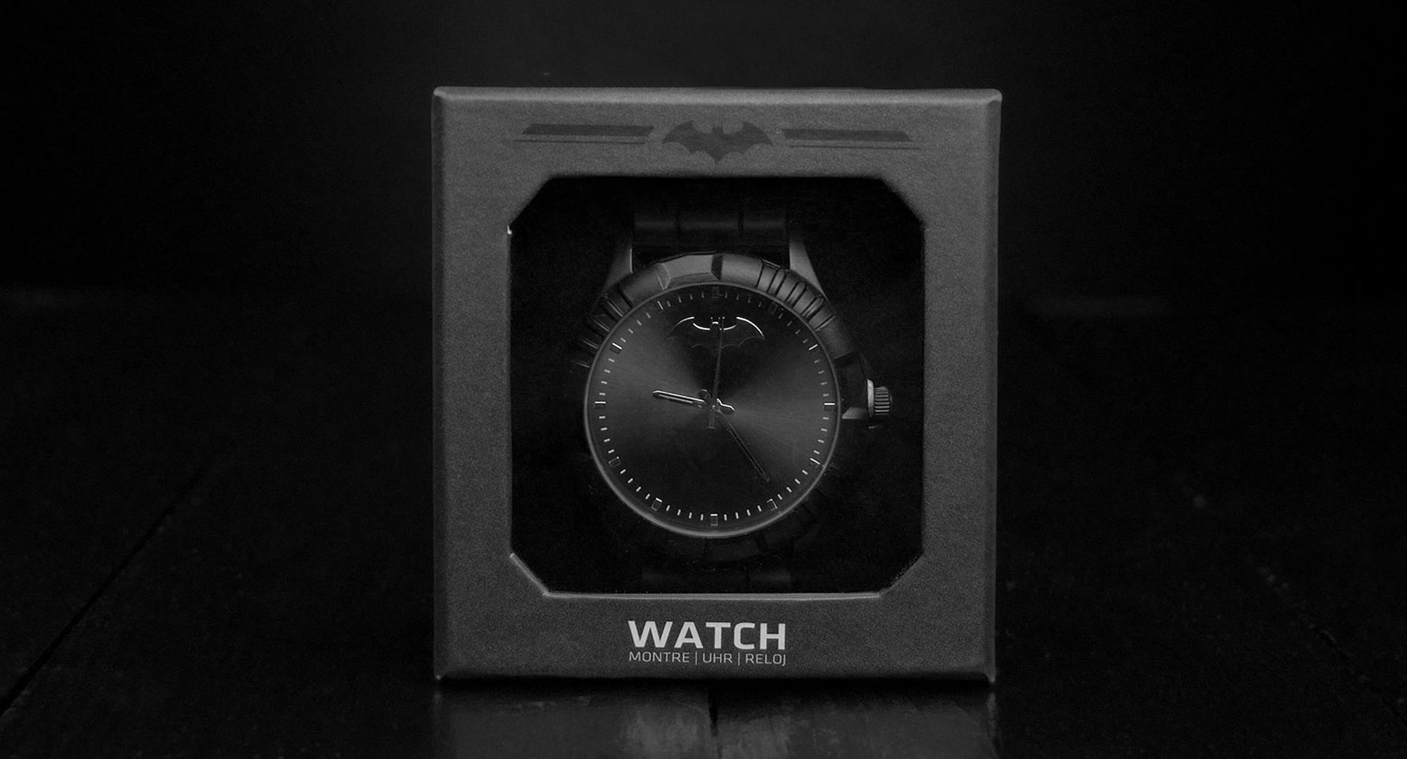
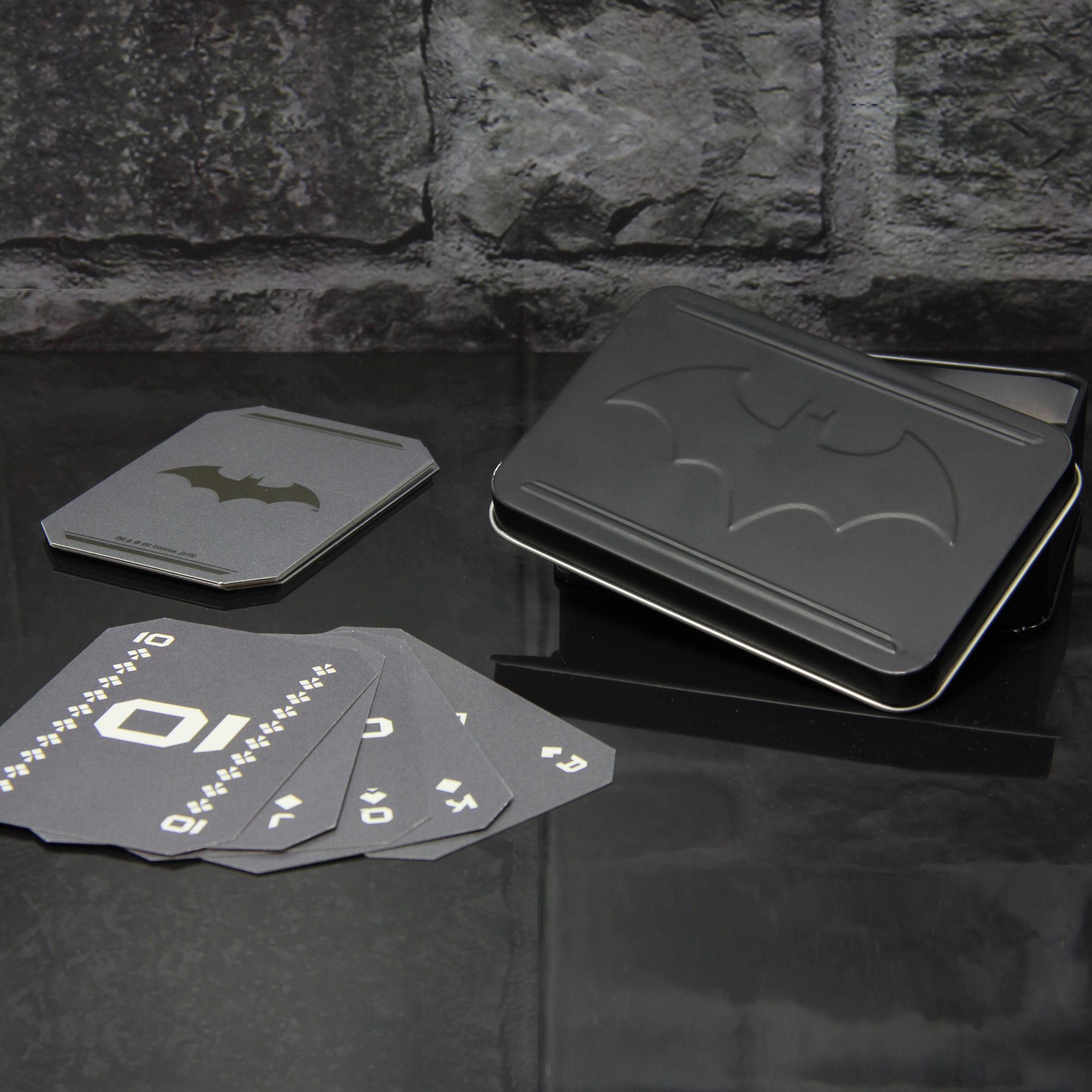
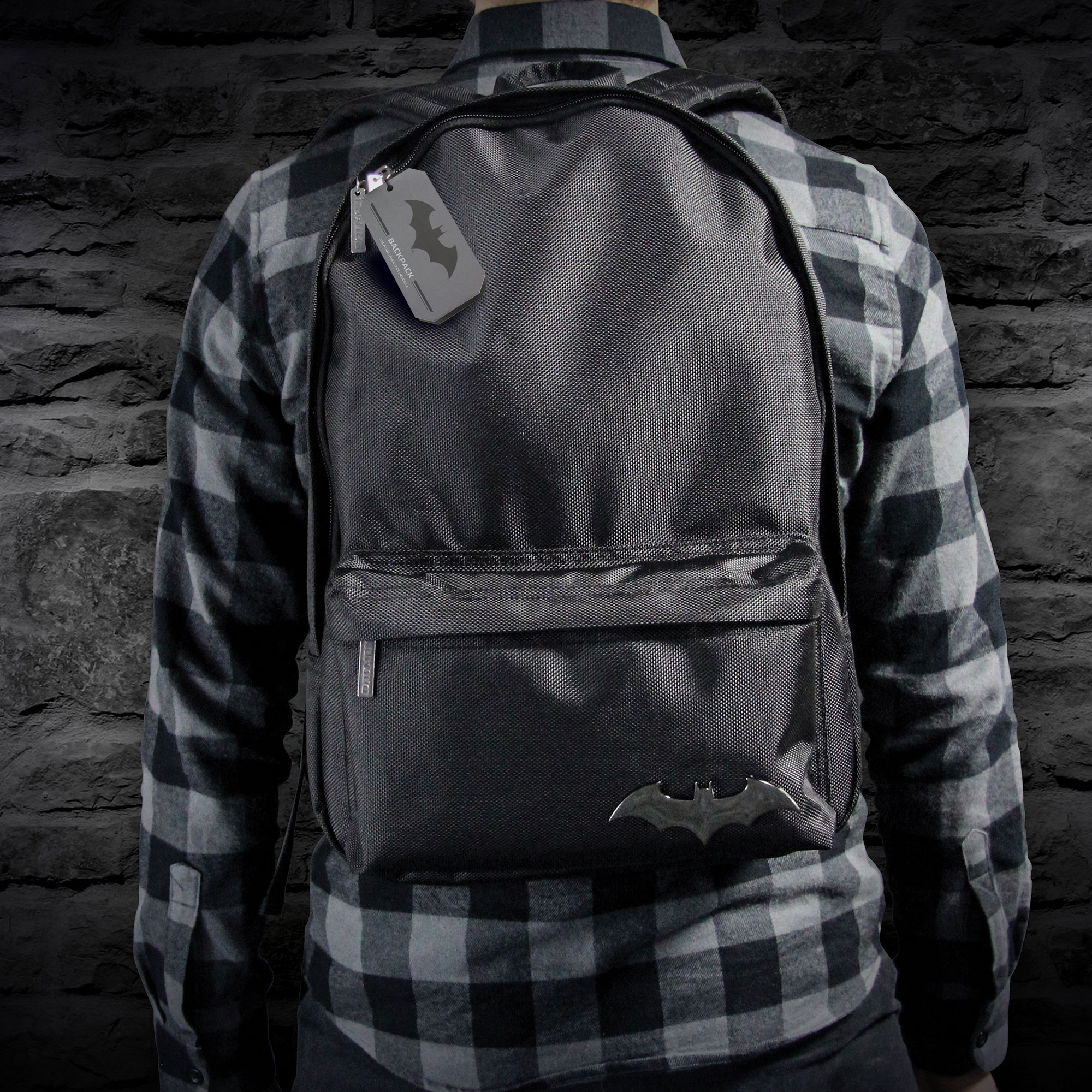
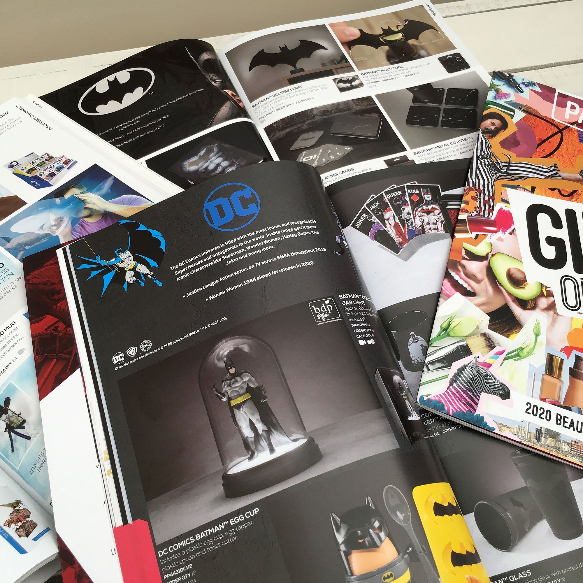
BATMAN DC COMICS Styleguide / Concept / Product / Packaging
Iconic DC Comics is home to a large majority of the world’s favourite super-heroes and none more famous than the Dark Knight himself, Batman. For several years I have worked on Batman merchandise that has been sold all over the globe. From developing style-guides that Warner Brothers approved, to product and packaging design, working with both modern and retro DC Comic artwork has been a really fun job!
Styleguide / Concept / Product / Packaging
Iconic DC Comics is home to a large majority of the world’s favourite super-heroes and none more famous than the Dark Knight himself, Batman. For several years I have worked on Batman merchandise that has been sold all over the globe. From developing style-guides that Warner Brothers approved, to product and packaging design, working with both modern and retro DC Comic artwork has been a really fun job!

PALADONE PROJECTS
Brand identity / Brand assets / Catalogues
/ Marketing collateral / Web + Social media
Brand identity / Brand assets / Catalogues
/ Marketing collateral / Web + Social media
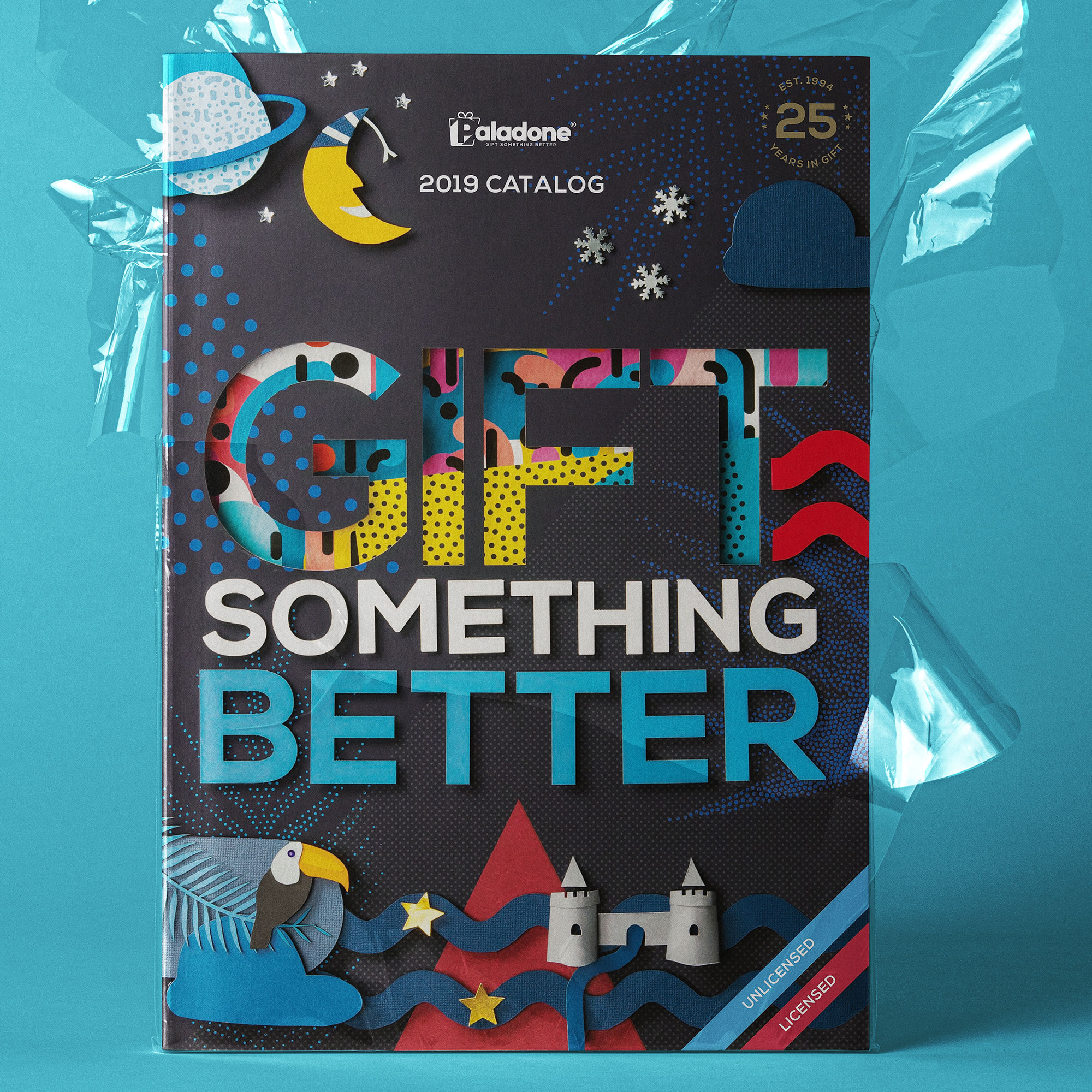
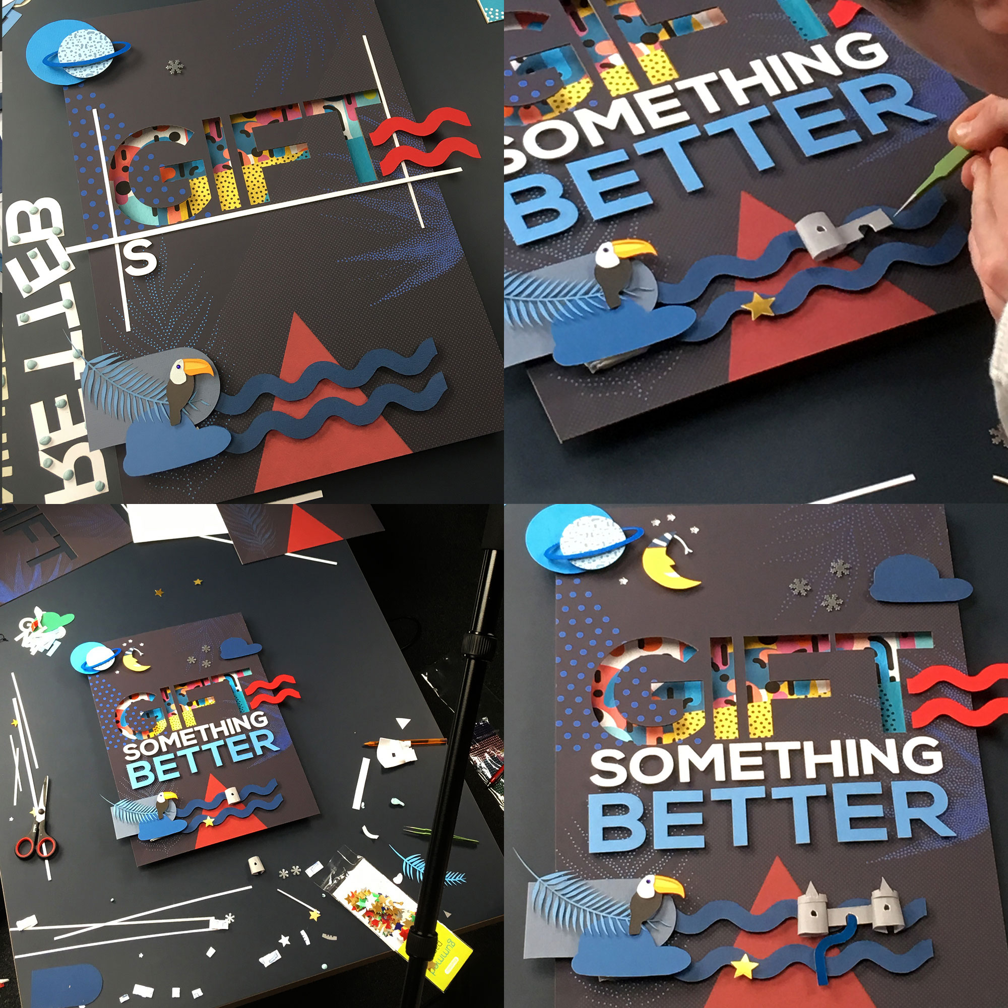
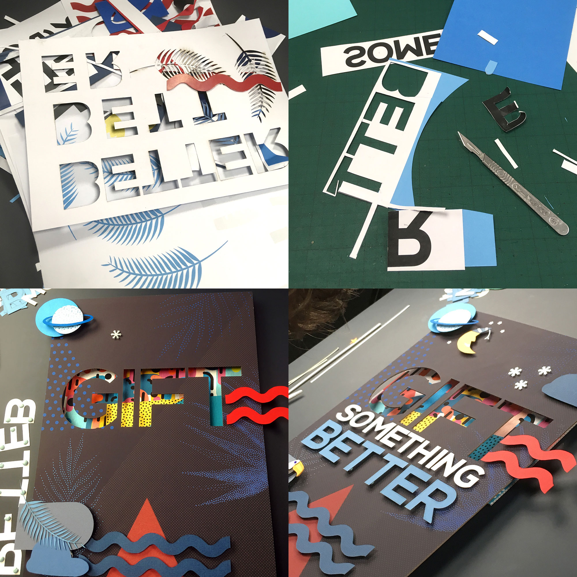
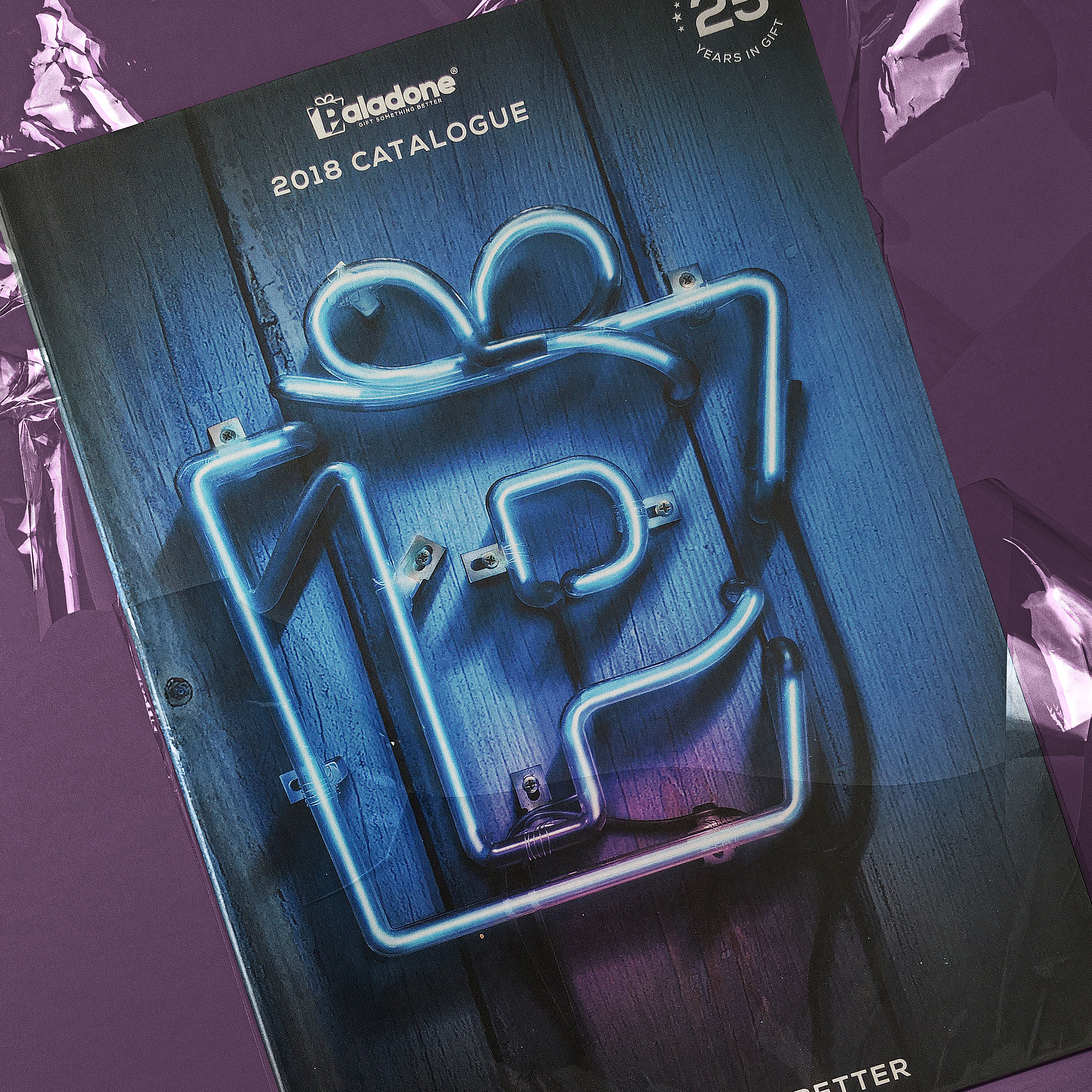
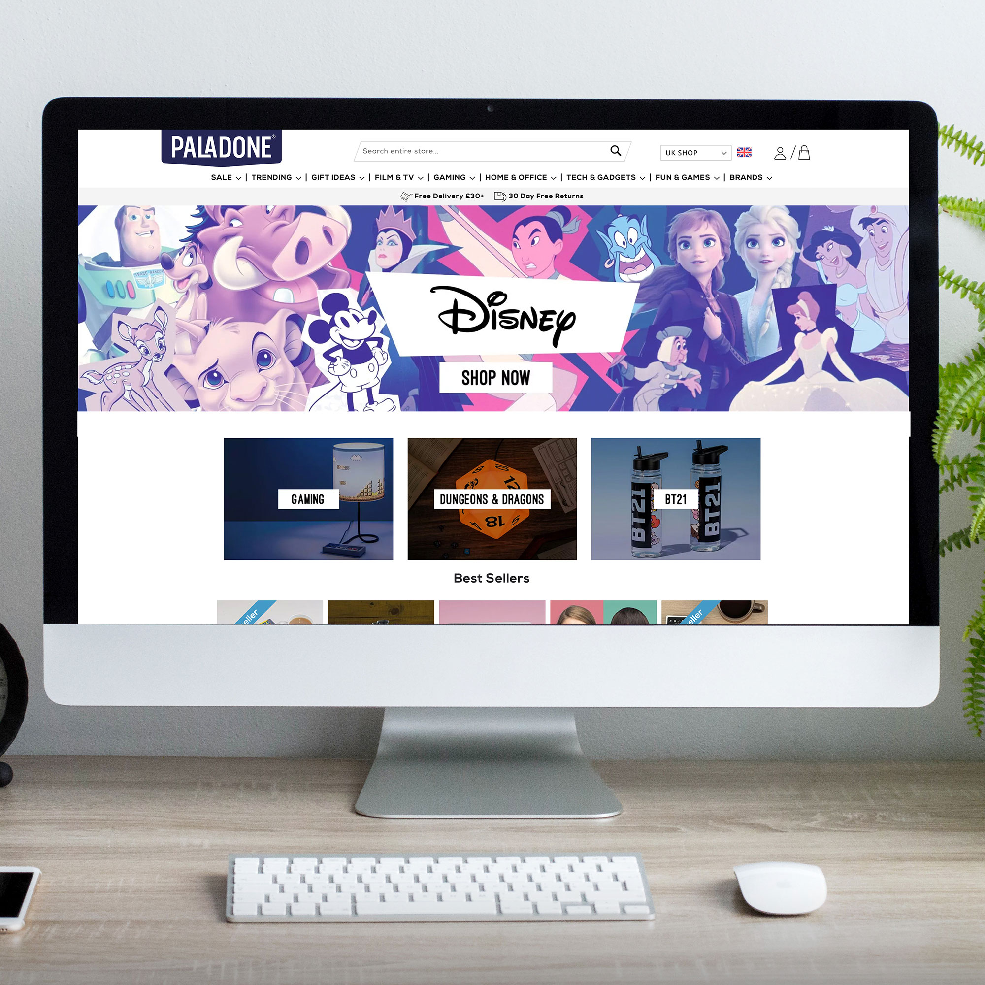
PALADONE PROJECTS
Brand identity / Brand assets / Catalogues / Marketing collateral / Web + Social media
Shoreham-by-Sea is home to gift, gadget and merchandise design-house Paladone Products who create and distribute their products to over 80 countries around the world. I worked in collaboration with a design team to bring the brand to life on various projects including catalogue covers, digital assets, event artwork, marketing collateral and the website design. The work with Paladone has always challenged my creativity and skills as they are market leaders and need their assets to be leading in creativity too. paladone.com


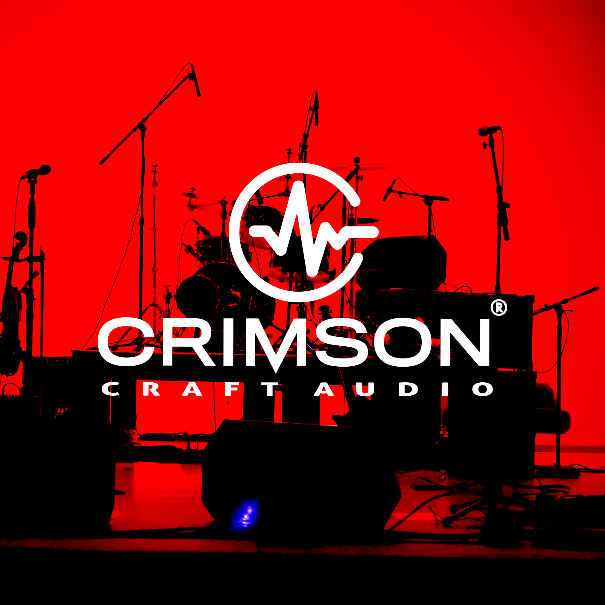

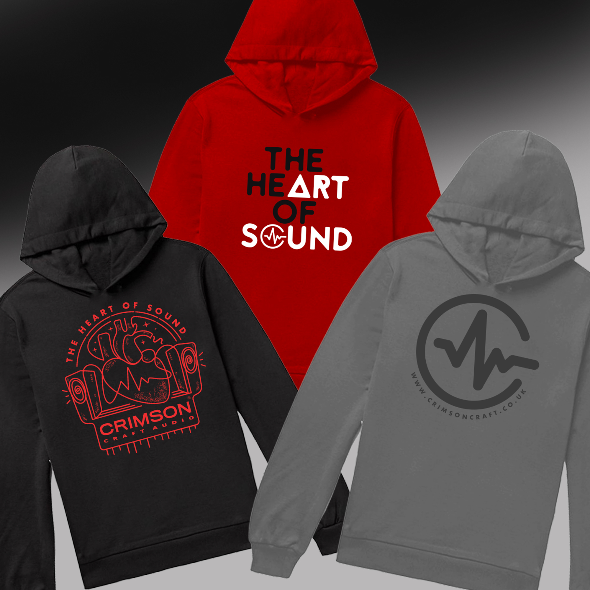
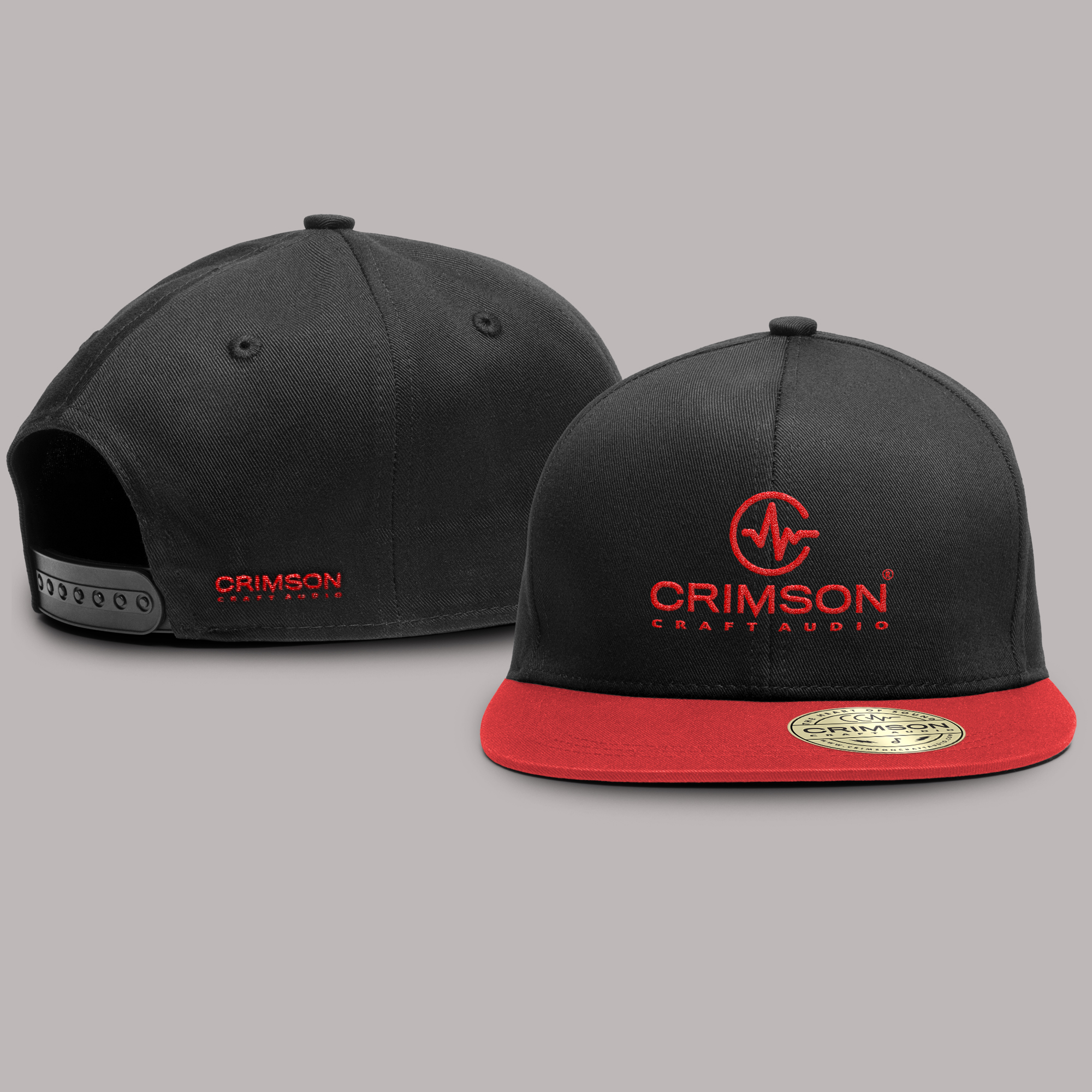
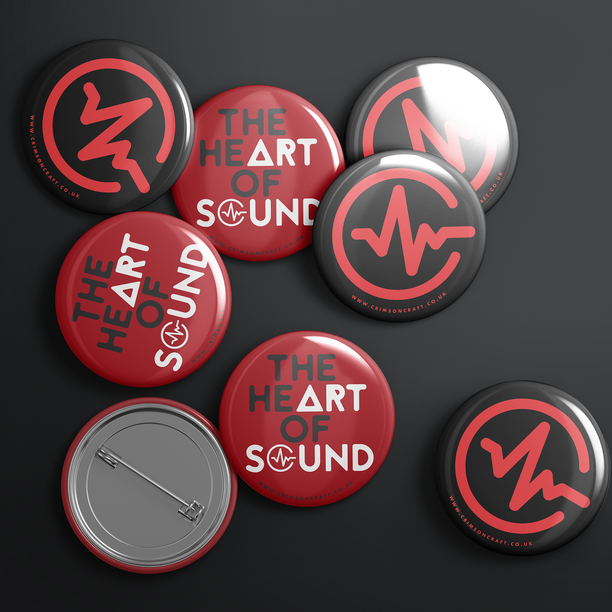
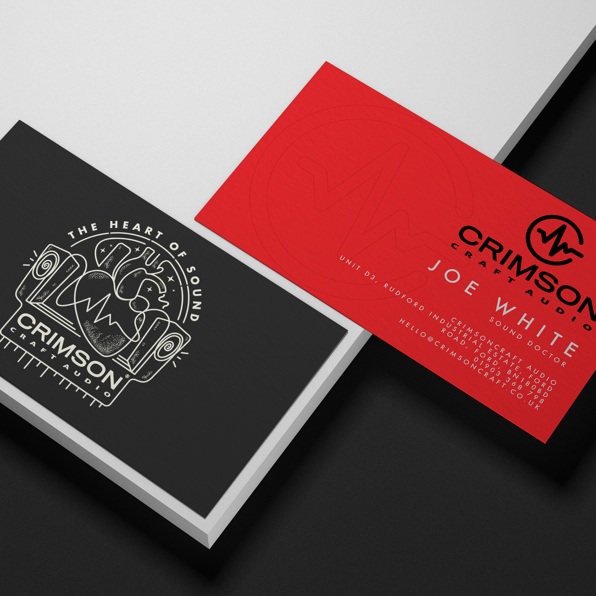
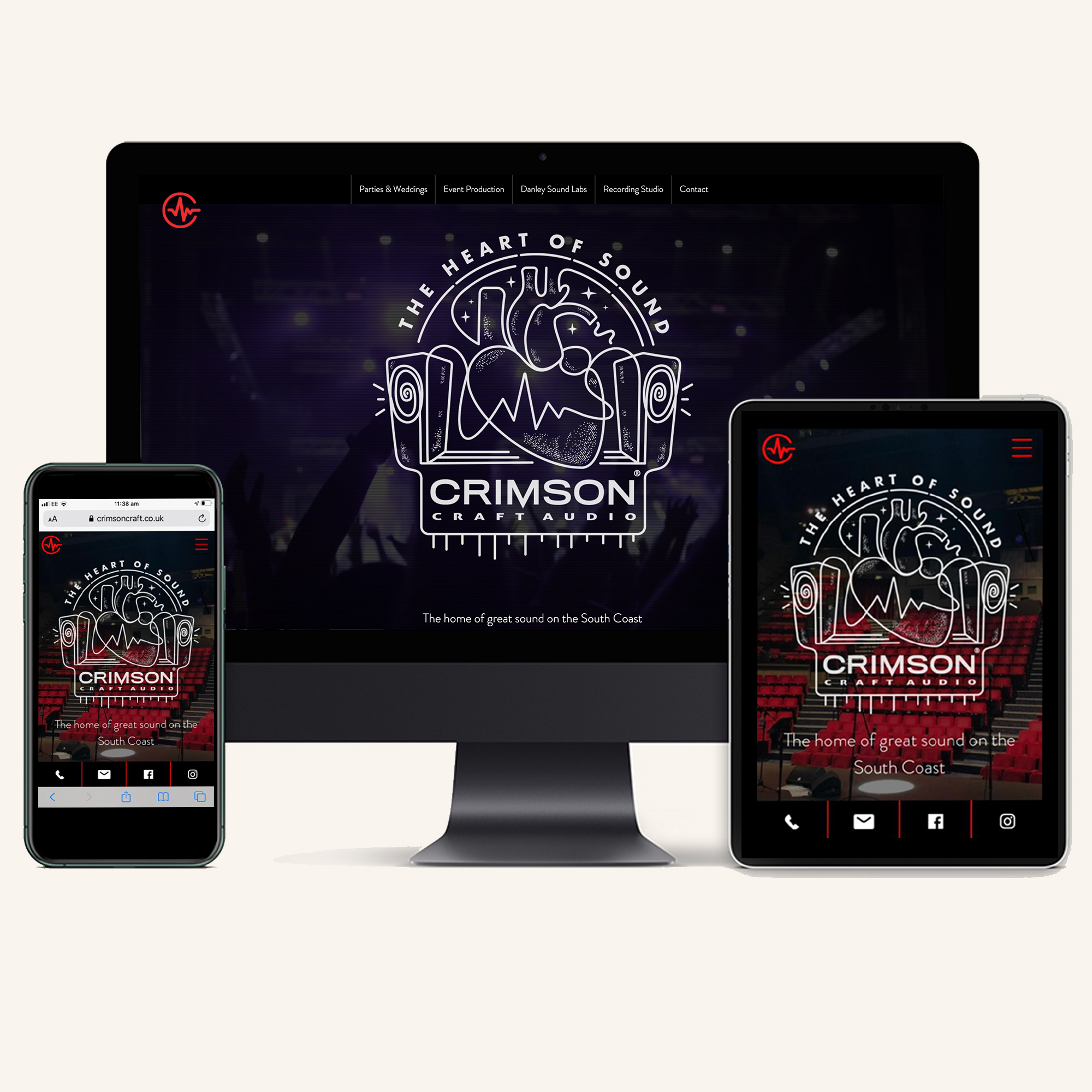
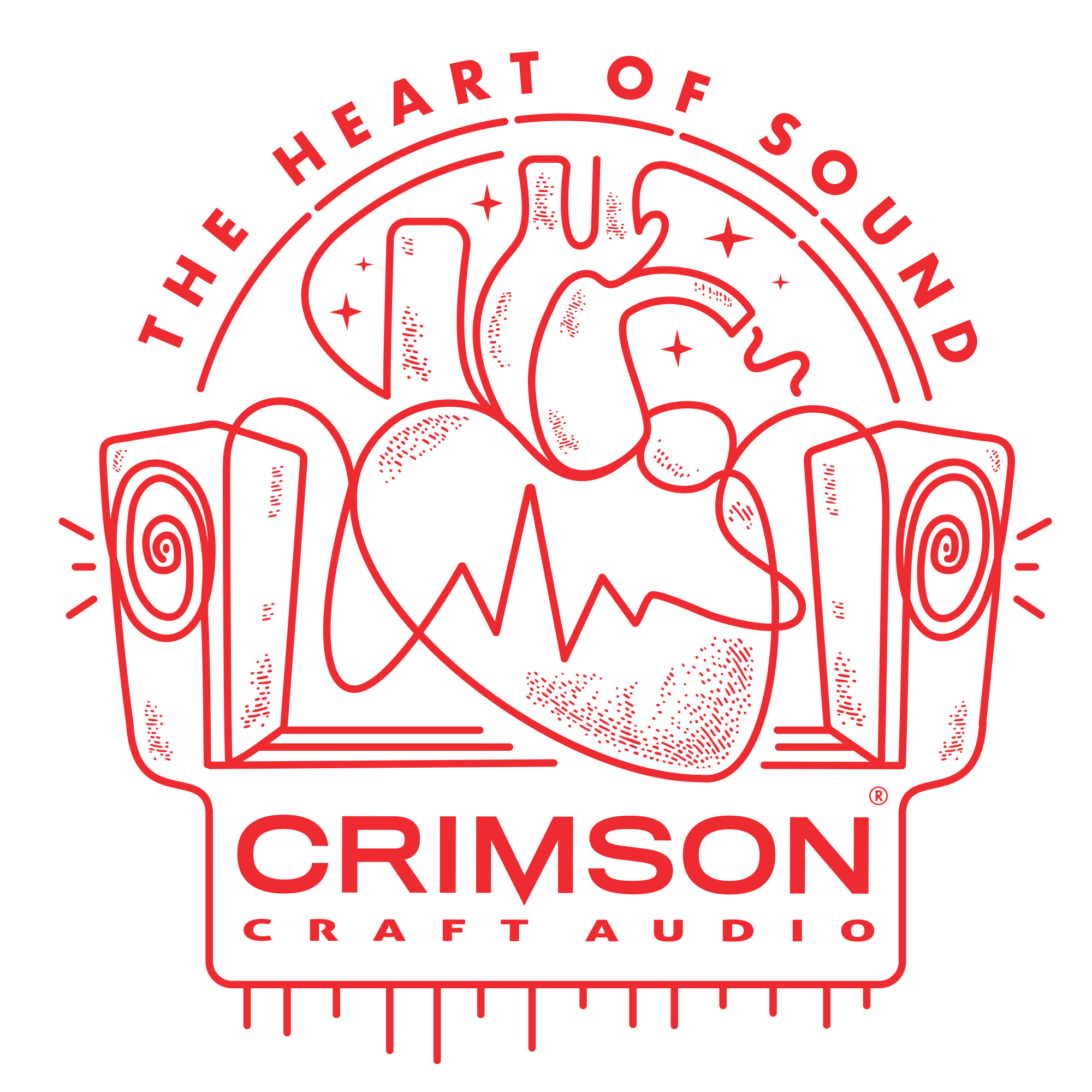
CRIMSON CRAFT AUDIO
Brand identity / Concept / Illustration
Brand identity / Concept / Illustration
CRIMSON CRAFT AUDIO
Brand identity / Concept / Illustration
Crimson Craft Audio are a recording studio and event production company who approached me to help them rebrand their business with a unique visual concept. I worked directly with them to produce this striking new brand identity, logo, and accompanying illustrations, and helped them apply it to their company stationery, website, and merchandise. crimsoncraft.co.uk
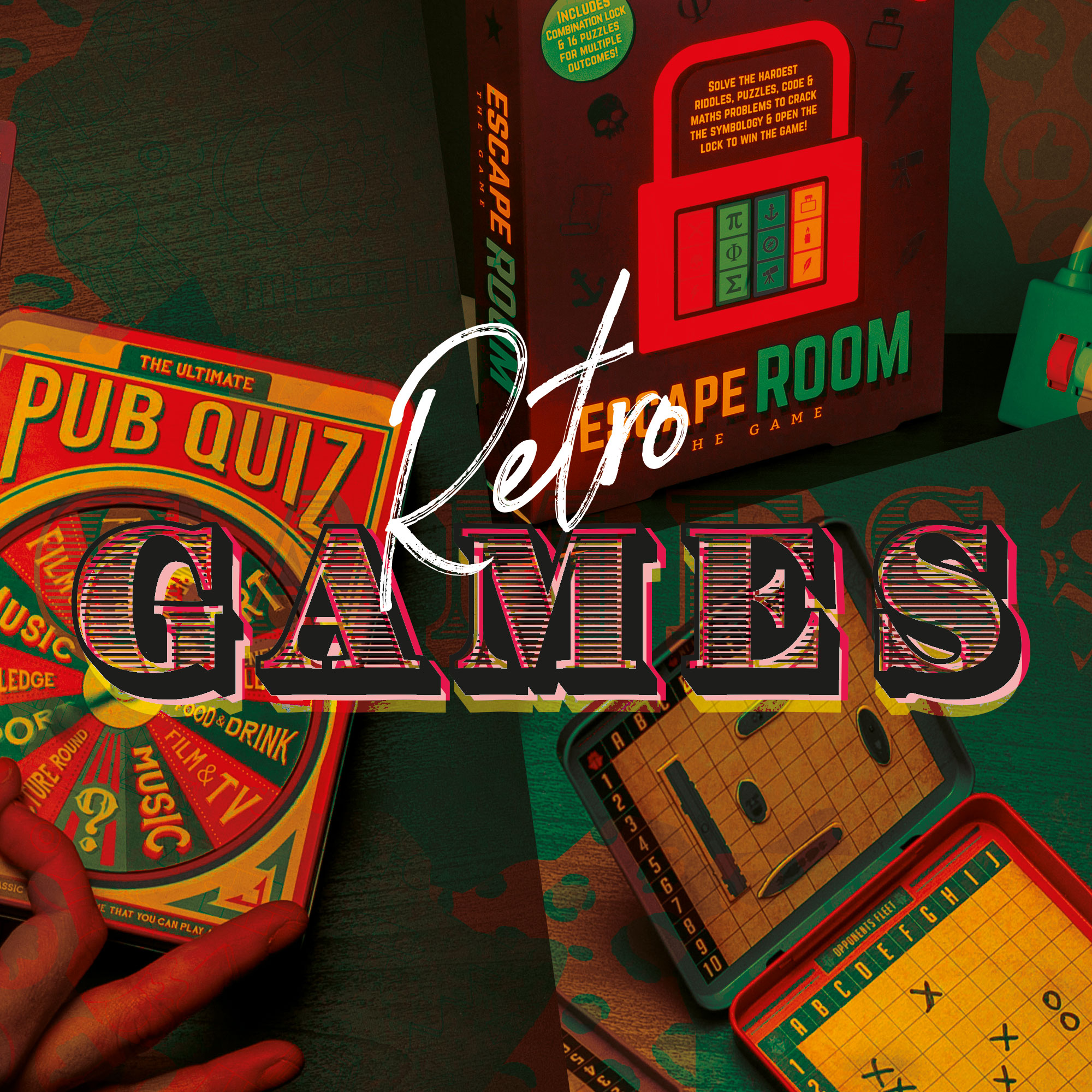
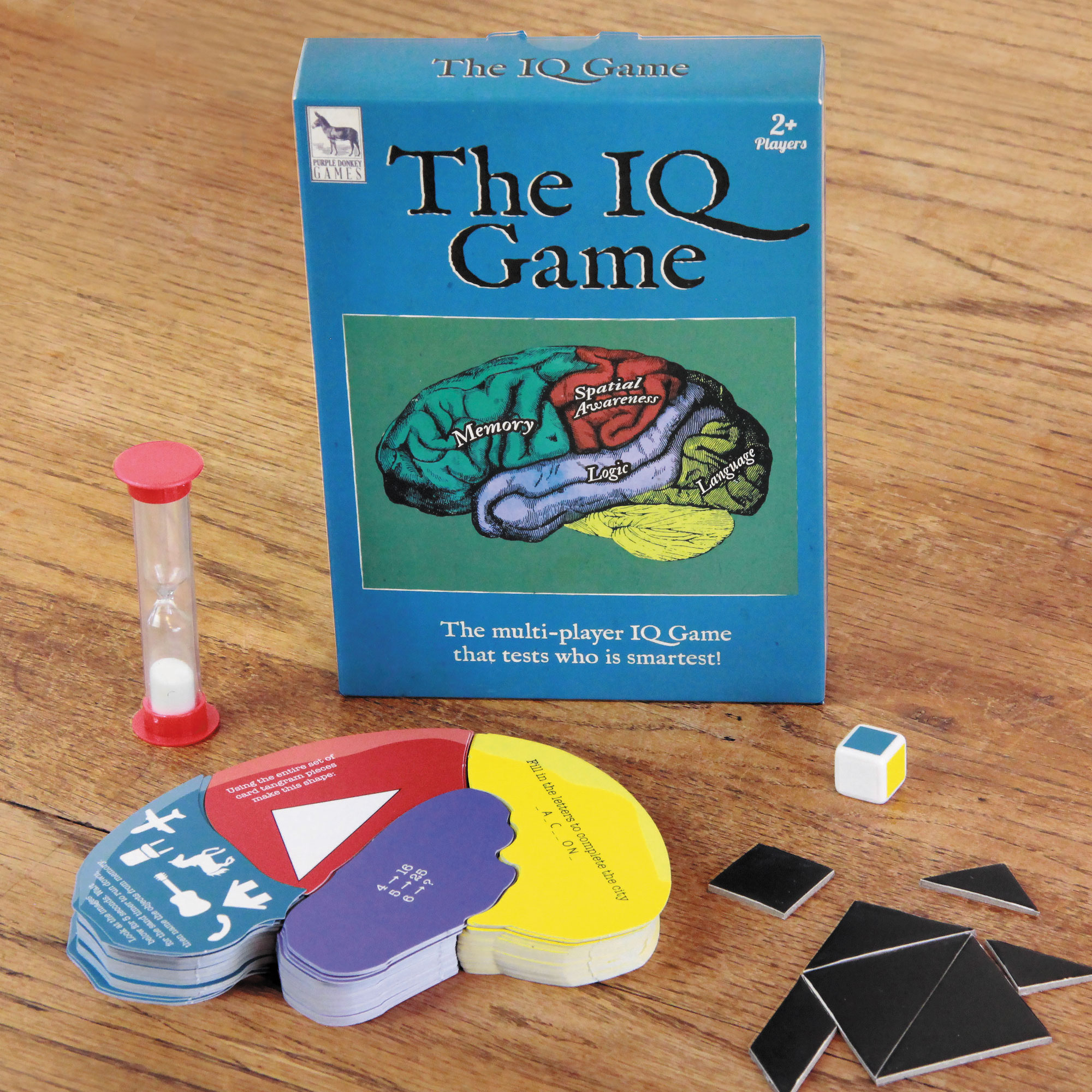
RETRO GAMES
Concept / Product / Packaging design
Concept / Product / Packaging design
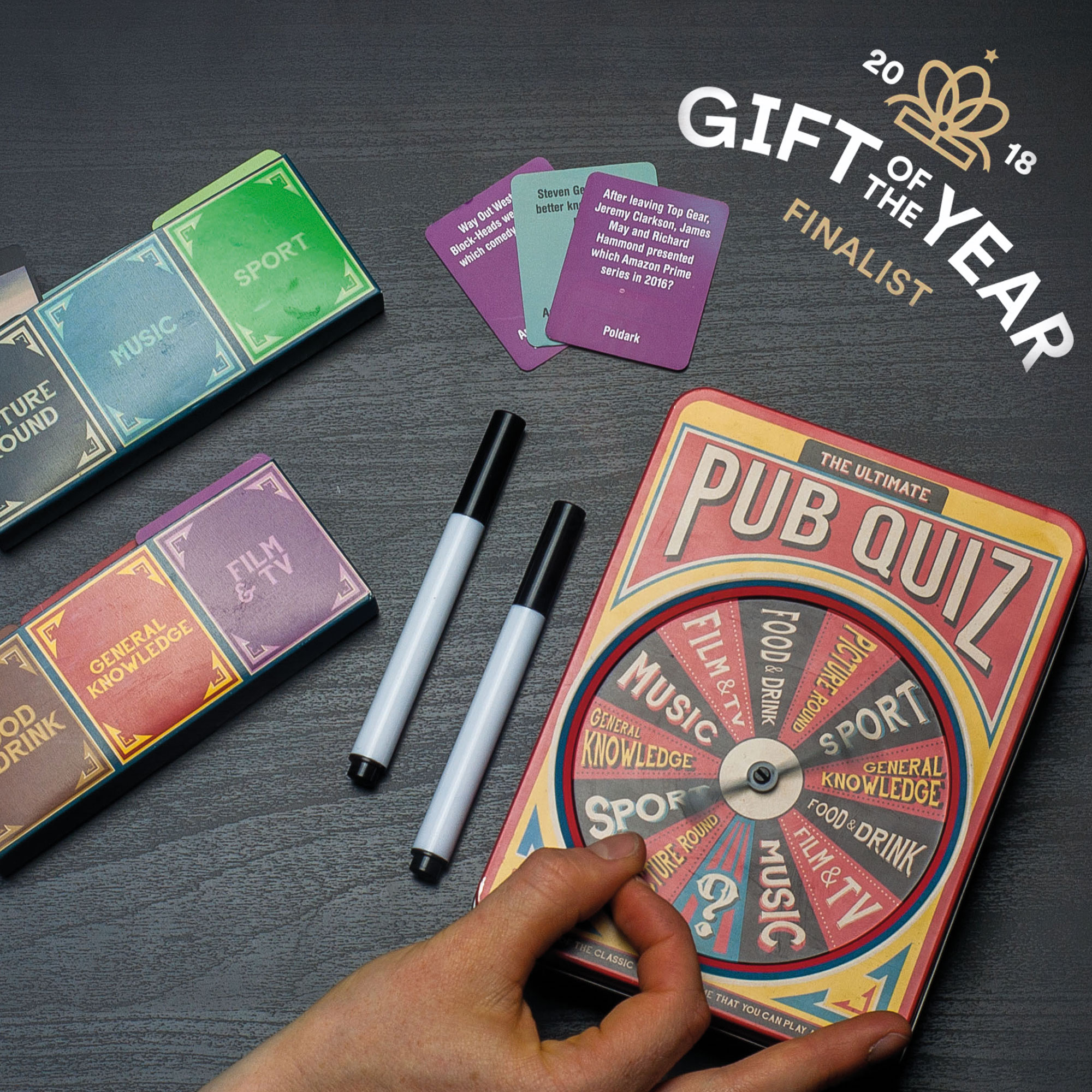
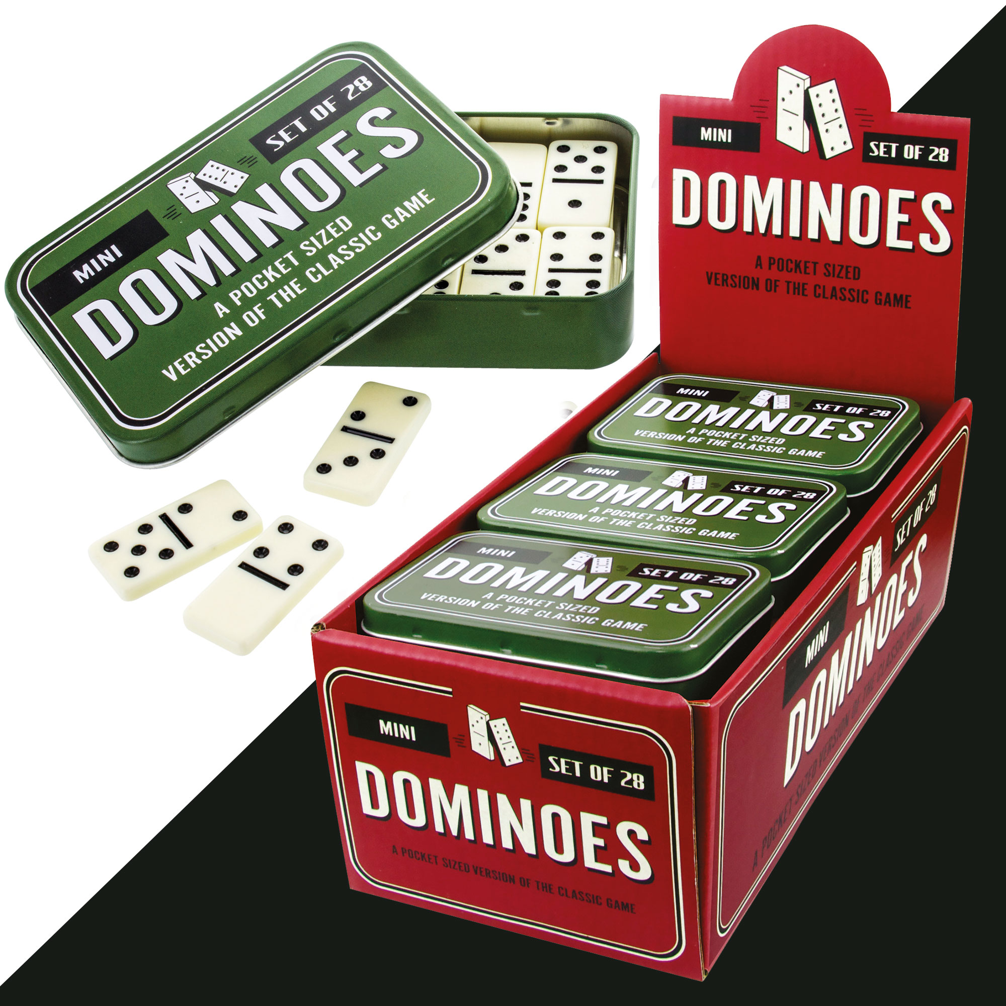
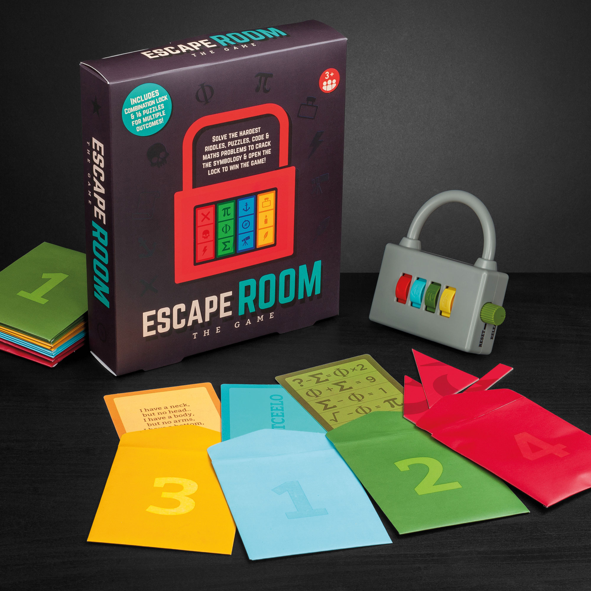
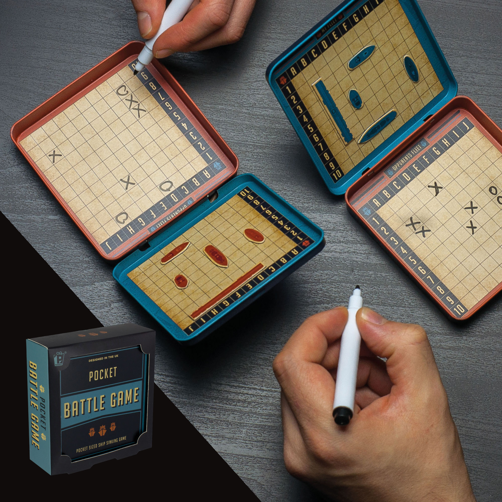
RETRO GAMES
Concept / Product / Packaging design
In the past 5 years board games, games nights and non-screen-based entertainment has seen a huge resurgence and I have been involved in a huge variety of product developments that have sat within this market. From brainstorm and concept creation through to product and packaging design, taking these products from an idea to the high street has been a fun, creative process.


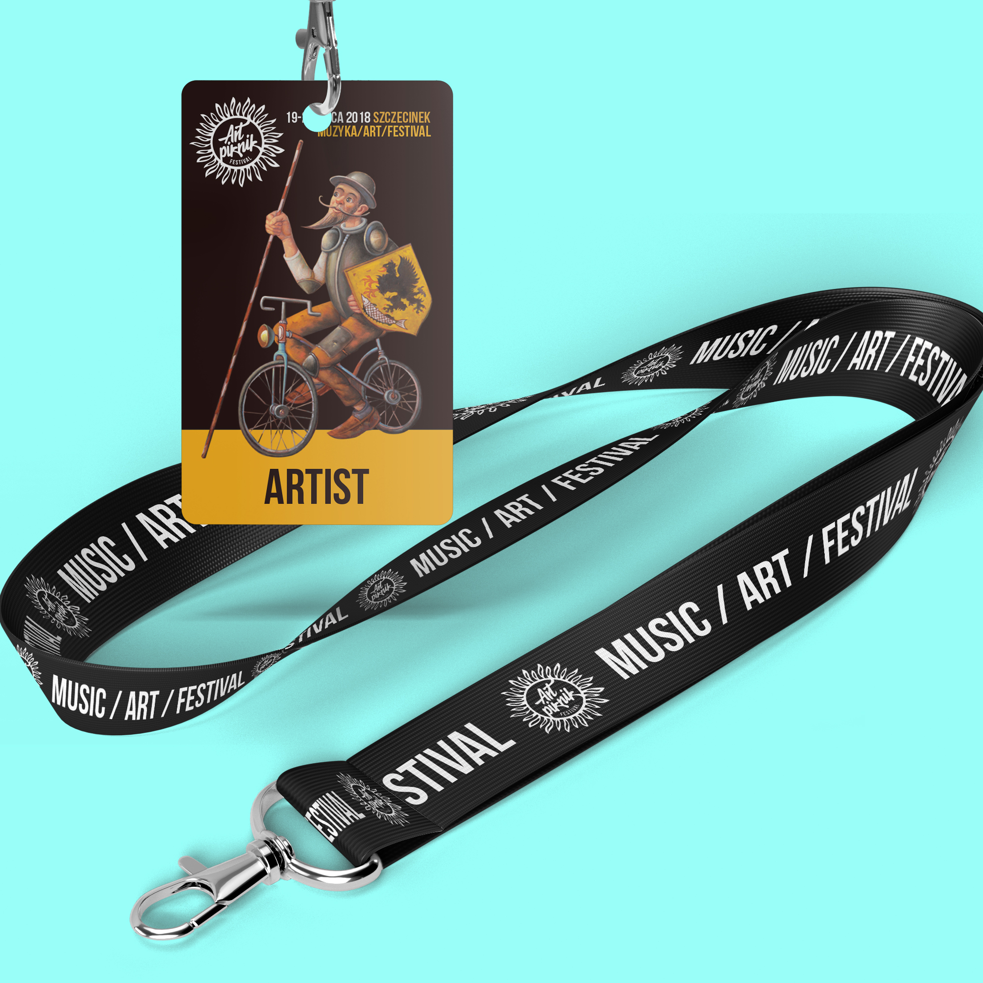
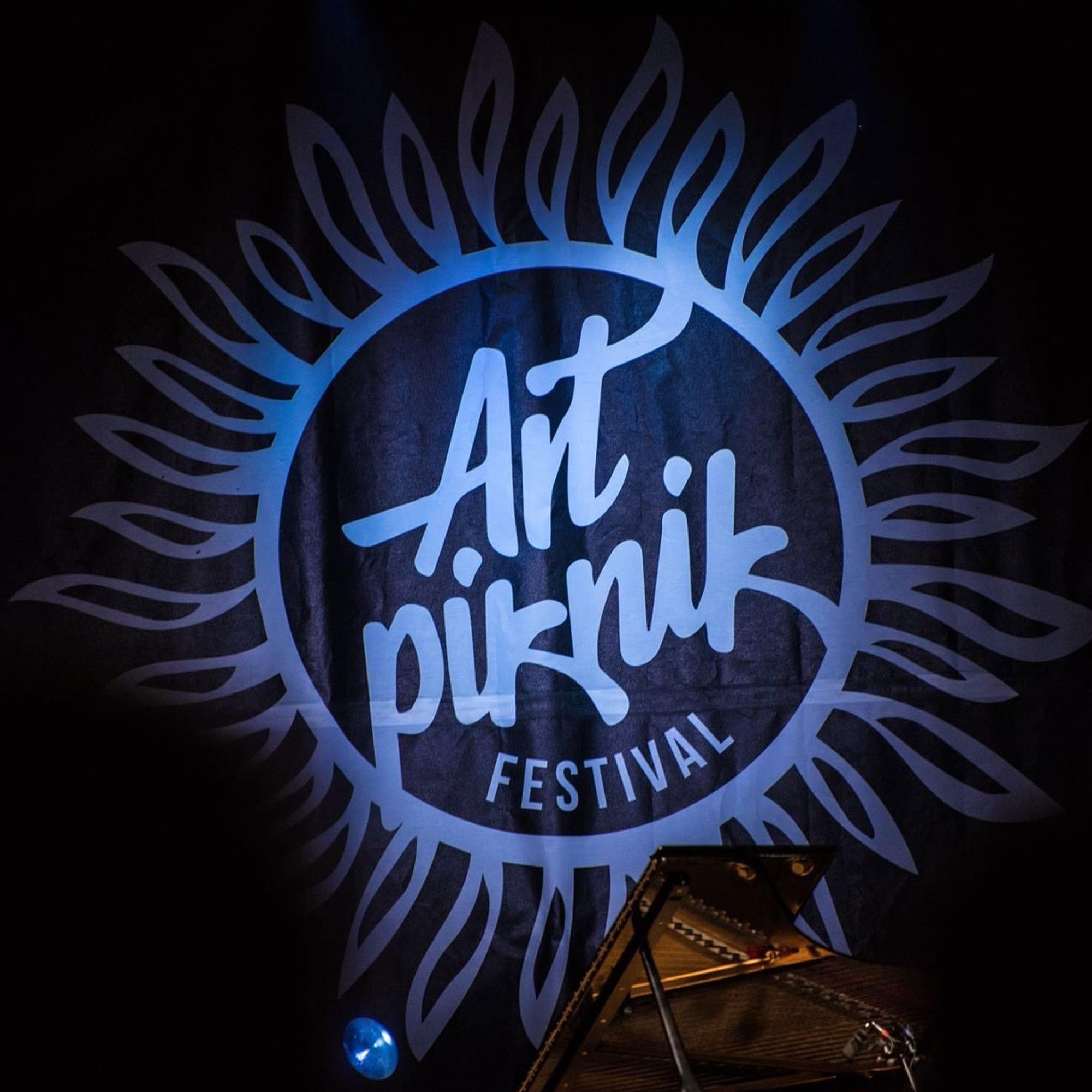
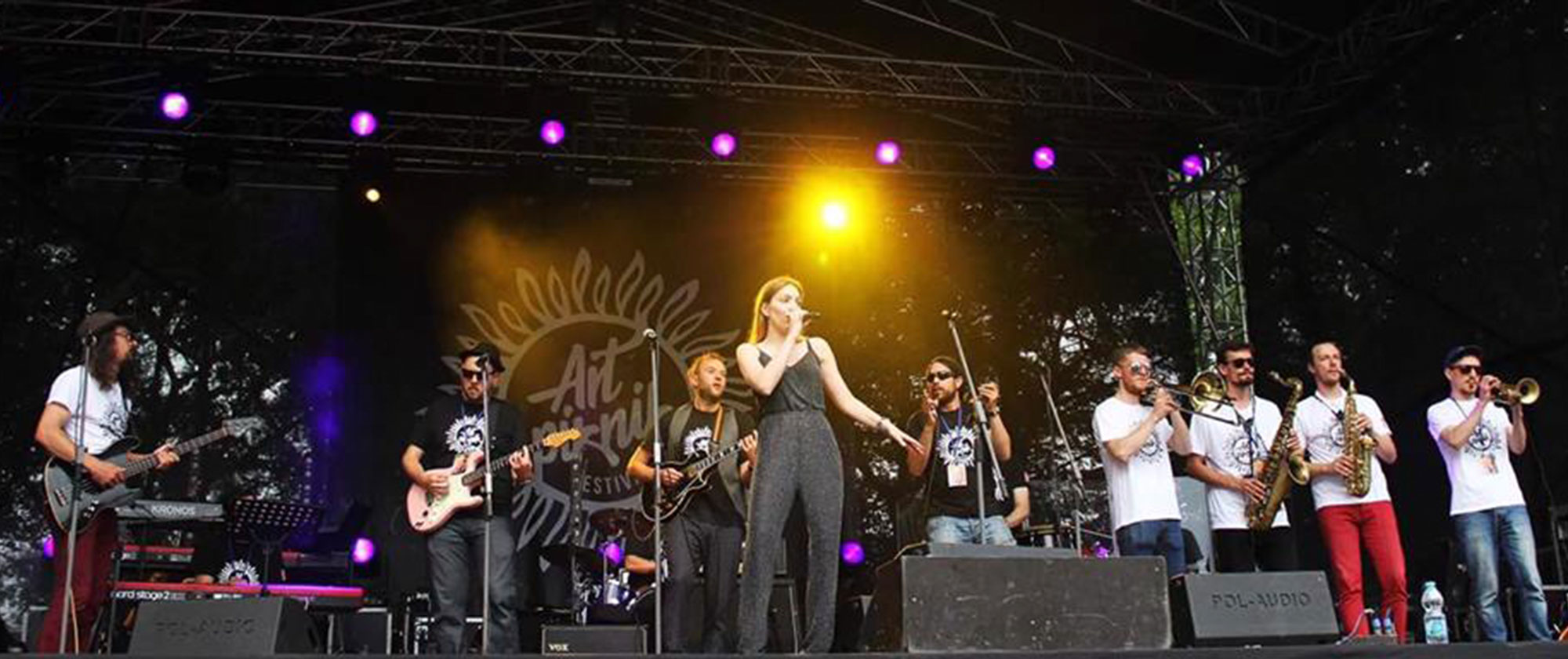
ART PIKNIK FESTIVAL
Branding / Merchandise / Marketing assets /
Social media / Music album
Branding / Merchandise / Marketing assets /
Social media / Music album
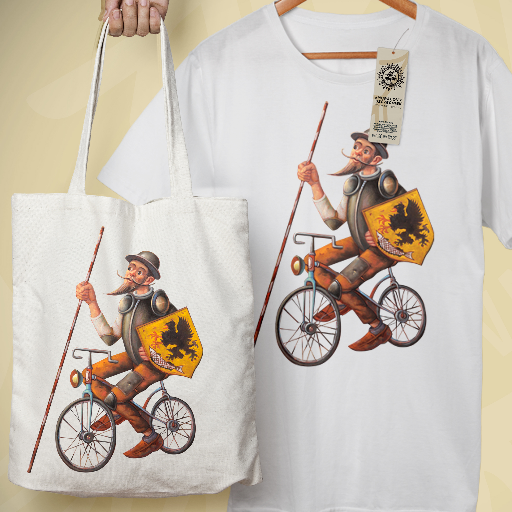
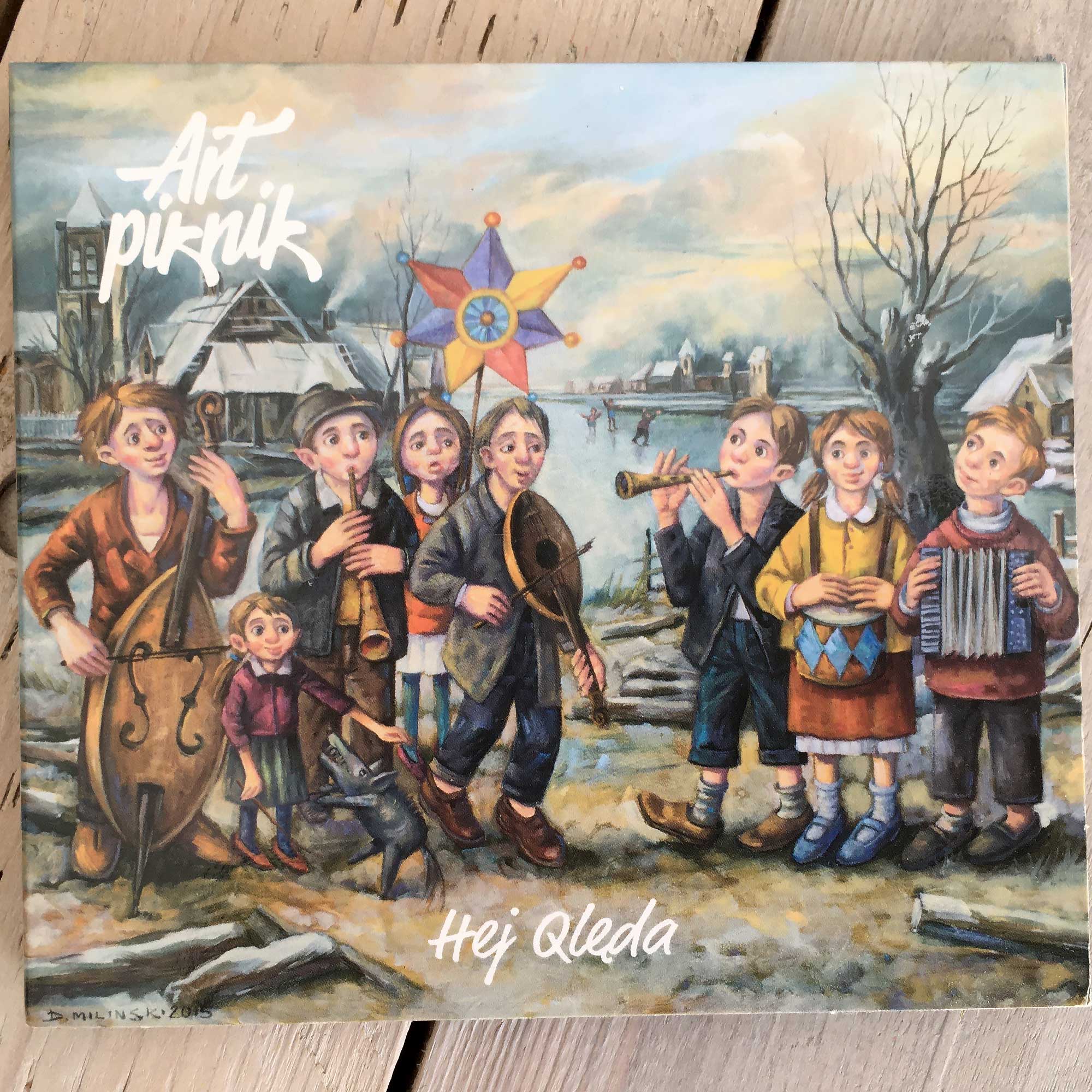
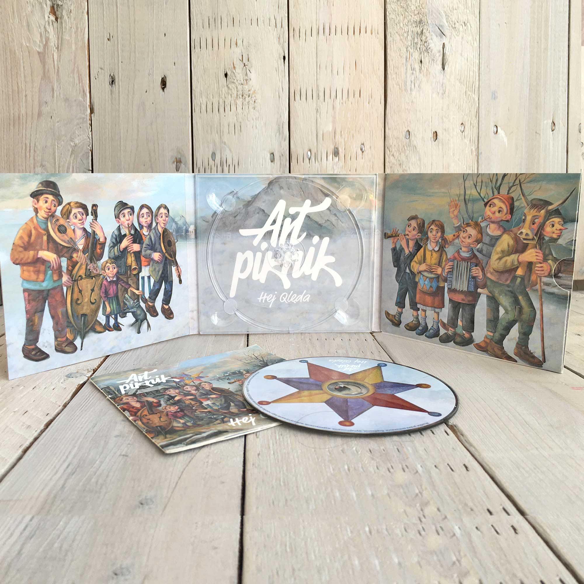
ART PIKNIK FESTIVAL
Branding / Merchandise / Marketing assets / Social media / Music album
Art Piknik is a festival, that I am hugely proud to have founded, that takes place in Szczecinek, Poland each year. It brings together a community and celebrates art and music of all genres across a weekend and in a variety of spaces and locations. It is supported by the local council and raises funds and delivers gifts to those in the community who are in need. I design both the artwork, branding, and merchandise, and the music schedule!


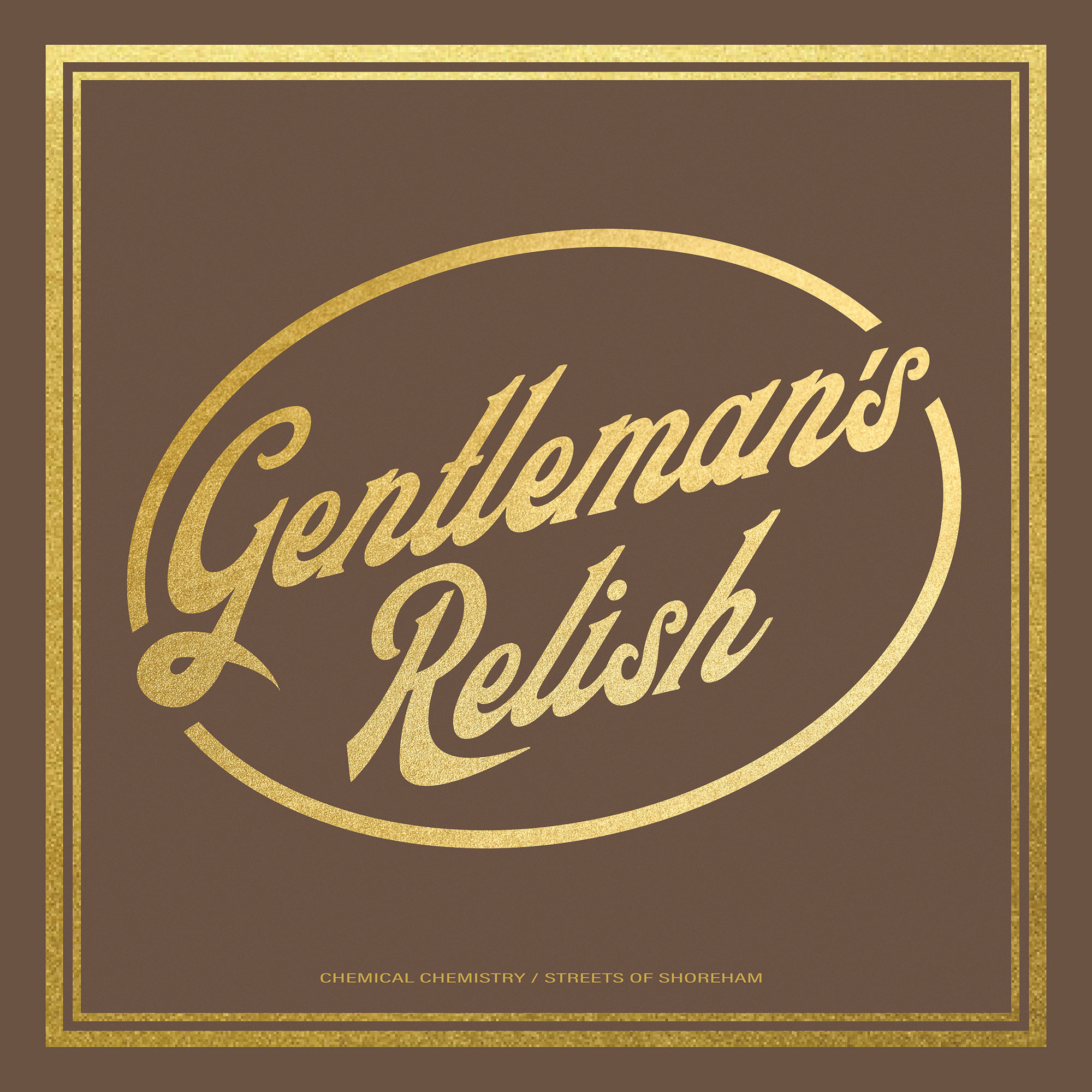
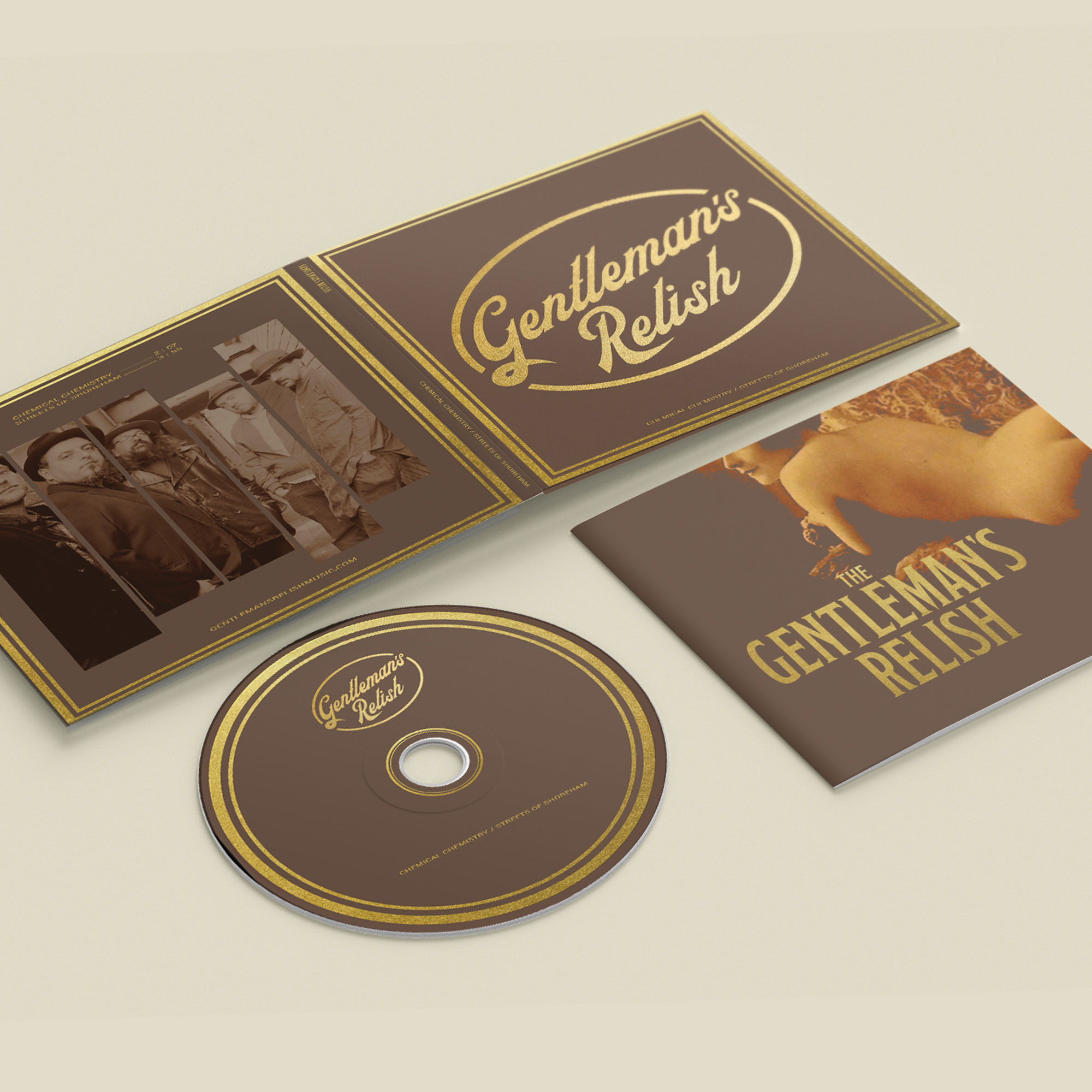
GENTLEMAN’S RELISH
Identity / Album design /
Identity / Album design /
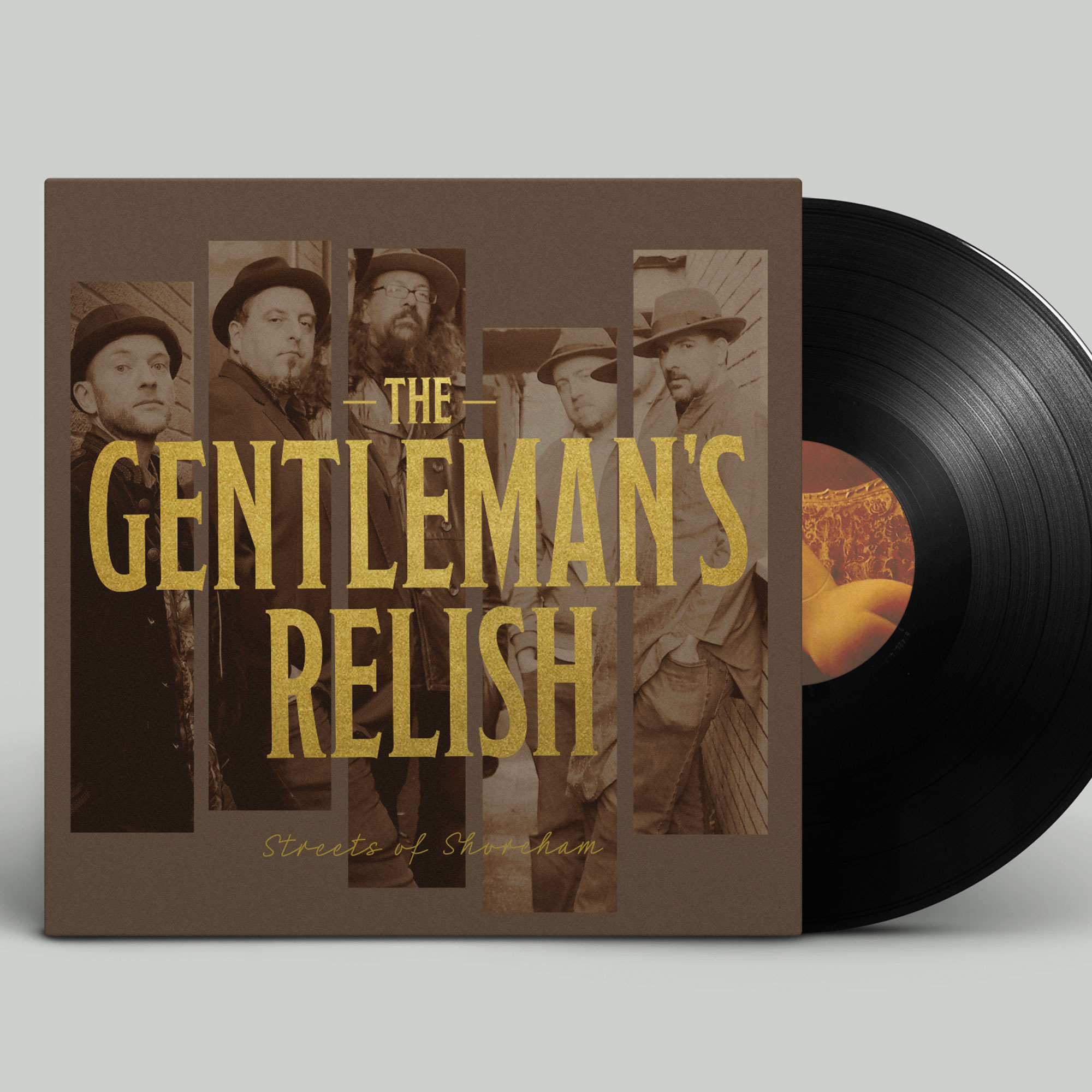
GENTLEMAN’S RELISH
Identity / Album design /
Gentleman’s Relish is a funk and blues band that I play guitar in. As with Banned Sauce, I thrive on bringing music and design together and have worked hard to develop the bands identity, branding, and typography to use across album covers and merchandise.
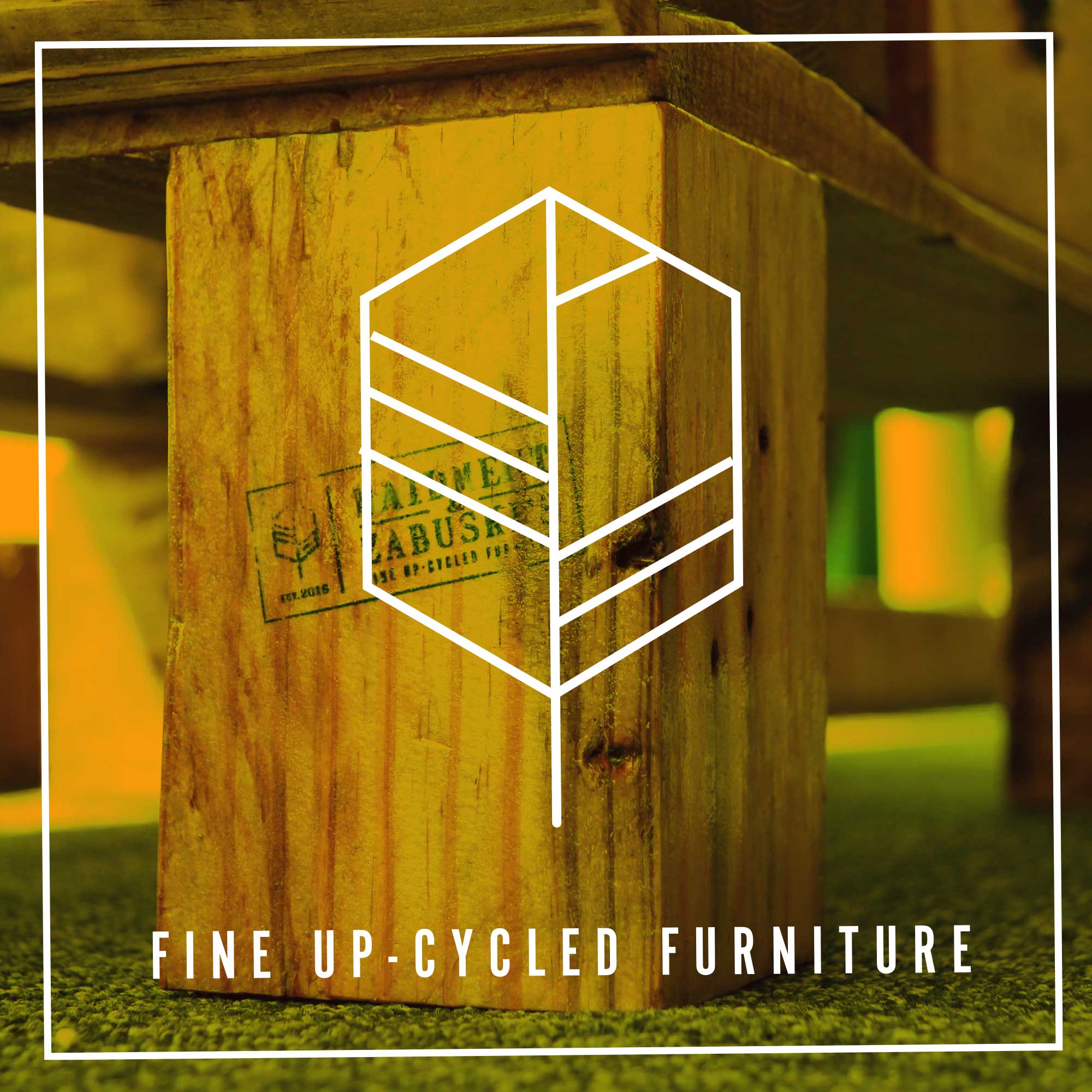
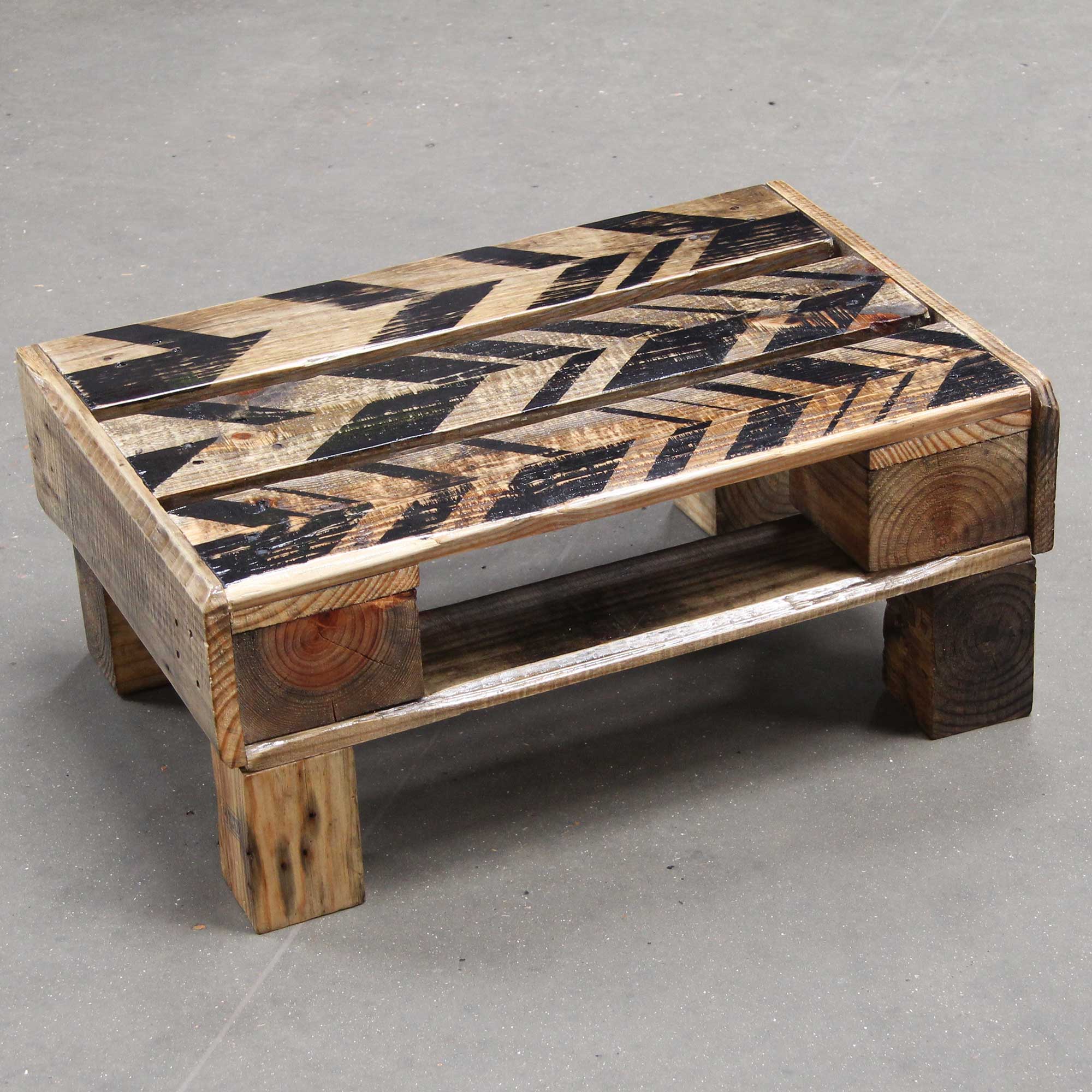
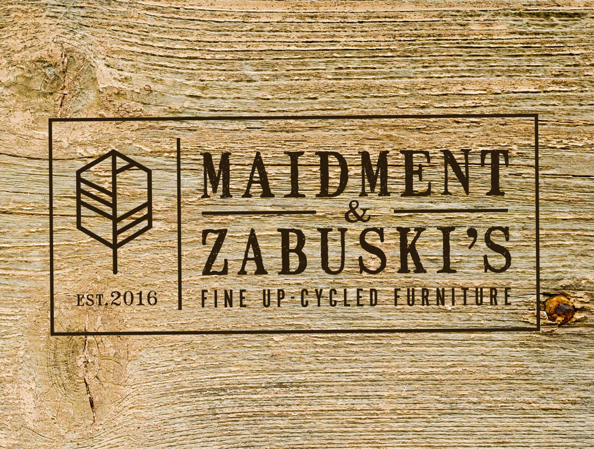
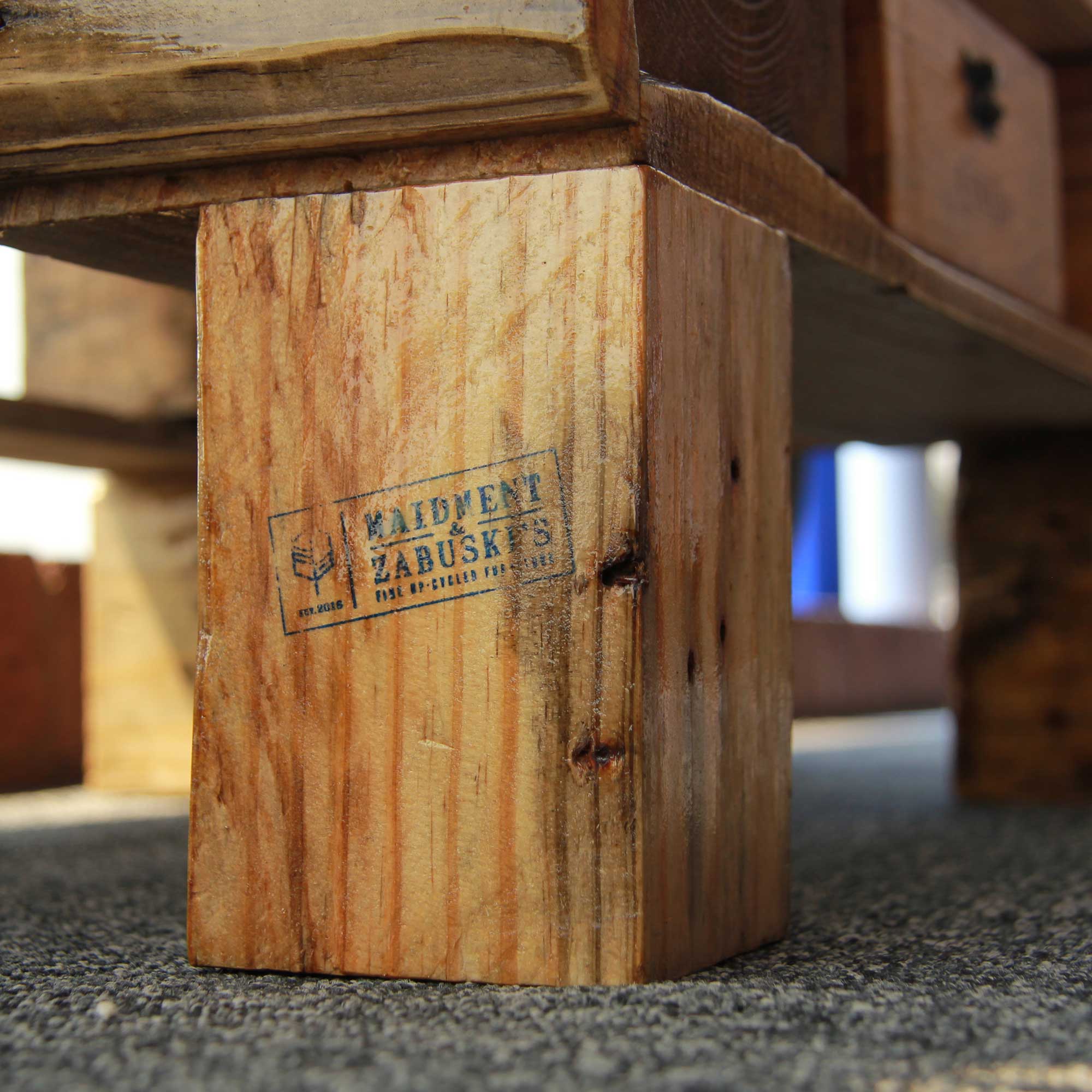
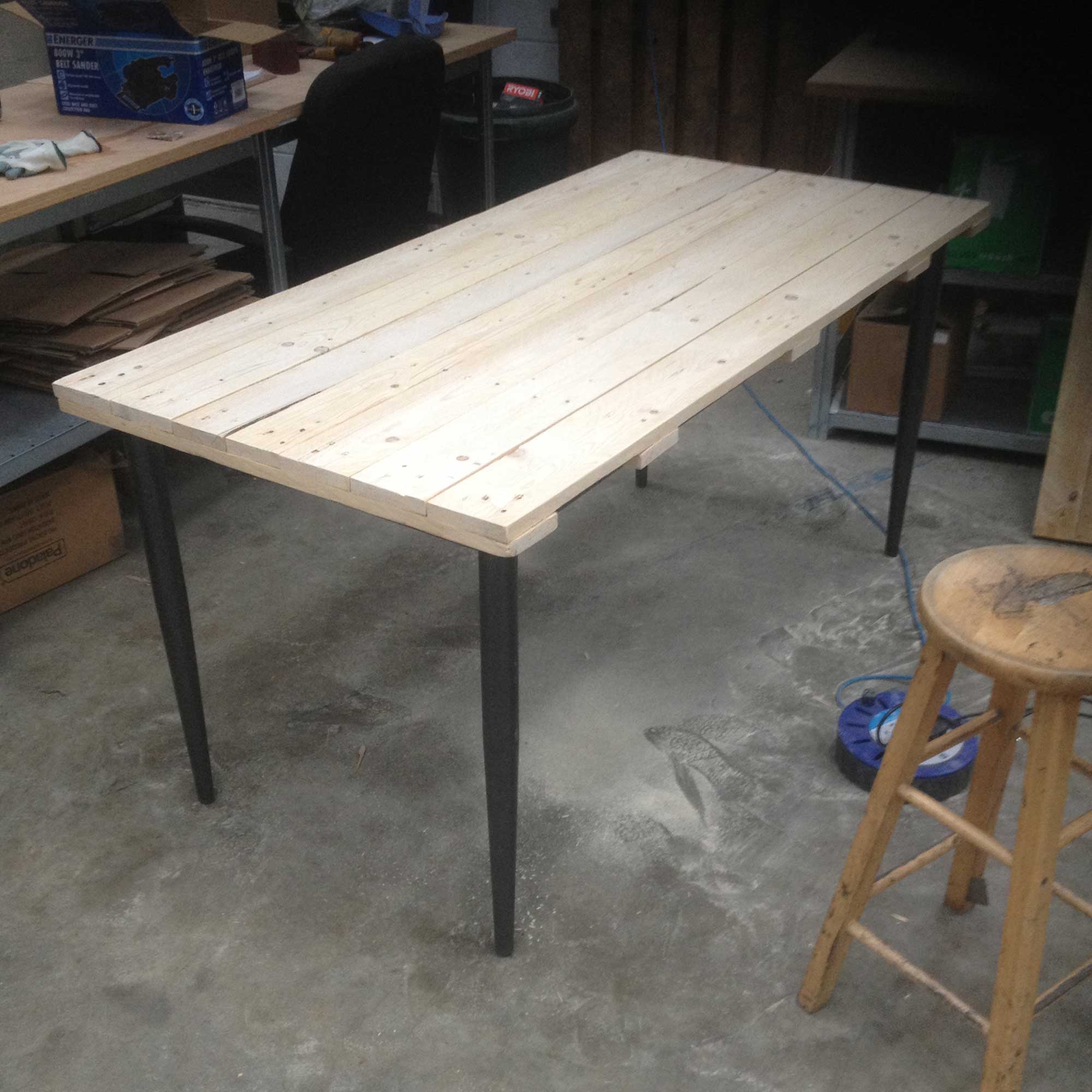
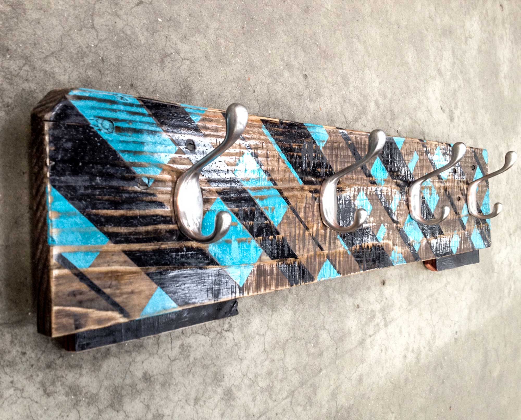
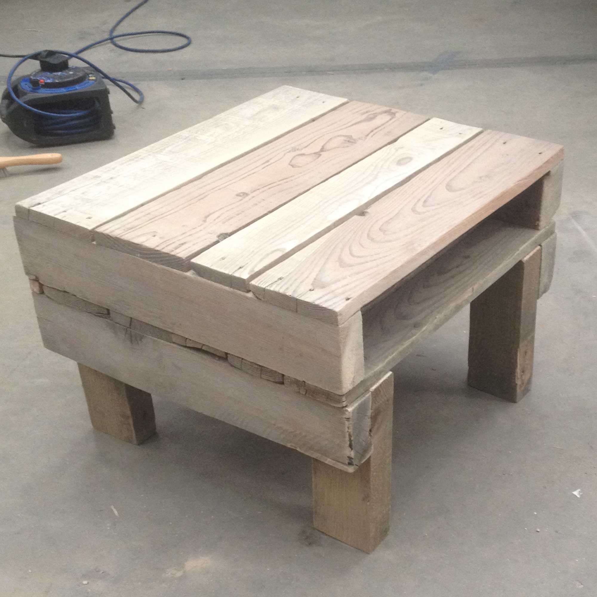
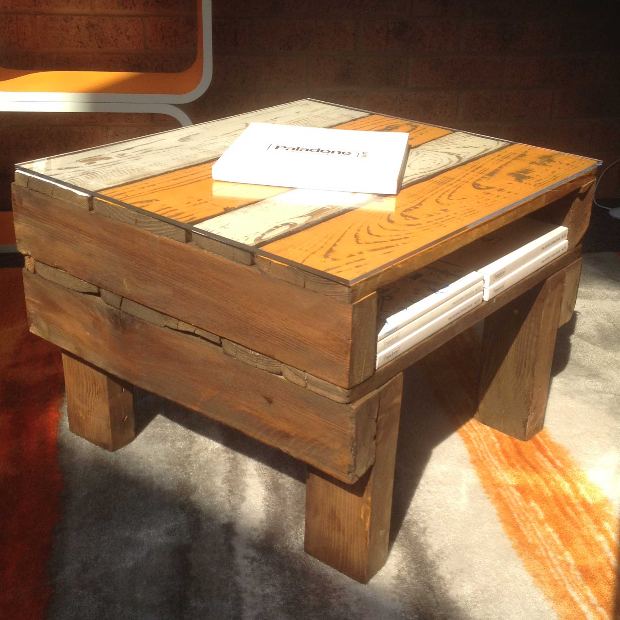
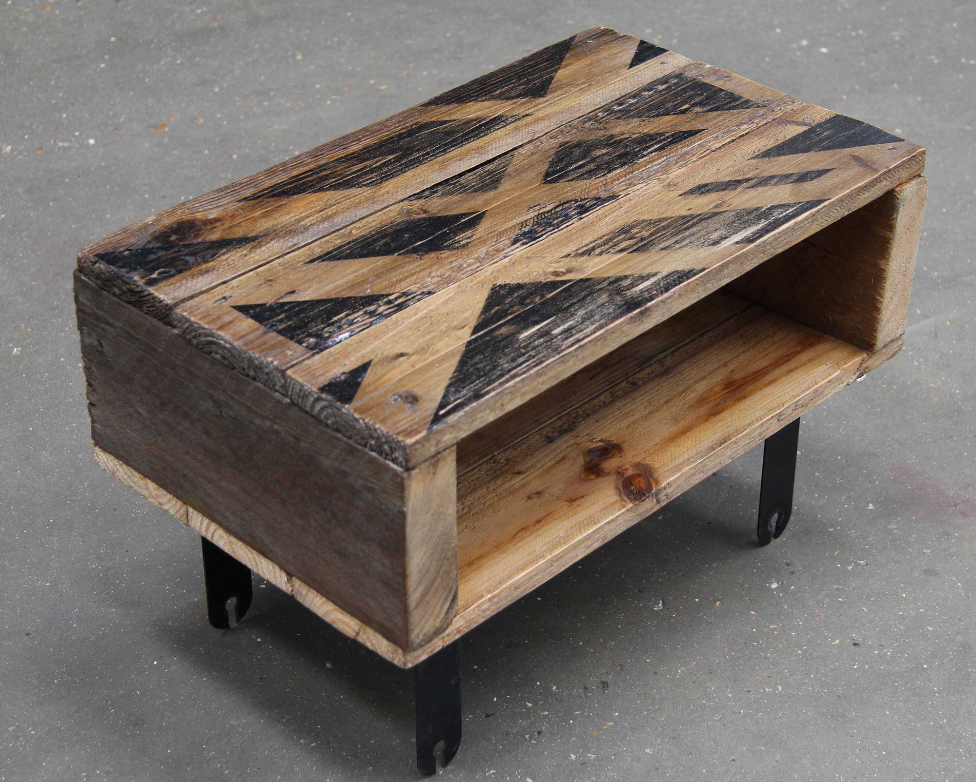
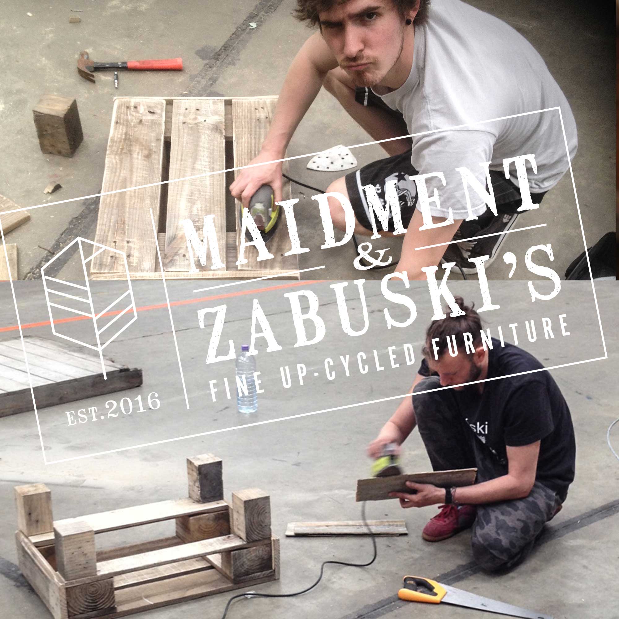
MAIDMENT & ZABUSKI’S
Identity / Product design / Crafting
Identity / Product design / Crafting
Maidment & Zabuski’s
Identity / Product design / Crafting
Where passion meets creation. I have always loved the idea behind recycling materials for sustainability.
With this combination in mind, myself and a friend with this same goal created a local up-cycling business specialising in furniture made predominantly of retired wooden shipping pallets. Using both our backgrounds in product & graphic design, we embarked on this brilliant journey to transform previously discarded materials into desirable furniture. I based the design of our company logo on the stencils that are branded onto wooden shipping crates and pallets.
With this combination in mind, myself and a friend with this same goal created a local up-cycling business specialising in furniture made predominantly of retired wooden shipping pallets. Using both our backgrounds in product & graphic design, we embarked on this brilliant journey to transform previously discarded materials into desirable furniture. I based the design of our company logo on the stencils that are branded onto wooden shipping crates and pallets.